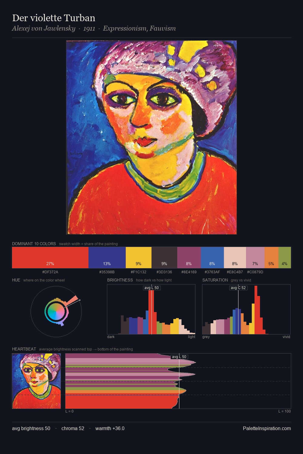
Synchromism Palette 5
Somber Umber
Somber Subdued and serious - low-key, low-chroma, emotionally weighted toward gravity.
Umber Dark earthy brown - raw or burnt umber, a foundational old-master earth pigment.

Palette Analysis
Synchromism occupies the comfortable middle of the value scale, avoiding both extremes to hold the eye in a sustained middle grey. A distinctly cool atmosphere runs through this palette: sky, water, and mist given colour form. Colours are neither washed out nor blazing; they occupy the productive middle ground of the chroma scale. The saturated accent, #DA291B, registers at 10.4% - sparse enough to feel like a deliberate surprise. A value spread of 60 units gives the palette both depth and air - shadows are genuinely dark, lights genuinely light. The palette has the character of outdoor light: cool, mid-bright, with colour rendered faithfully rather than expressively.
Example use cases
- publishing
- corporate identity
- consumer apps
- hospitality
- design agencies
I Love This!
Use This Palette
Copy, export, or download for your project
Copy, export, or download for your project
Copy:
Download:
Share: