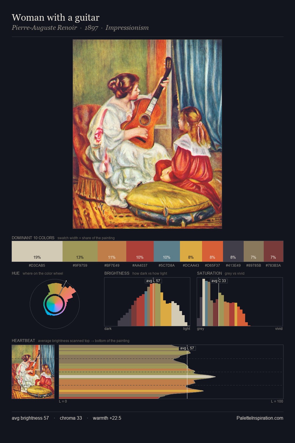
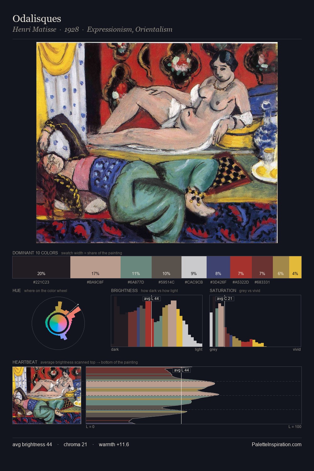
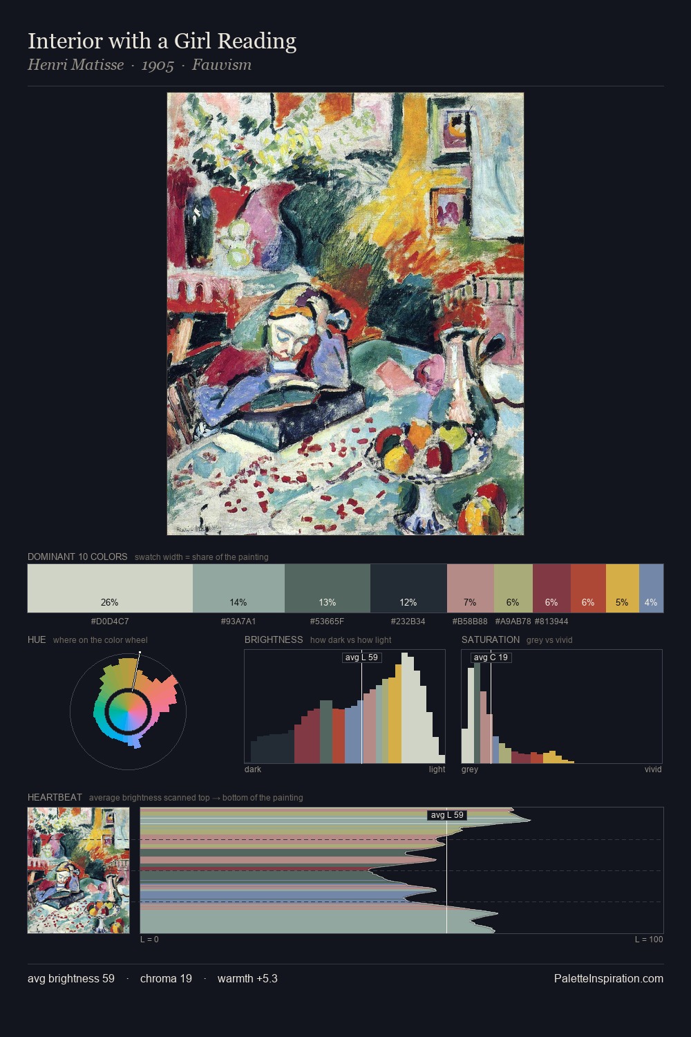
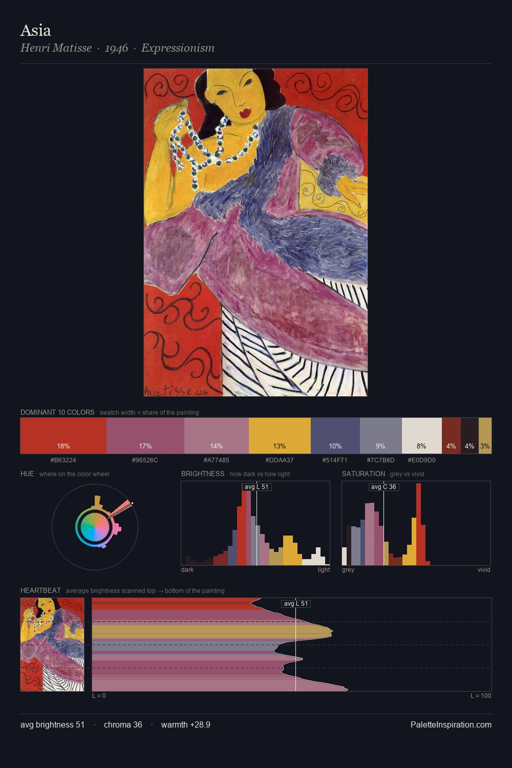
Synchromism Palette 1
Muted Topaz
Muted Deliberately desaturated - chroma pulled toward gray, the restraint of tonal painting.
Topaz Golden yellow - the color of topaz gemstone, warm and slightly saturated.

Palette Analysis
The value structure of Synchromism is mid-key: quiet, controlled, and cohesive. Yellow, ochre, sienna: warm hues deployed as the palette's primary energy. Chroma is held at a comfortable level - distinct colours, but no single hue is allowed to overwhelm. The highest-chroma note - #D3AE23 - appears at just 5.5%, deployed as a precision accent against the quieter ground. A value spread of 62 units gives the palette both depth and air - shadows are genuinely dark, lights genuinely light.
Example use cases
- publishing
- corporate identity
- consumer apps
- hospitality
- design agencies
I Love This!
Use This Palette
Copy, export, or download for your project
Copy, export, or download for your project
Copy:
Download:
Share: