Sydney Laurence Palette 6

Palette Analysis
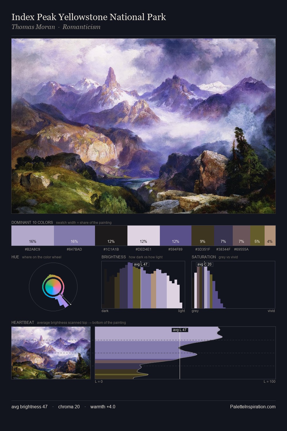
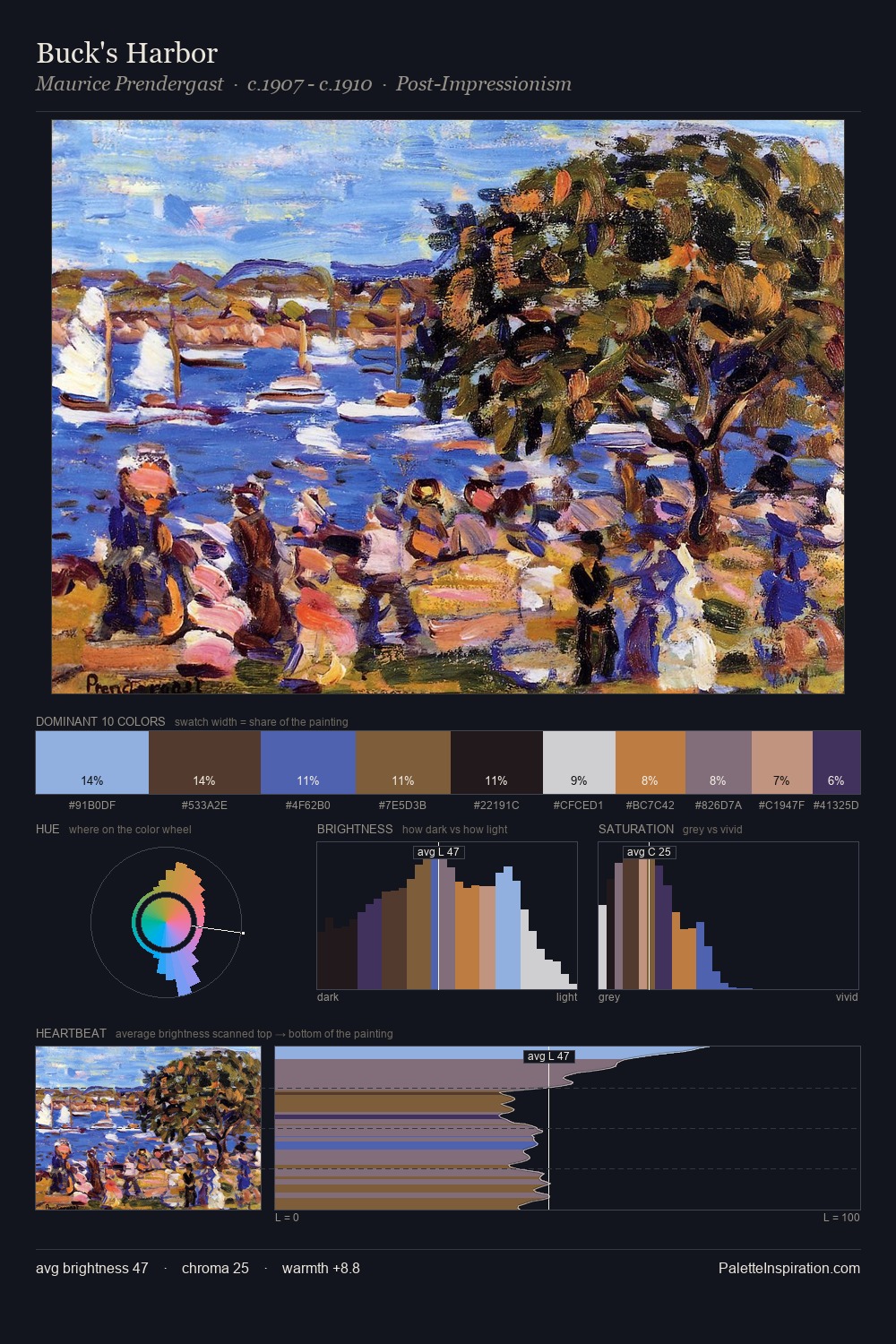
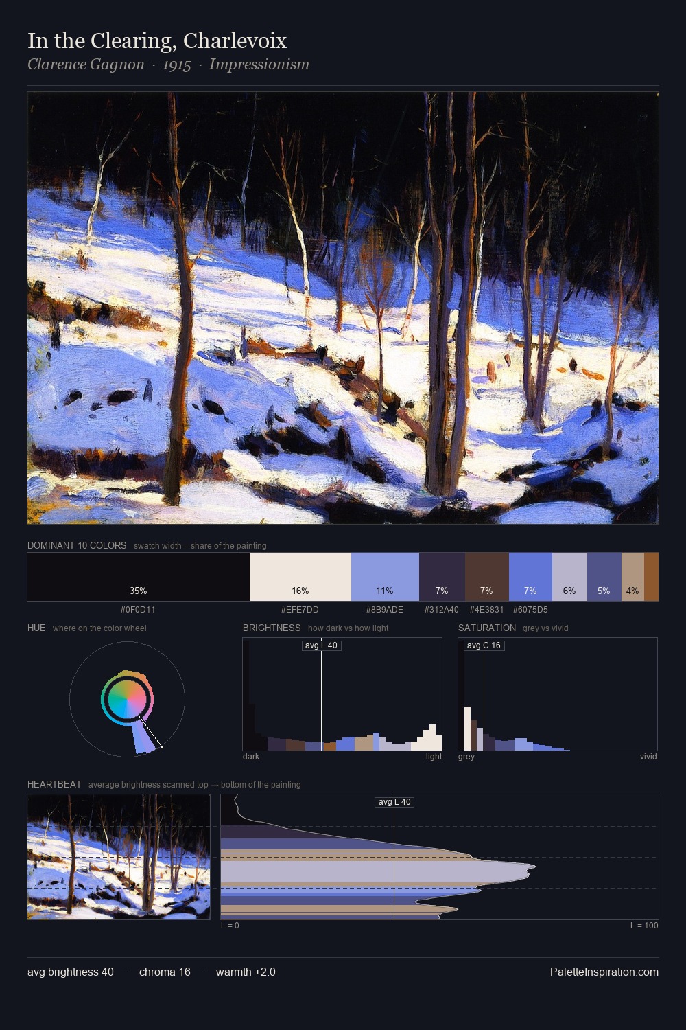
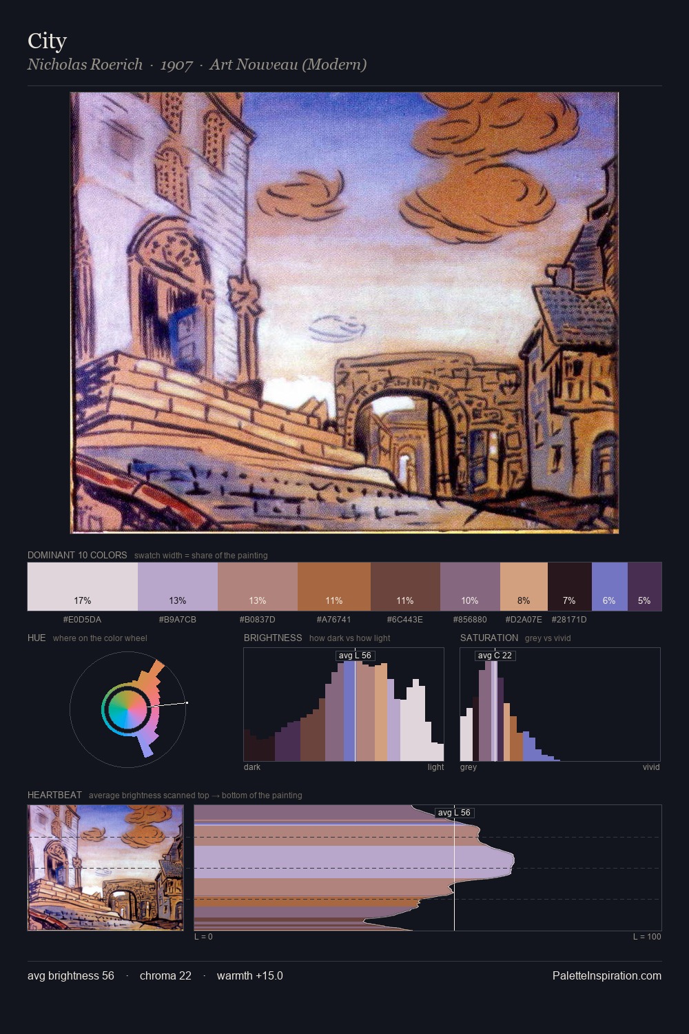
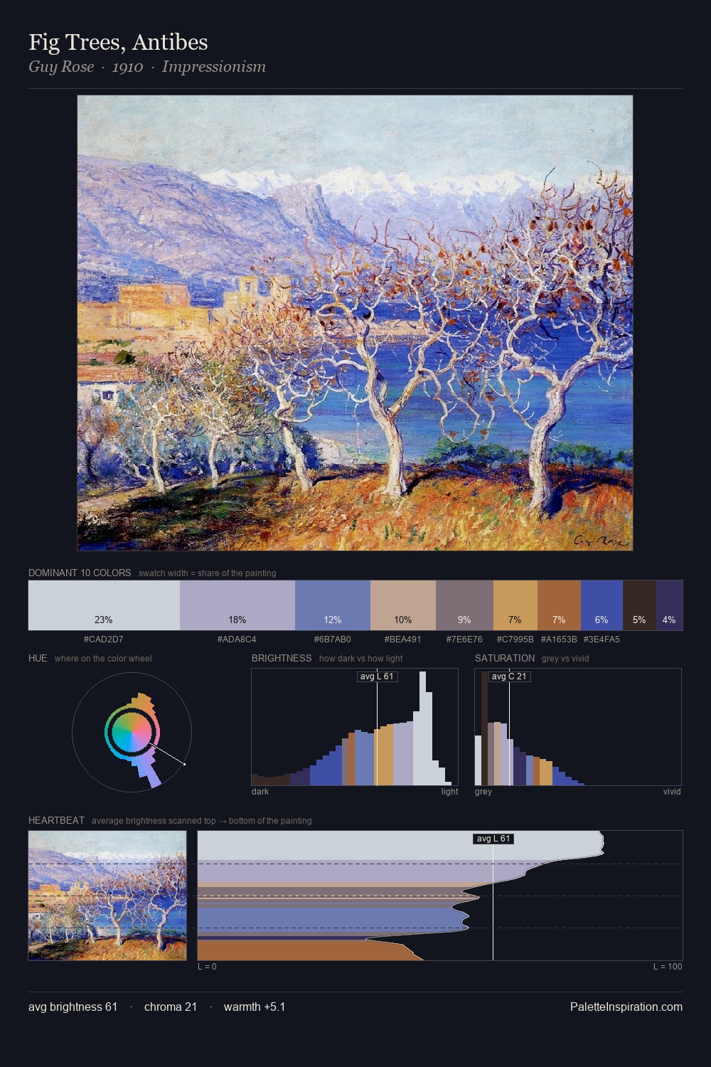
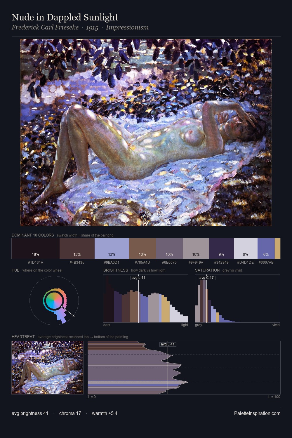
The value structure of Sydney Laurence is mid-key: quiet, controlled, and cohesive. Cool hues prevail: blues, greens, and greys anchor the palette's emotional temperature. Saturation is deliberately withheld - the beauty here lies in the near-monochromatic gradations rather than colour difference. 29.8% of the palette belongs to #DBDBE9, a concentration that makes it the unmistakable visual centre. The highest-chroma note - #4E3720 - appears at just 5.7%, deployed as a precision accent against the quieter ground. The full value range is 64 units: broad enough to build convincing three-dimensional form. High luminosity and cool temperature suggest the plein-air condition: unfiltered daylight and open sky. Palette 6 sits within the larger chromatic argument that Sydney Laurence's complete body of work advances.
Example use cases
- publishing
- corporate identity
- consumer apps
- hospitality
- design agencies
I Love This!
Copy, export, or download for your project