Surrealism Palette 6
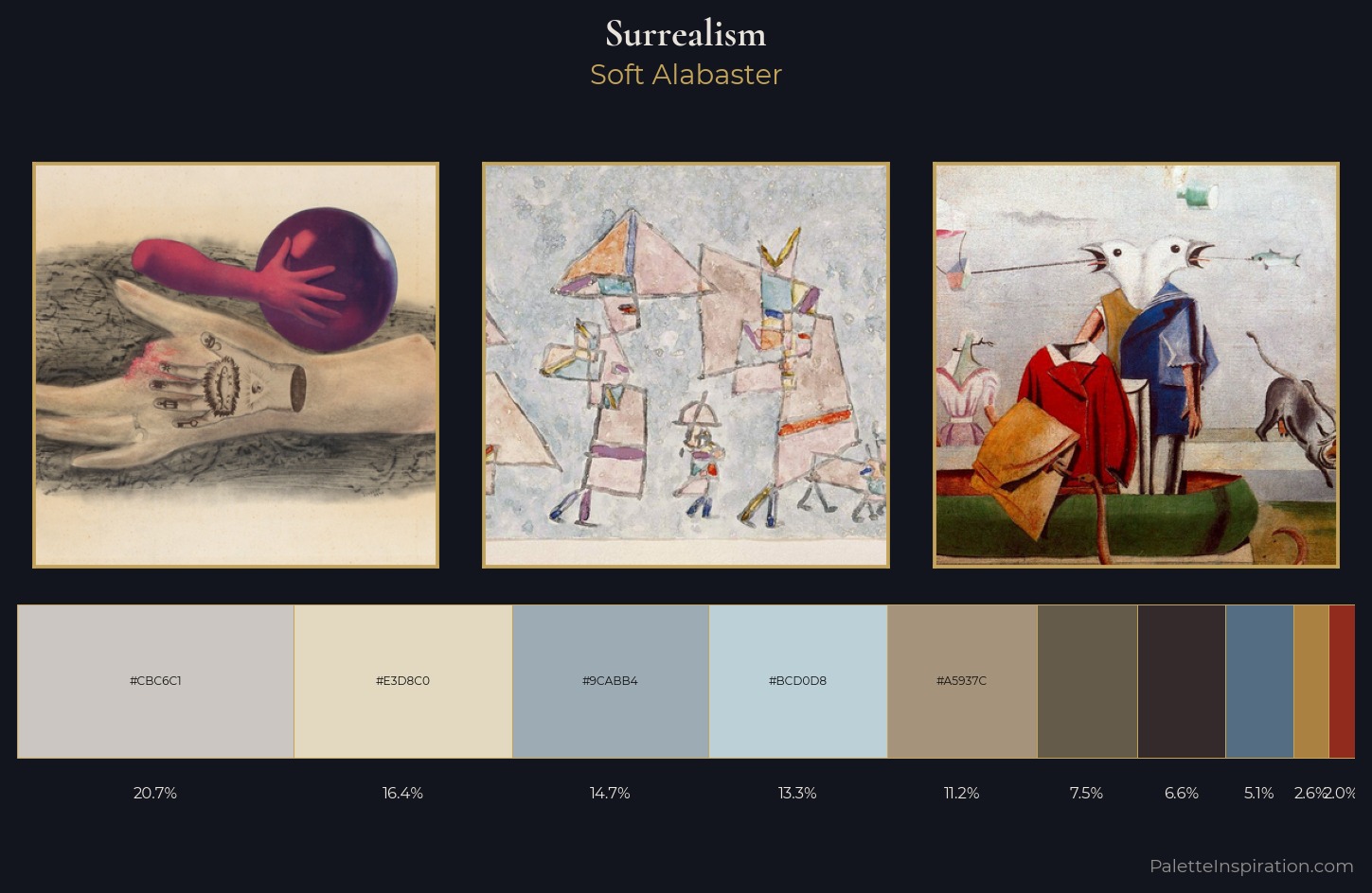
Soft Alabaster
Soft Low-contrast, gentle chroma - mid-key values and low saturation, approachable and calm.
Alabaster Warm off-white - creamy stone white, luminous and slightly translucent.
Palette Analysis
Values in Surrealism tilt decisively toward white, giving the palette its luminous character. A distinctly cool atmosphere runs through this palette: sky, water, and mist given colour form. The absence of saturated colour is itself an expressive choice: this is a palette of restraint and atmosphere. The most saturated colour, #BCD0D8, is reserved to 13.3% of the surface, where it acts as a focal punctuation. At 58 units of value range, the palette has the tonal breadth to sustain complex spatial readings. The palette has the character of outdoor light: cool, mid-bright, with colour rendered faithfully rather than expressively.
Example use cases
- florist branding
- event design
- real estate
- jewelry retail
- hospitality branding
I Love This!
Use This Palette
Copy, export, or download for your project
Copy, export, or download for your project
Copy:
Download:
Share: