Stefan Popescu Palette 3
Pale Ivory
Pale High-key and low-chroma - delicate, bleached, washed with light.
Ivory Warm creamy white - the color of natural ivory, warmer than pure white.

Palette Analysis
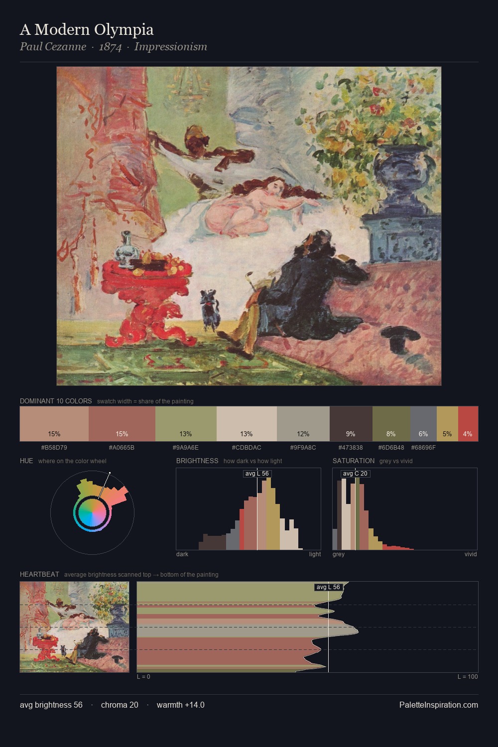
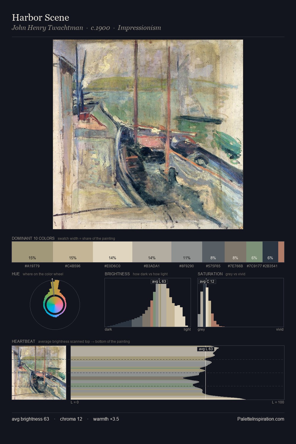
Stefan Popescu is strongly light-biased - shadow is suggested rather than declared. Heat pervades this palette; warm chromatic identities outweigh cool ones at almost every weight. Muted throughout, the palette achieves its effects through value and temperature rather than chromatic force. #9C7260 functions as the palette's exclamation mark: highest chroma, lowest percentage (5.7%). 38 units of value spread create a palette that is varied but unified - contrast in the service of harmony. In the context of Stefan Popescu's full range of palettes, group 3 represents one movement in an ongoing chromatic dialogue.
Example use cases
- exhibition design
- foundation branding
- estate management
- art education
- museums & galleries
I Love This!
Use This Palette
Copy, export, or download for your project
Copy, export, or download for your project
Copy:
Download:
Share: