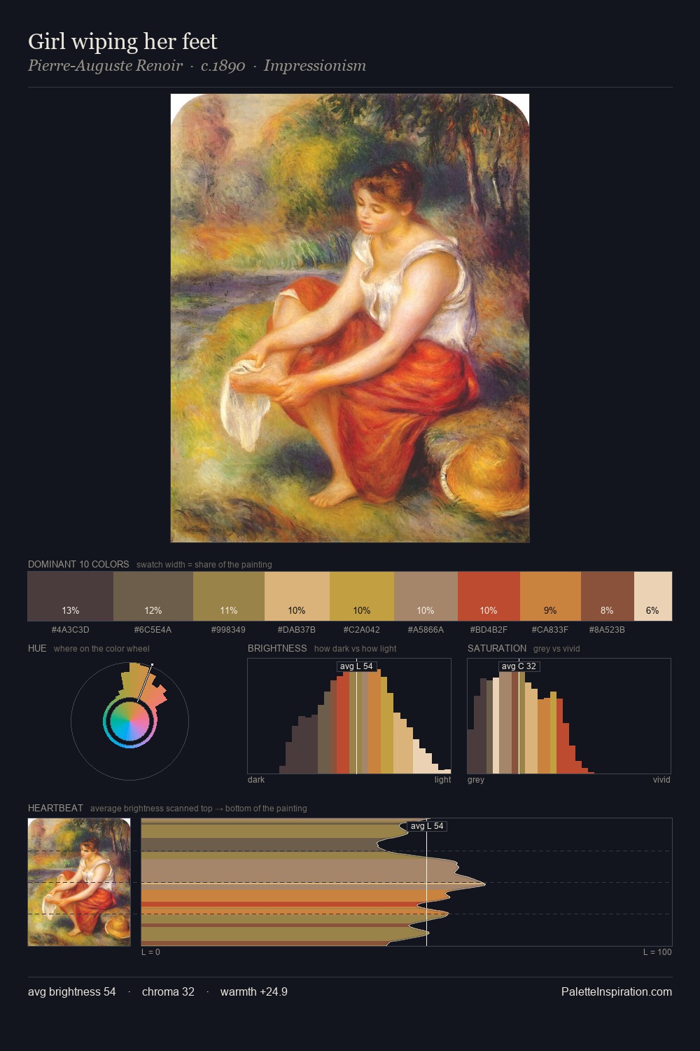
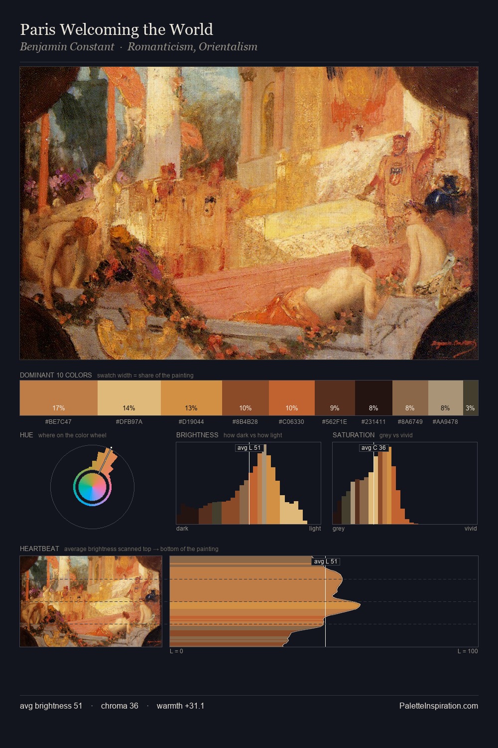
Stefan Popescu Palette 2
Pale Aureolin
Pale High-key and low-chroma - delicate, bleached, washed with light.
Aureolin Bright transparent yellow - a clear, luminous lemon-gold pigment hue.

Palette Analysis
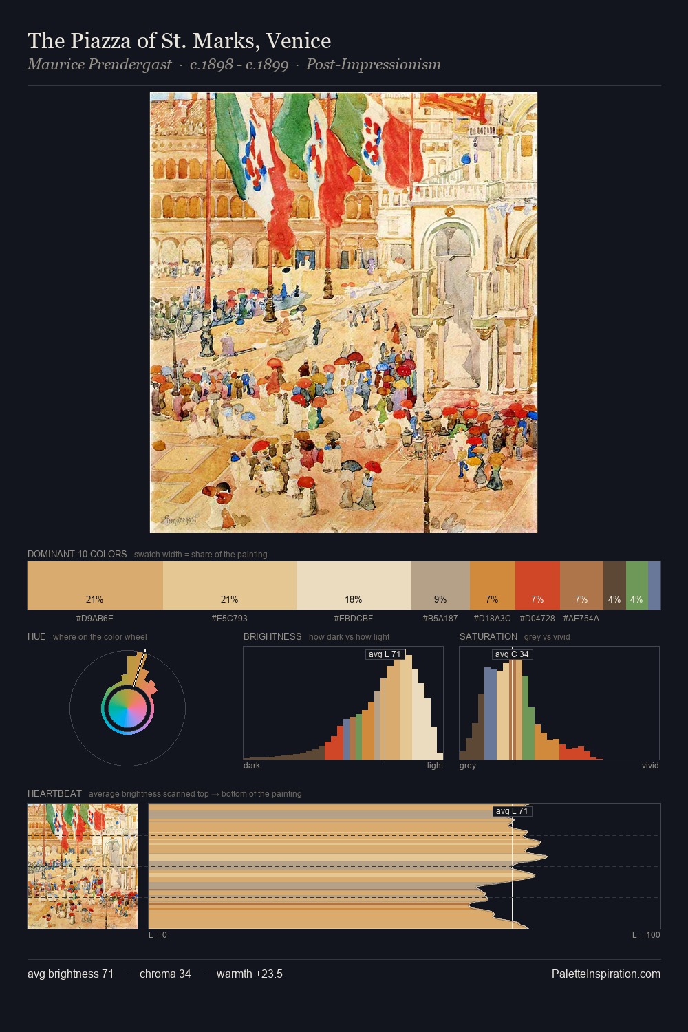
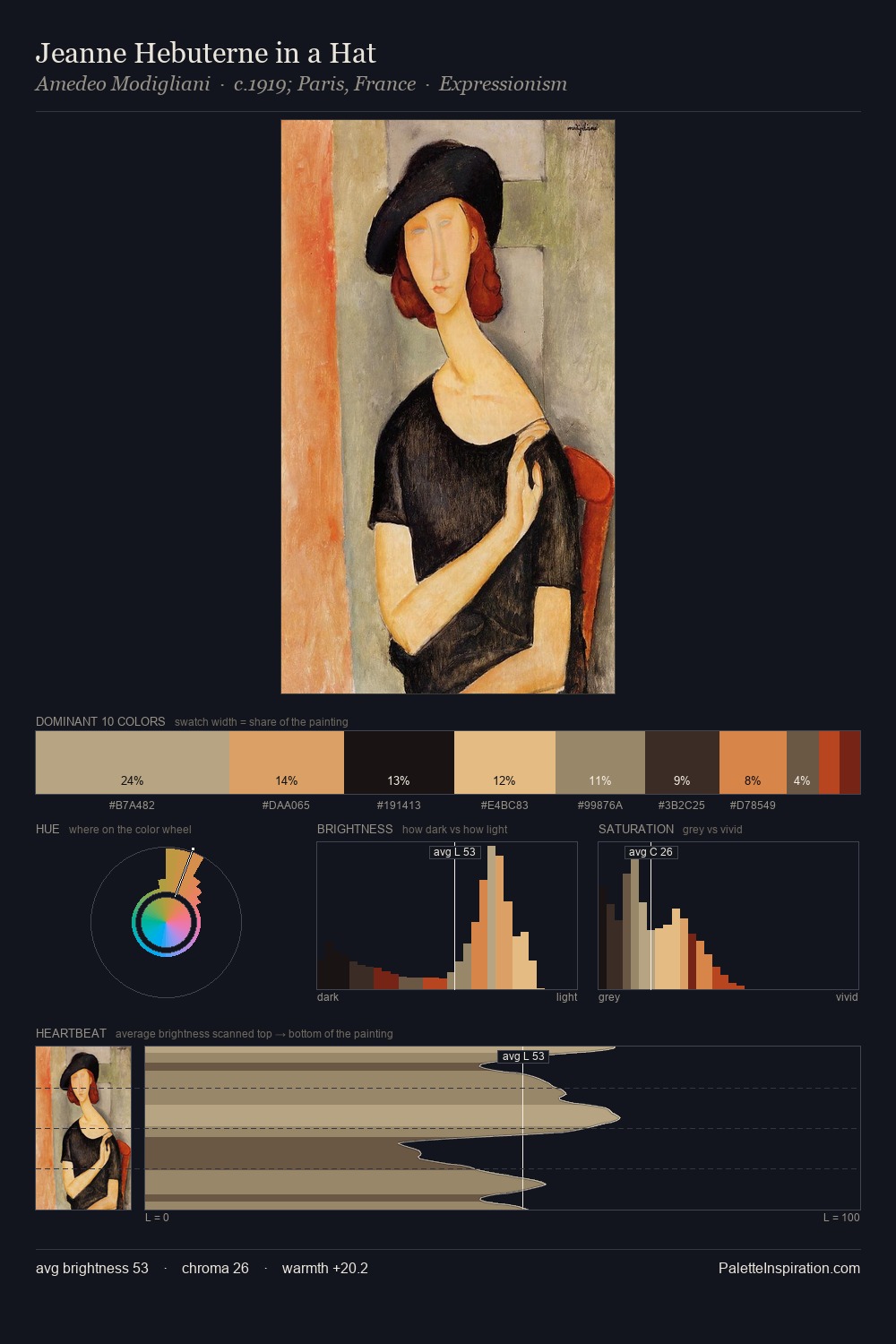
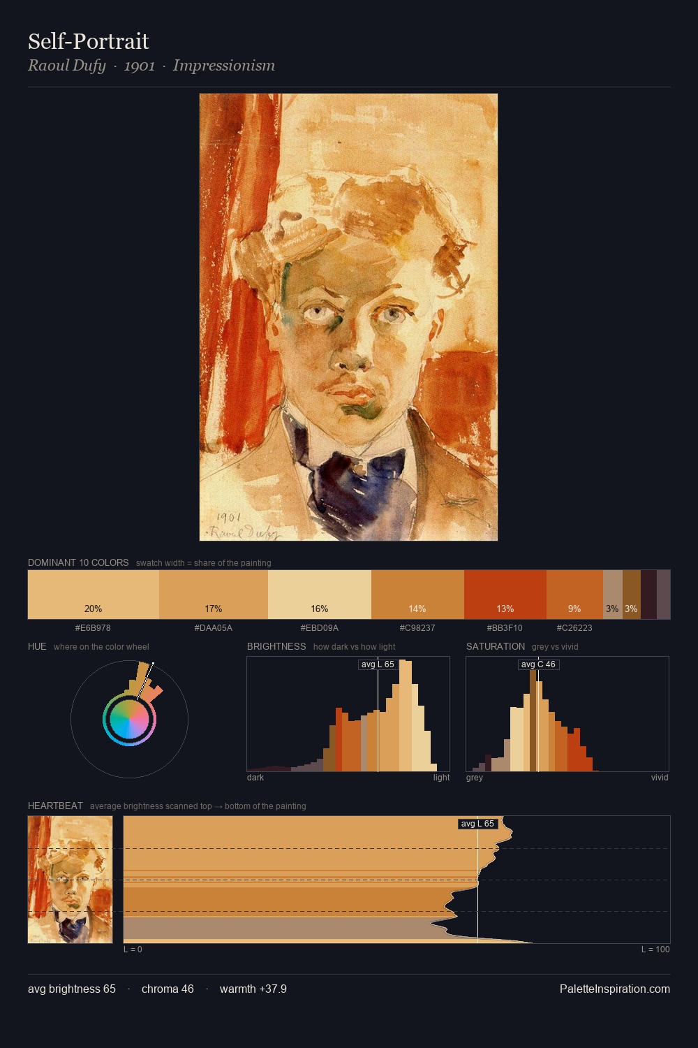
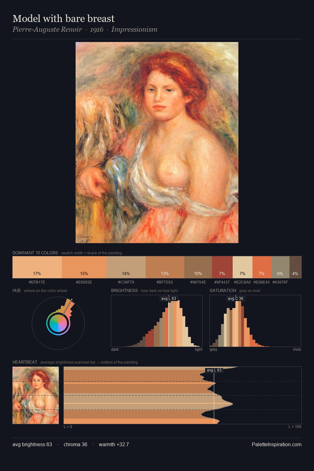
Light floods Stefan Popescu; the palette keeps values pale and airy across its range. Stefan Popescu orchestrates warmth above all else - reds, ambers, and siennas take the lead. Colours are neither washed out nor blazing; they occupy the productive middle ground of the chroma scale. The saturated accent, #E7BB77, registers at 9.3% - sparse enough to feel like a deliberate surprise. 49 units of value spread create a palette that is varied but unified - contrast in the service of harmony. In the context of Stefan Popescu's full range of palettes, group 2 represents one movement in an ongoing chromatic dialogue.
Example use cases
- publishing
- corporate identity
- consumer apps
- hospitality
- design agencies
I Love This!
Use This Palette
Copy, export, or download for your project
Copy, export, or download for your project
Copy:
Download:
Share: