Stefan Dimitrescu Palette 3

Palette Analysis
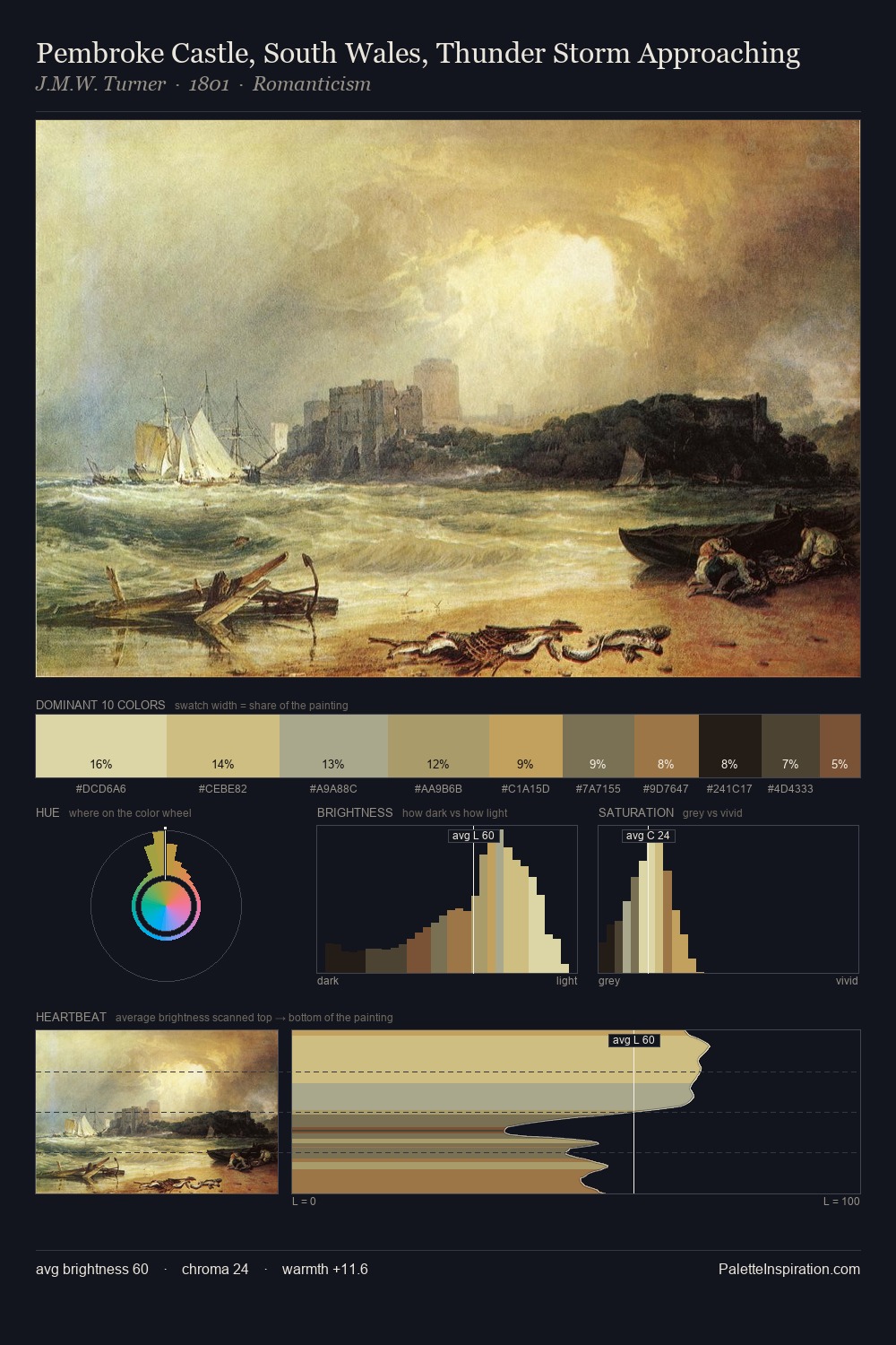
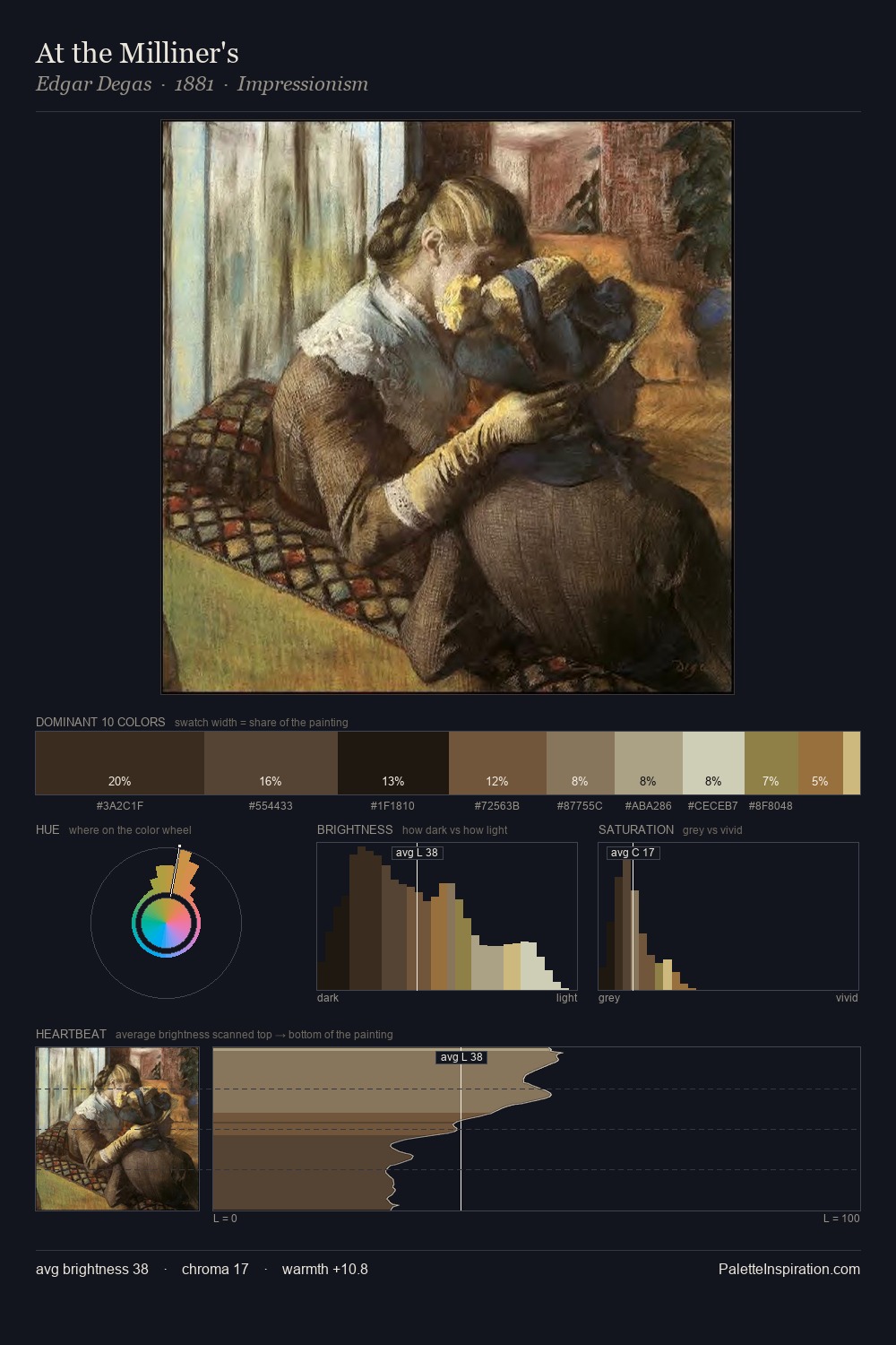
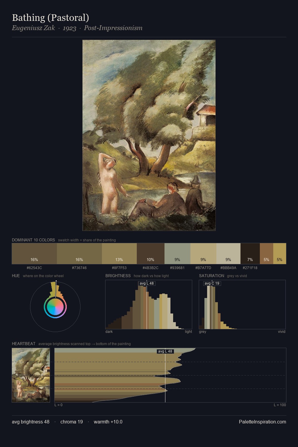
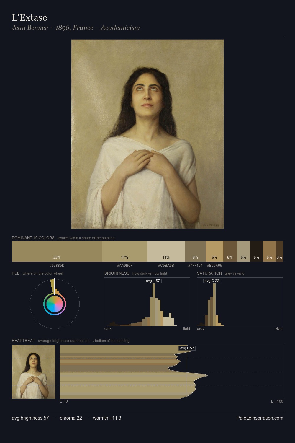
Values in Stefan Dimitrescu rest in the mid-range - neither dramatically lit nor steeped in shadow. Cool tones set the register here - the blues and greens easily outweigh any warm accents. Chroma is moderate: colours carry enough saturation to be read as colour, but the palette stops well short of garish intensity. The saturated accent, #A1874B, registers at 11.3% - sparse enough to feel like a deliberate surprise. Spanning 37 units on the value axis, the palette achieves the balance between tonal flatness and fragmentation. The mid-to-high key, cool bias, and moderate chroma point to outdoor observation - sky and diffused daylight as the dominant light source. Stefan Dimitrescu's palette 3 carries its own internal logic while remaining in conversation with the artist's broader colour intelligence.
Example use cases
- interior design
- furniture brands
- cookbook publishing
- wine & spirits
- food packaging
I Love This!
Copy, export, or download for your project