Simon Ushakov Palette 4
Muted Vermillion
Muted Deliberately desaturated - chroma pulled toward gray, the restraint of tonal painting.
Vermillion Brilliant red-orange - the classic mercury sulfide pigment, vivid and warm.

Palette Analysis
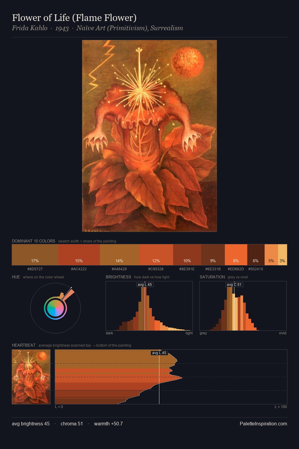
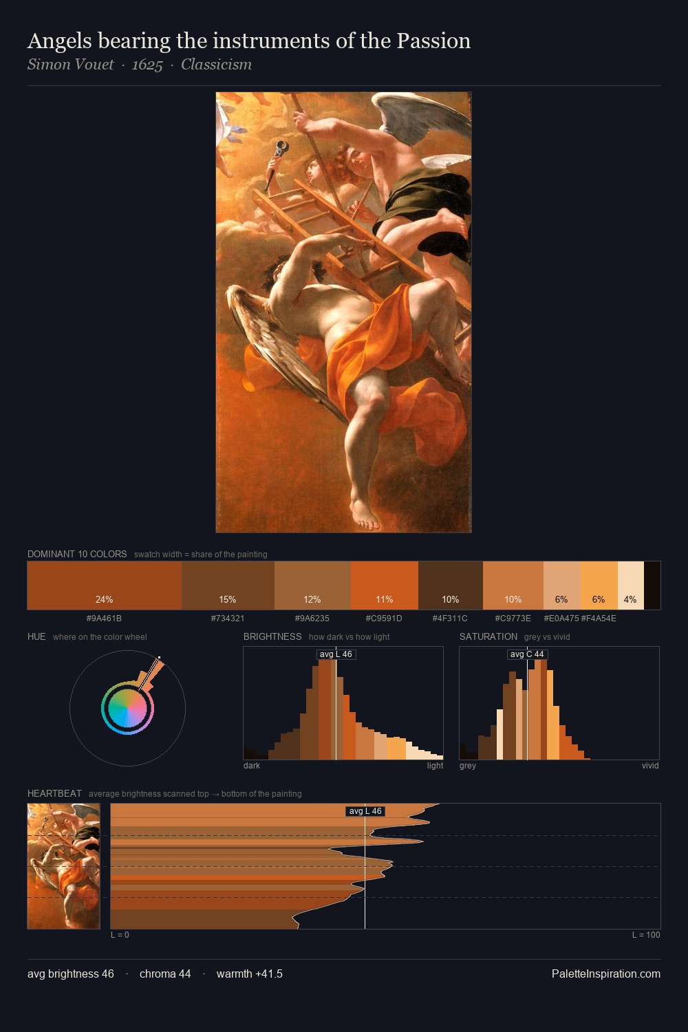
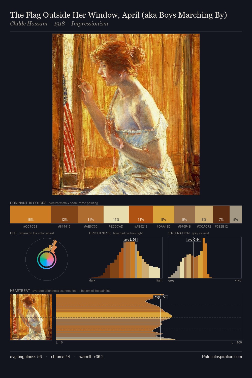
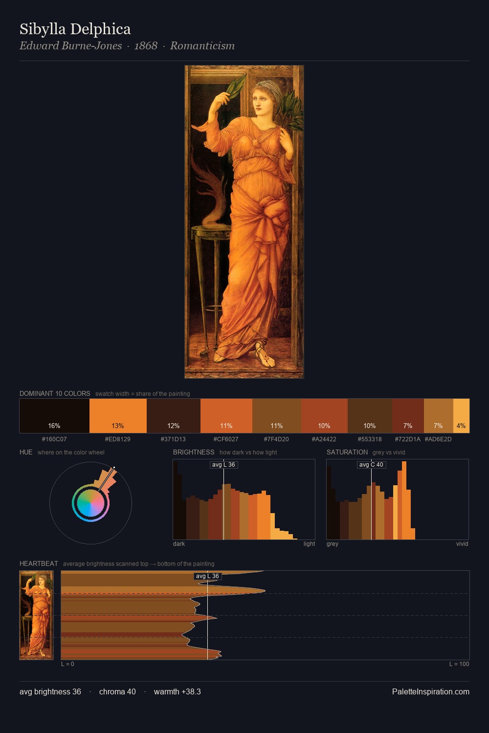
The value structure of Simon Ushakov is mid-key: quiet, controlled, and cohesive. Simon Ushakov orchestrates warmth above all else - reds, ambers, and siennas take the lead. Mid-saturation across the board: the palette has colour character without chromatic excess. The most saturated colour, #AB4A1E, is reserved to 5.9% of the surface, where it acts as a focal punctuation. Spanning 45 units on the value axis, the palette achieves the balance between tonal flatness and fragmentation. Palette 4 sits within the larger chromatic argument that Simon Ushakov's complete body of work advances.
Example use cases
- publishing
- corporate identity
- consumer apps
- hospitality
- design agencies
I Love This!
Use This Palette
Copy, export, or download for your project
Copy, export, or download for your project
Copy:
Download:
Share: