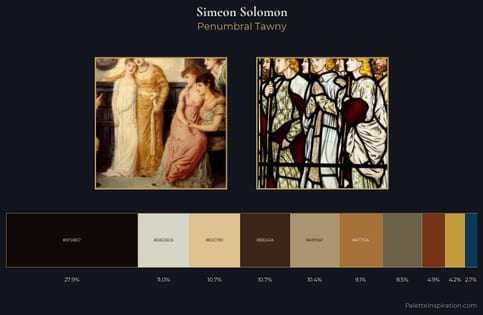
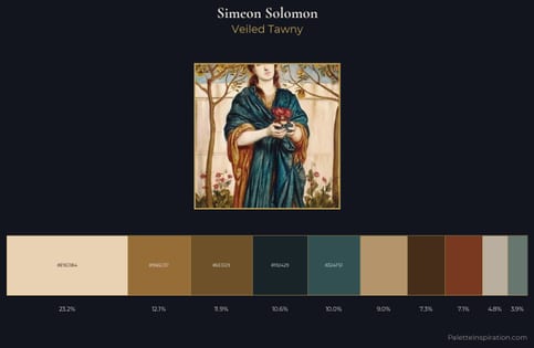
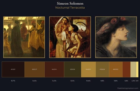
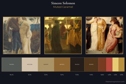
Simeon Solomon Palette 4
Palette Analysis
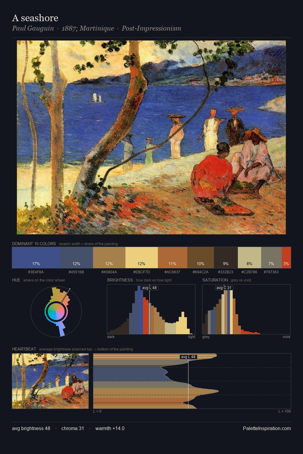
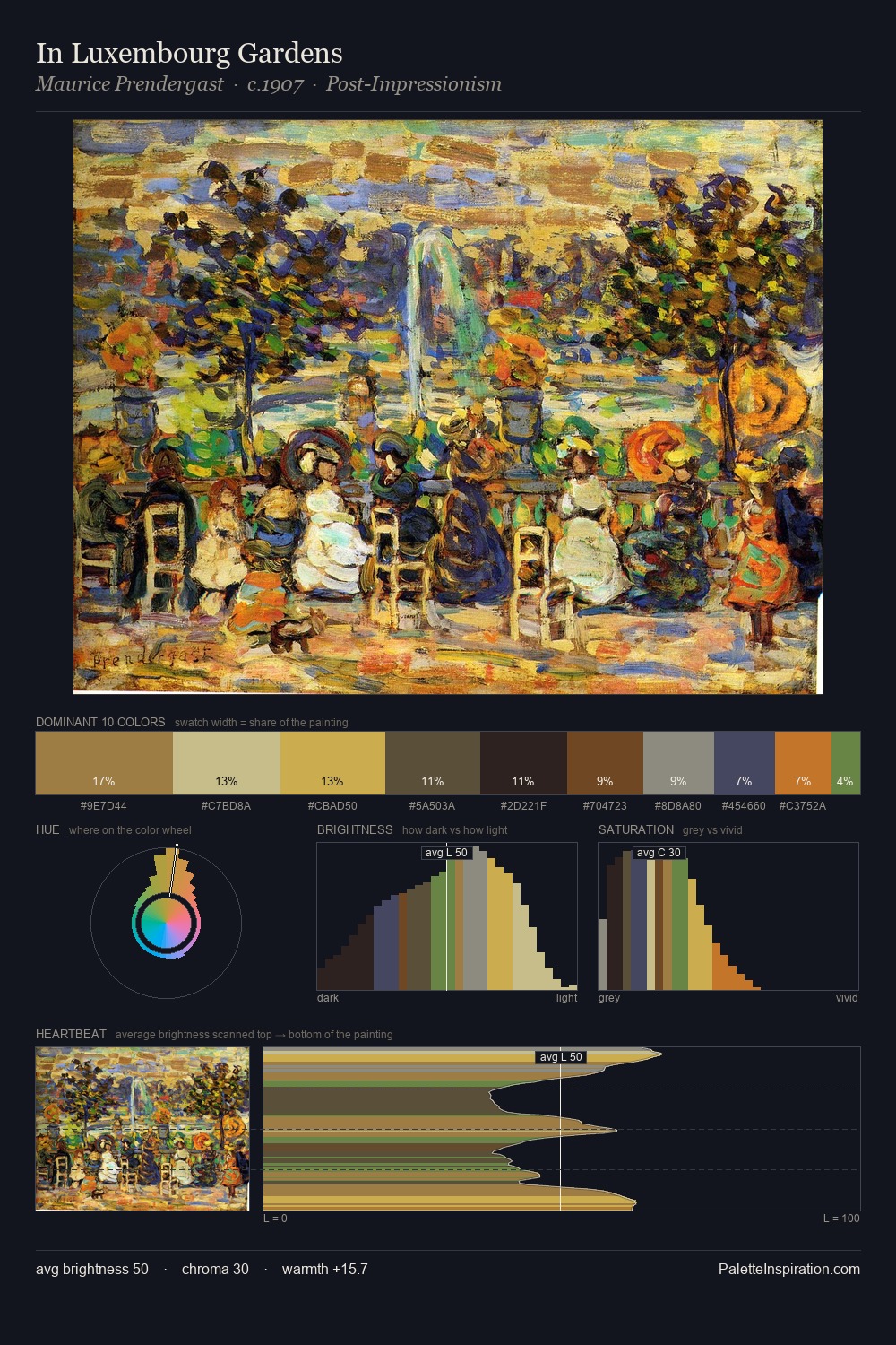
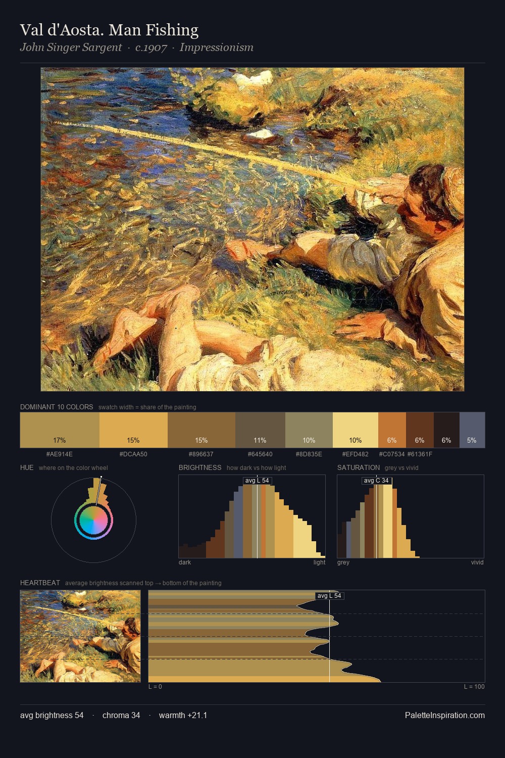
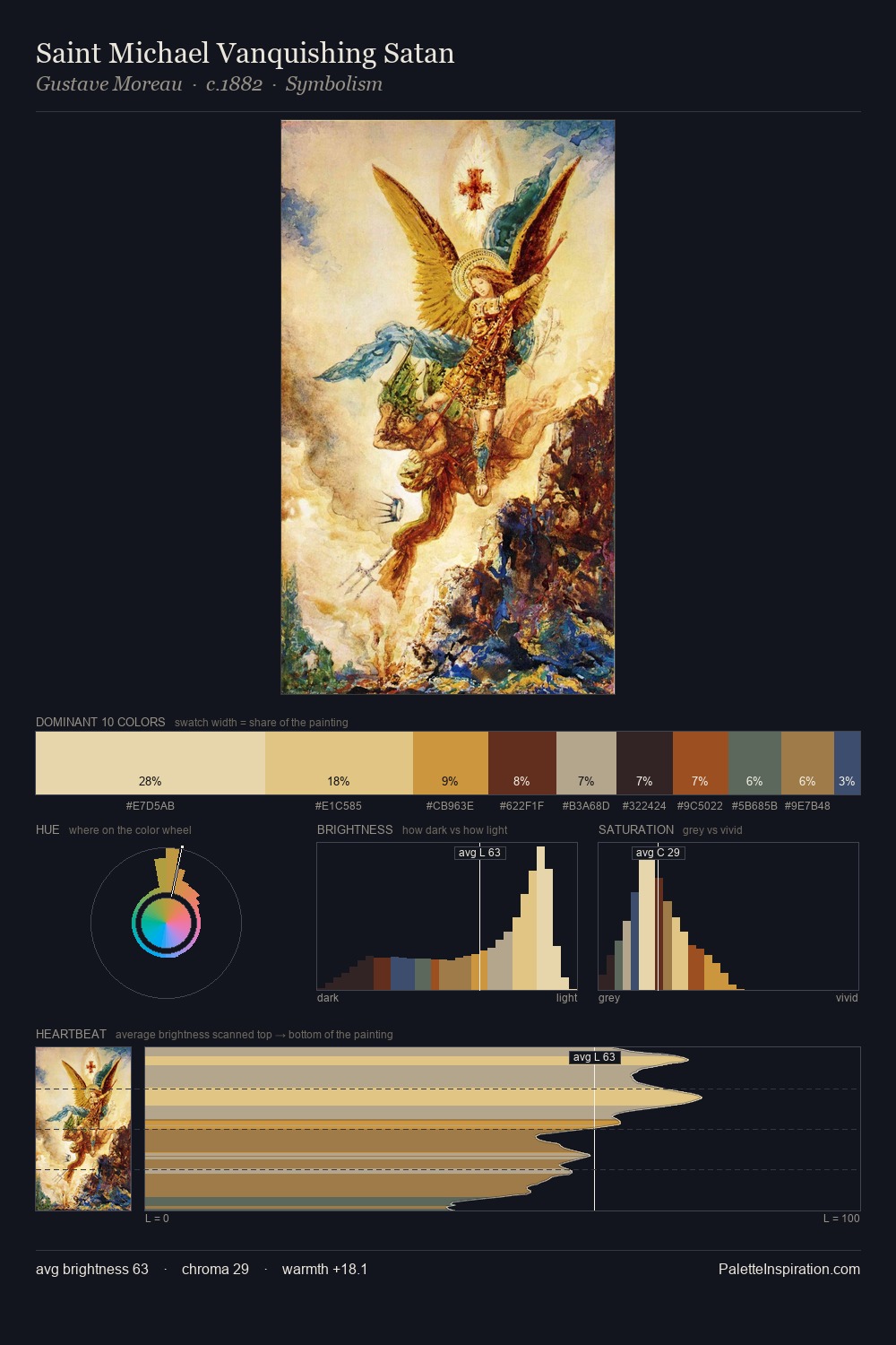
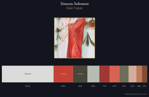
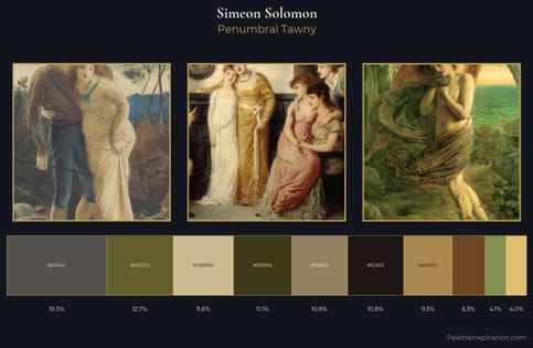
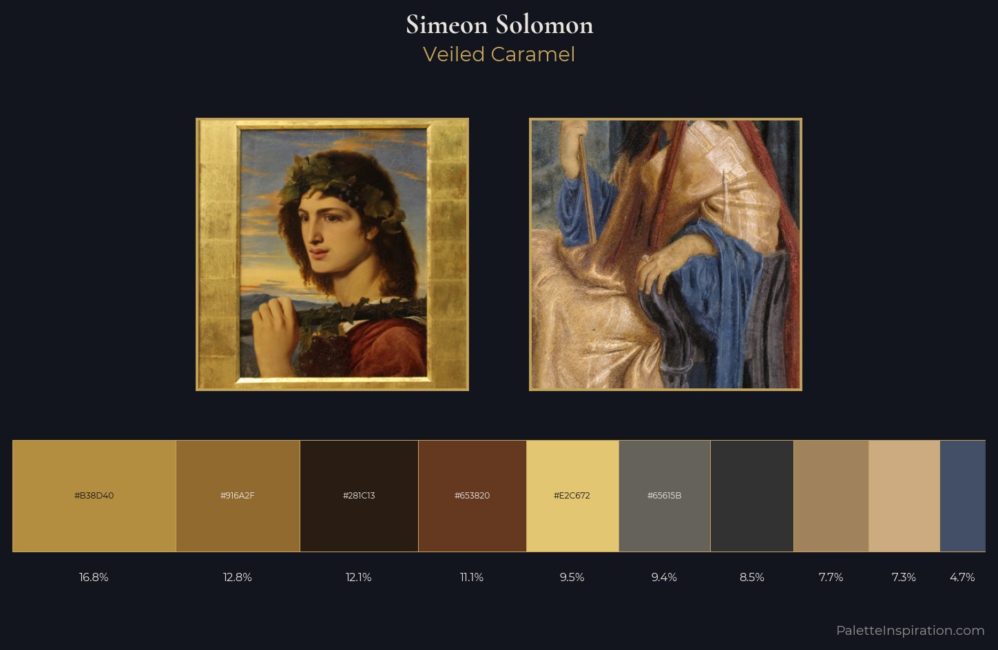
Simeon Solomon keeps values measured and balanced, a hallmark of tonal restraint. Warm and cool are kept in productive tension, creating the kind of chromatic harmony that sustains the eye. Chroma is moderate: colours carry enough saturation to be read as colour, but the palette stops well short of garish intensity. Only 11.1% is devoted to #653820, yet that small allocation delivers the palette's entire chromatic tension. From deepest dark to palest light, the palette traverses 59 units of the value scale - a span that creates natural depth. The palette reads as an Impressionist one - light-biased, chromatically direct, and built on temperature contrast rather than value opposition. Palette 4 sits within the larger chromatic argument that Simeon Solomon's complete body of work advances.
Example use cases
- theater design
- jewelry brands
- tobacco-adjacent retail
- event branding
- film & entertainment
I Love This!
Copy, export, or download for your project