Shotei Takahashi Palette 4
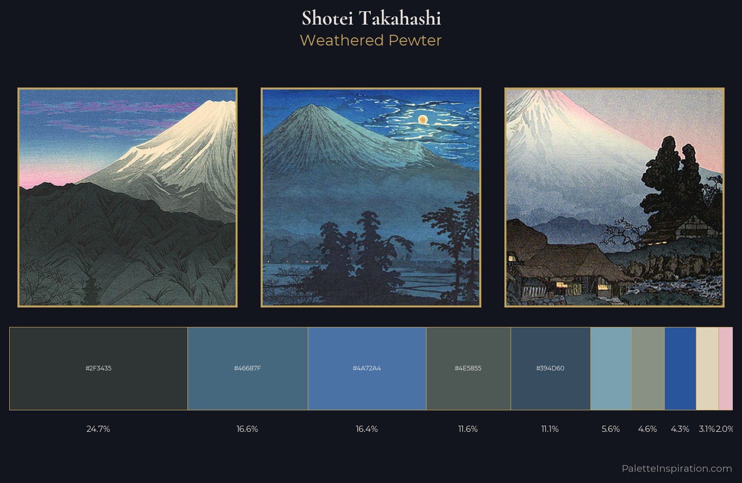
Palette Analysis
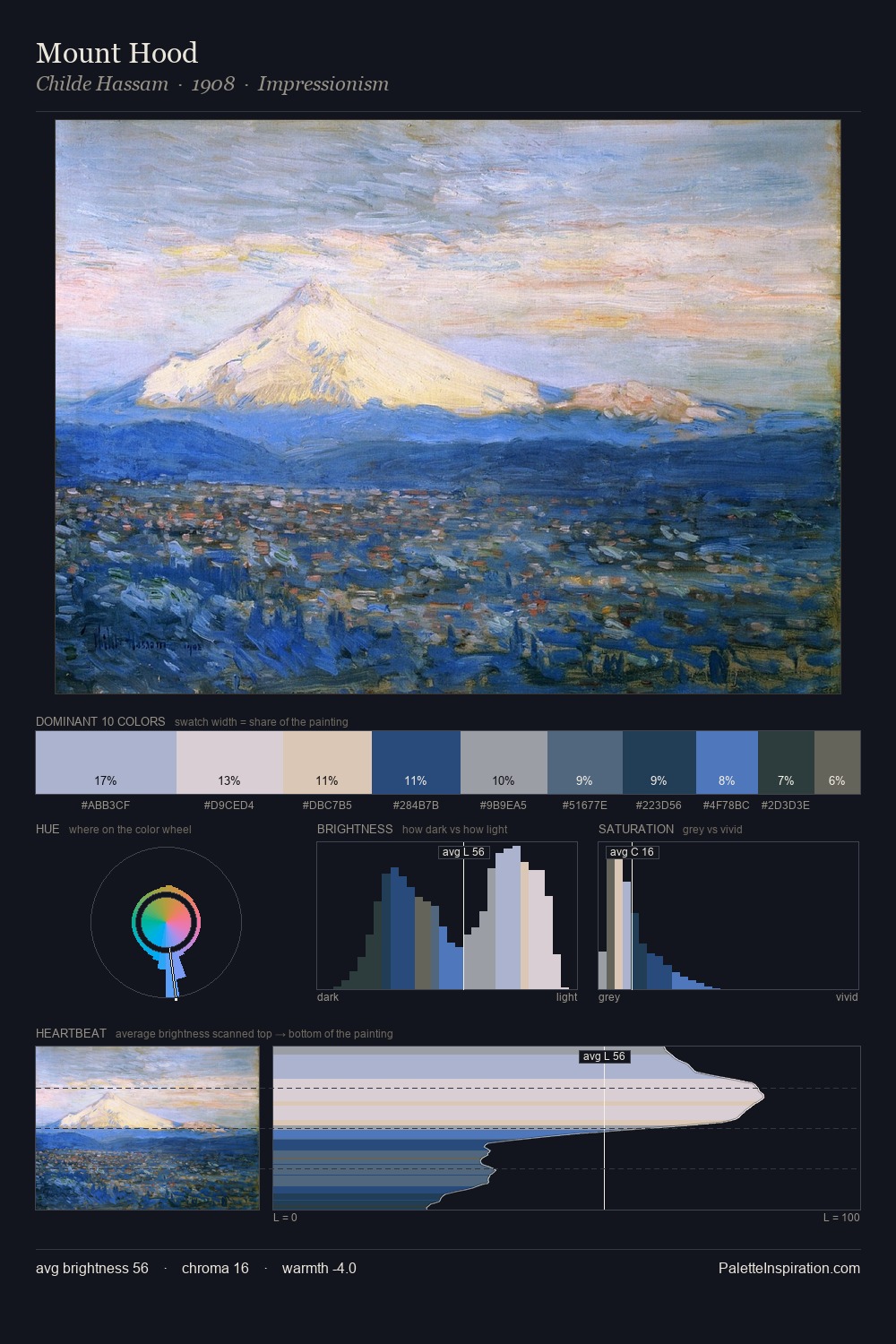
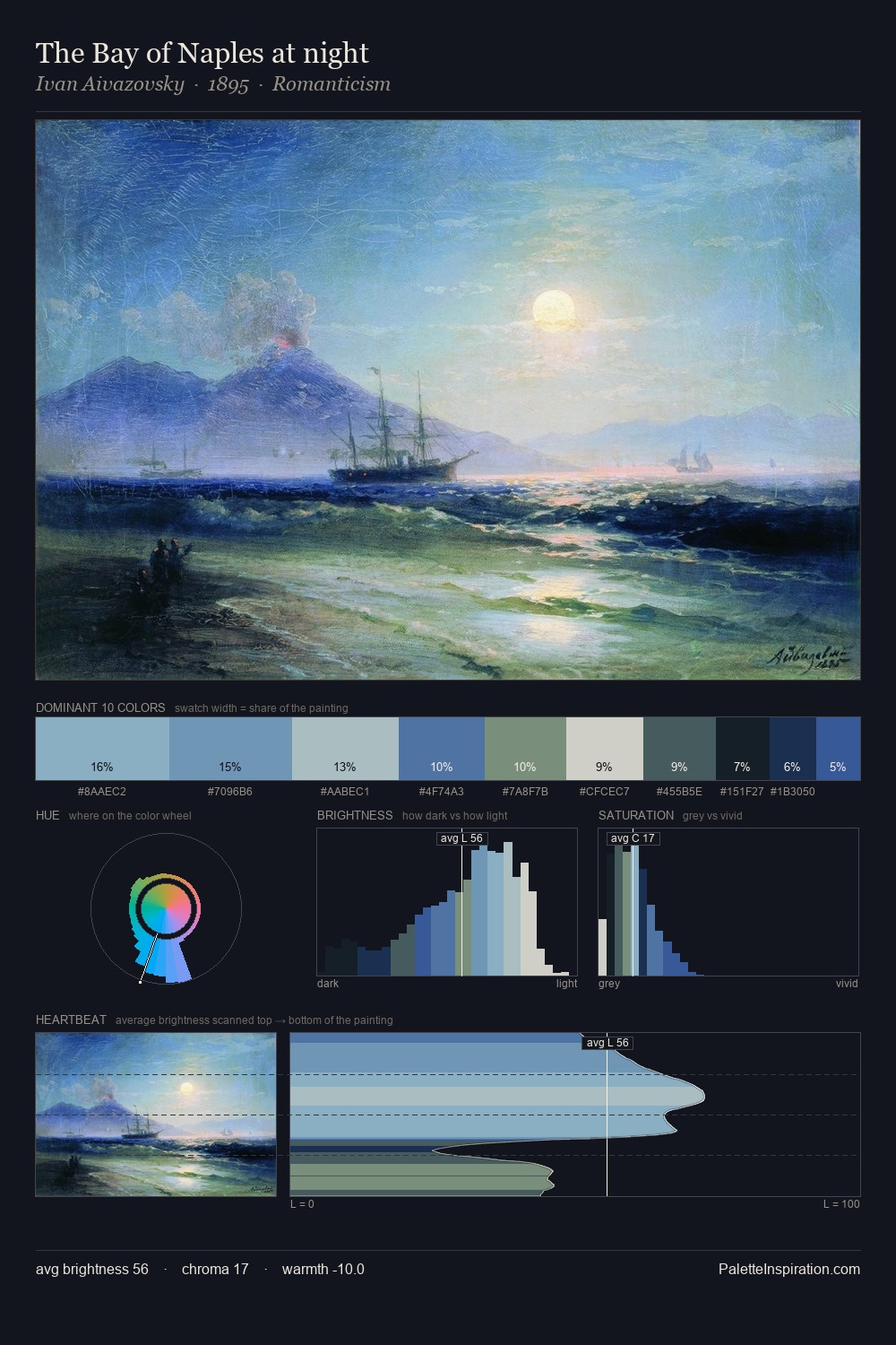
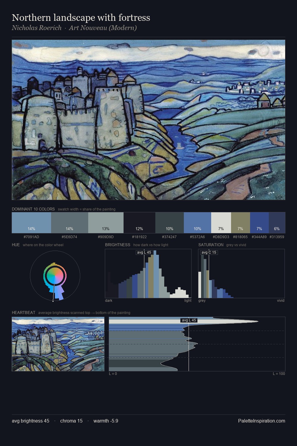
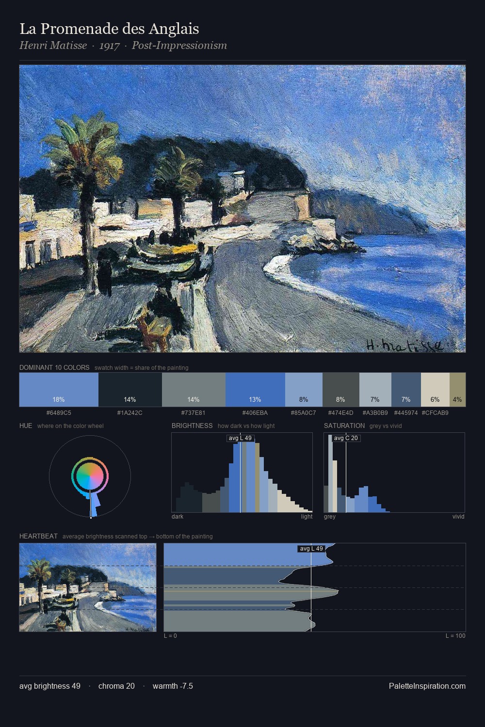
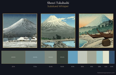
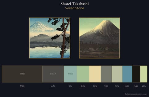
Mid-key values give Shotei Takahashi its characteristic quietness - nothing blazes, nothing disappears. Cool tones set the register here - the blues and greens easily outweigh any warm accents. Every colour is desaturated; the palette proceeds through near-neutrals and gently-coloured greys. The saturated accent, #E6BAC3, registers at 2.0% - sparse enough to feel like a deliberate surprise. A value spread of 55 units gives the palette both depth and air - shadows are genuinely dark, lights genuinely light. The mid-to-high key, cool bias, and moderate chroma point to outdoor observation - sky and diffused daylight as the dominant light source. Shotei Takahashi's palette 4 carries its own internal logic while remaining in conversation with the artist's broader colour intelligence.
Example use cases
- publishing
- corporate identity
- consumer apps
- hospitality
- design agencies
I Love This!
Copy, export, or download for your project