Shotei Takahashi Palette 2

Palette Analysis
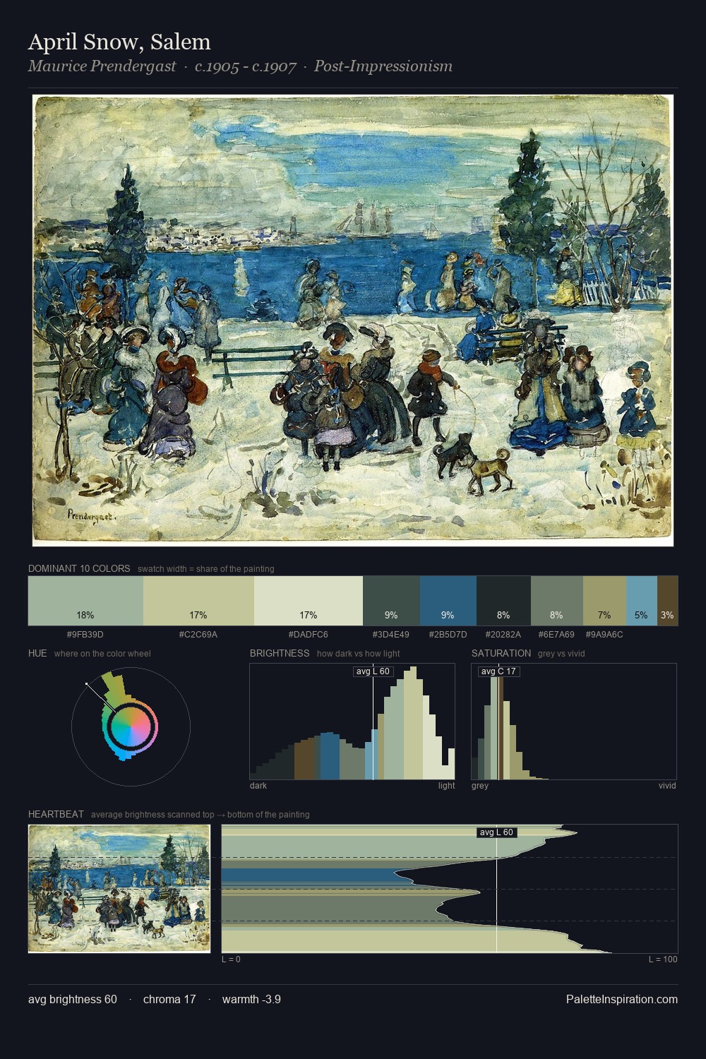
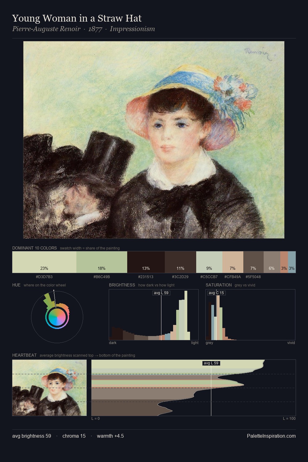
Shotei Takahashi distributes its values across the middle register, creating harmony without high contrast. Temperature is cool-dominant, with blue and green families claiming the largest areas. Every colour is desaturated; the palette proceeds through near-neutrals and gently-coloured greys. #37312C at 27.9% of the palette: an overwhelming presence that pulls all other colours into its gravitational field. The saturated accent, #CBD8A0, registers at 4.8% - sparse enough to feel like a deliberate surprise. 67 units of value range underpin the palette's structural clarity: the eye always knows where light falls. The mid-to-high key, cool bias, and moderate chroma point to outdoor observation - sky and diffused daylight as the dominant light source. This is palette 2 of Shotei Takahashi's sequence - a single chapter in a chromatic story told across many works.
Example use cases
- exhibition design
- foundation branding
- estate management
- art education
- museums & galleries
I Love This!
Copy, export, or download for your project