Self-portrait Palette 11
Soft Ivory
Soft Low-contrast, gentle chroma - mid-key values and low saturation, approachable and calm.
Ivory Warm creamy white - the color of natural ivory, warmer than pure white.

Palette Analysis
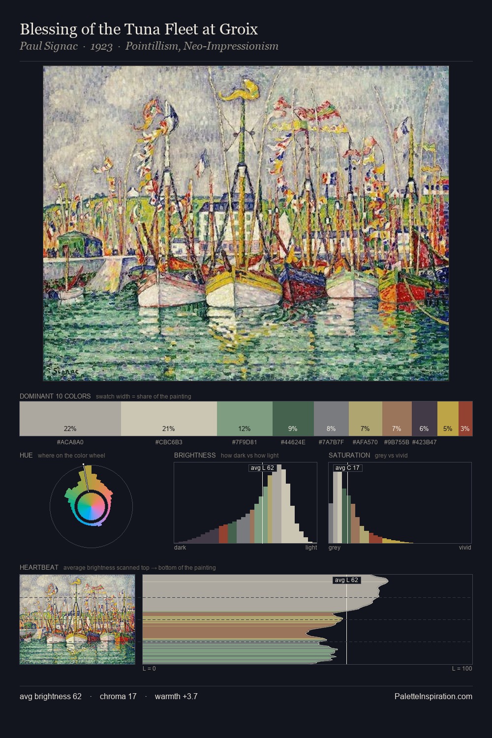
self-portrait works in the upper reaches of the value scale, creating an atmosphere of brightness and expansiveness. Warmth dominates - the palette leans heavily on the yellow-orange-red arc of the colour wheel. The absence of saturated colour is itself an expressive choice: this is a palette of restraint and atmosphere. #C7BDB0 at 30.1% of the palette: an overwhelming presence that pulls all other colours into its gravitational field. The highest-chroma note - #2C3351 - appears at just 2.7%, deployed as a precision accent against the quieter ground. At 55 units of value range, the palette has the tonal breadth to sustain complex spatial readings.
Example use cases
- exhibition design
- foundation branding
- estate management
- art education
- museums & galleries
I Love This!
Use This Palette
Copy, export, or download for your project
Copy, export, or download for your project
Copy:
Download:
Share: