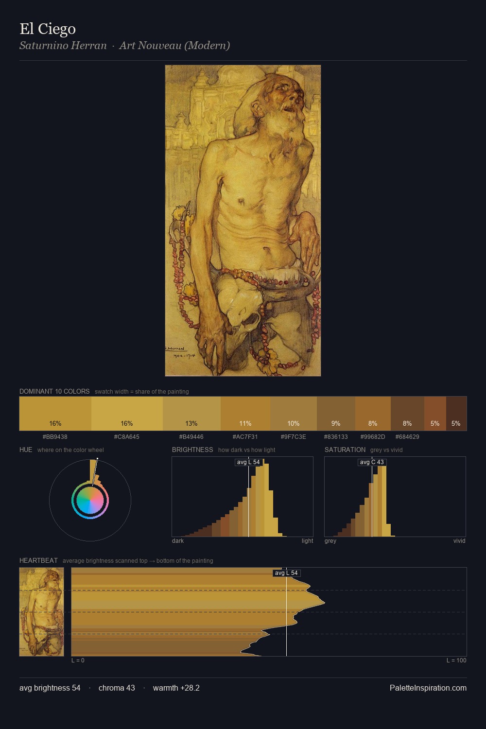
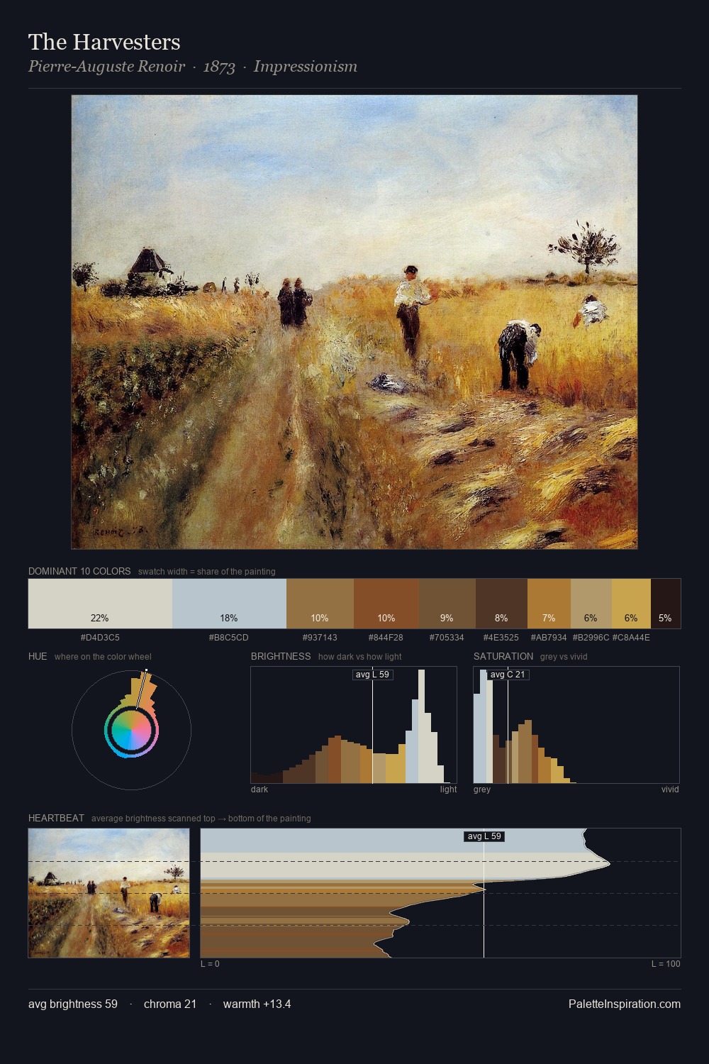
Saturnino Herran Palette 2
Veiled Fawn
Veiled Partially obscured light - mid-dark with a hazy, scrim-filtered quality.
Fawn Light warm tan - the color of a young deer, soft and golden-brown.

Palette Analysis
Saturnino Herran keeps values measured and balanced, a hallmark of tonal restraint. Temperature is balanced: the palette pits warm earth against cool sky without declaring a winner. Mid-range chroma keeps the palette grounded - colourful but not strident. The most saturated colour, #9A682D, is reserved to 7.9% of the surface, where it acts as a focal punctuation. Value range is moderate at 40 units - enough contrast for legibility, not so much as to fragment the tonal unity. The palette reads as an Impressionist one - light-biased, chromatically direct, and built on temperature contrast rather than value opposition. Palette 2 sits within the larger chromatic argument that Saturnino Herran's complete body of work advances.
Example use cases
- professional services
- specialty retail
- photography agencies
- tech products
- art galleries
I Love This!
Use This Palette
Copy, export, or download for your project
Copy, export, or download for your project
Copy:
Download:
Share: