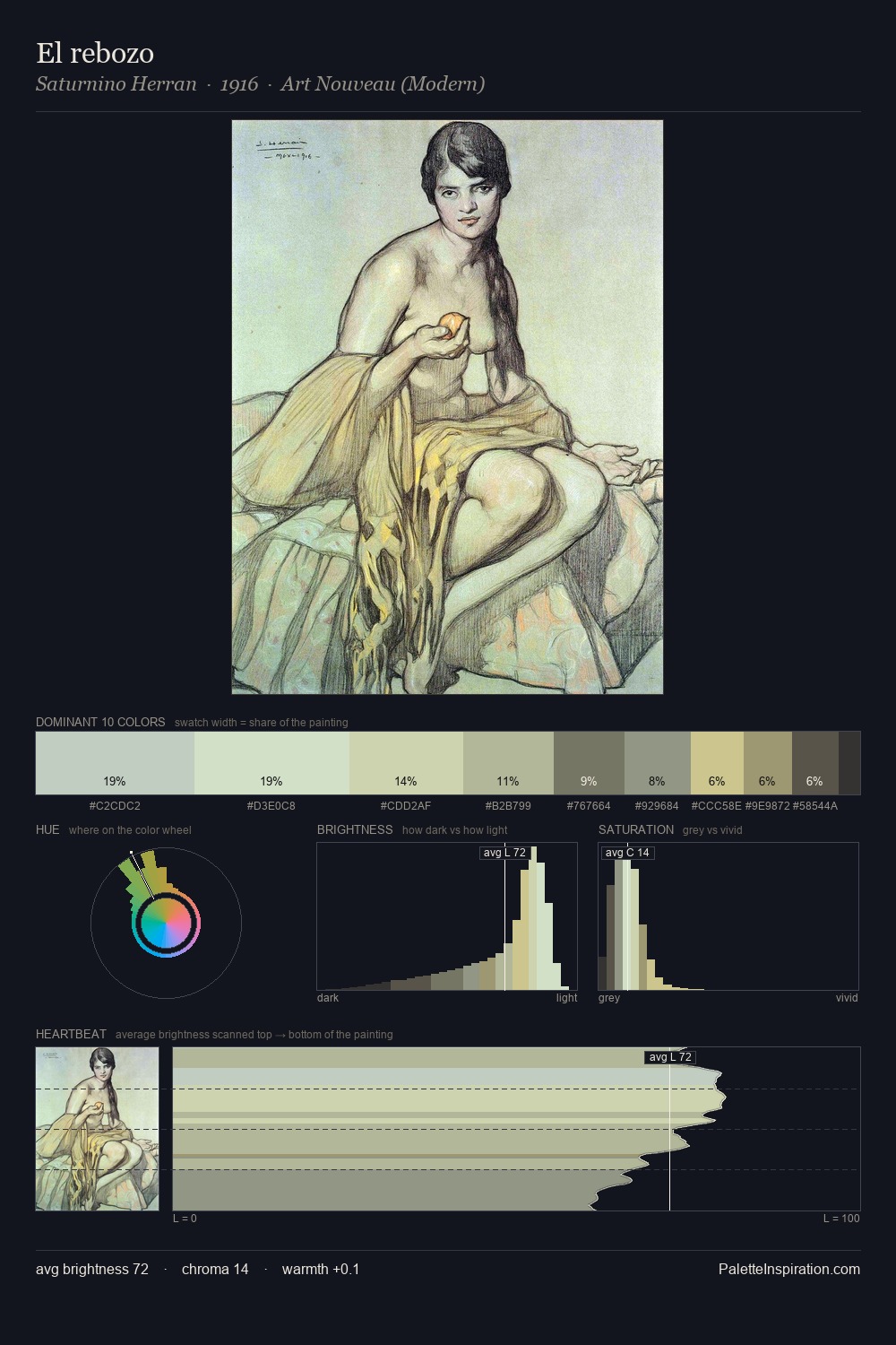
Saturnino Herran Palette 1
Gleaming Mellow
Gleaming Bright and polished - high-key, often warm, suggesting reflective or luminous surfaces.
Mellow Soft warm yellow - gentle, low-chroma, the color of aged paper or afternoon light.

Palette Analysis
Values in Saturnino Herran tilt decisively toward white, giving the palette its luminous character. Saturnino Herran builds on cool foundations: the palette favours the blue-cyan-green arc. Saturation is deliberately withheld - the beauty here lies in the near-monochromatic gradations rather than colour difference. The most saturated colour, #CDC691, is reserved to 9.4% of the surface, where it acts as a focal punctuation. At 60 units of value range, the palette has the tonal breadth to sustain complex spatial readings. High luminosity and cool temperature suggest the plein-air condition: unfiltered daylight and open sky. This is palette 1 of Saturnino Herran's sequence - a single chapter in a chromatic story told across many works.
Example use cases
- florist branding
- event design
- real estate
- jewelry retail
- hospitality branding
I Love This!
Use This Palette
Copy, export, or download for your project
Copy, export, or download for your project
Copy:
Download:
Share: