Sarah Purser Palette 1
Veiled Tawny
Veiled Partially obscured light - mid-dark with a hazy, scrim-filtered quality.
Tawny Warm orange-brown - a traditional term for the color of tanned leather or lion fur.

Palette Analysis
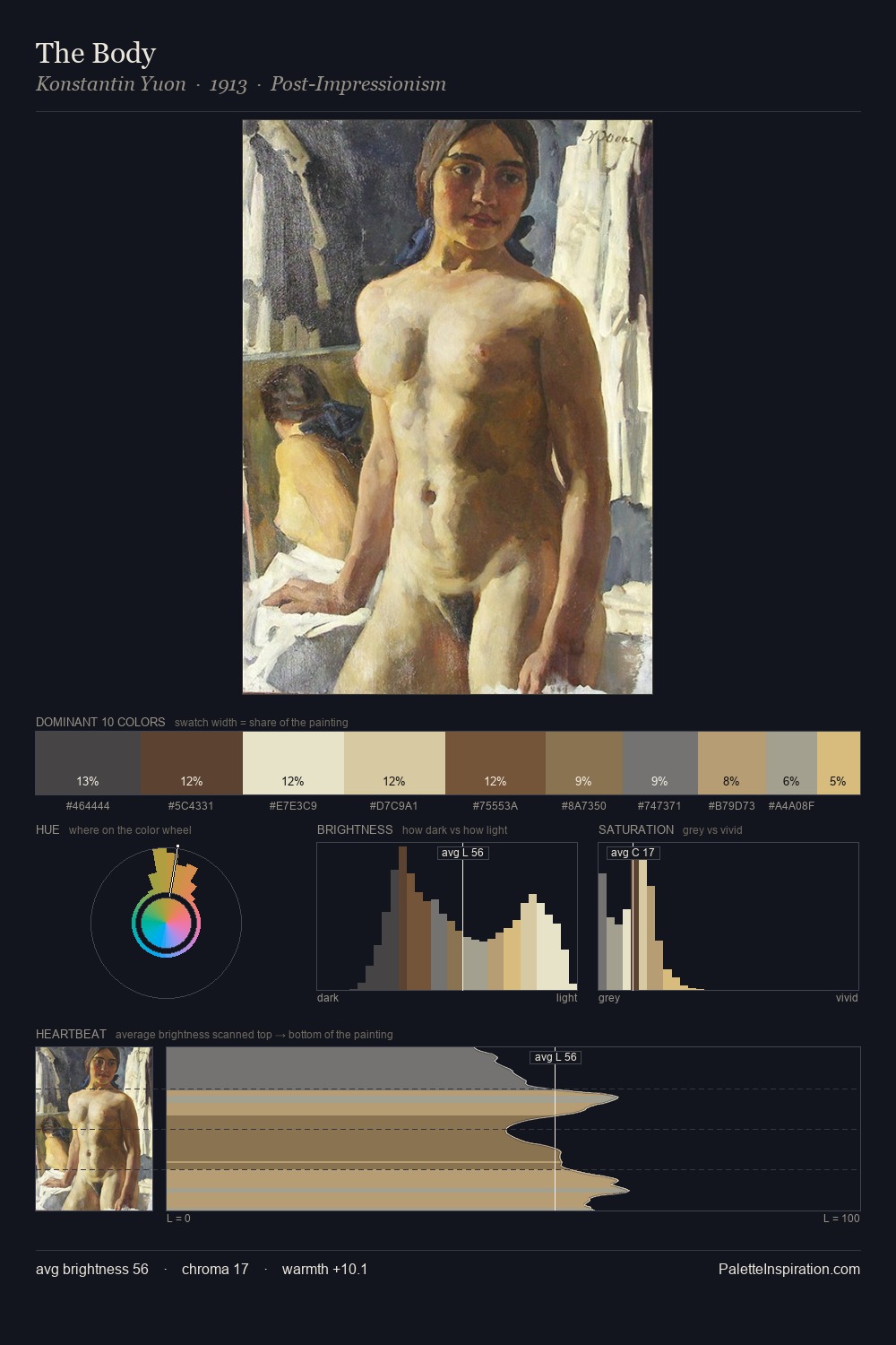
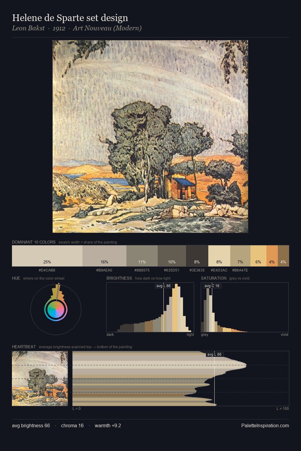
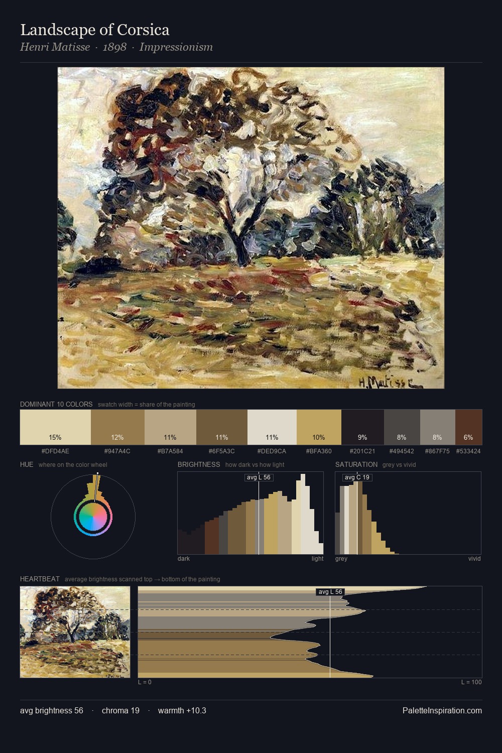
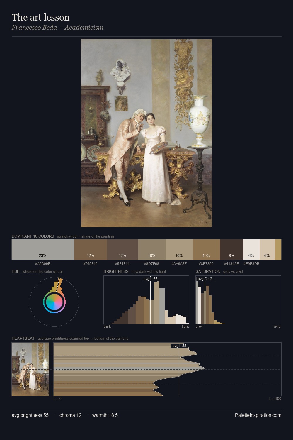
The value structure of Sarah Purser is mid-key: quiet, controlled, and cohesive. Warm hues command this palette; Sarah Purser favours the reds, oranges, and yellows of firelight and earth. All colours lean toward grey, building depth through value rather than colour punch. #9A7144 functions as the palette's exclamation mark: highest chroma, lowest percentage (4.6%). At 56 units of value range, the palette has the tonal breadth to sustain complex spatial readings. This is palette 1 of Sarah Purser's sequence - a single chapter in a chromatic story told across many works.
Example use cases
- nonprofit identity
- public libraries
- historical sites
- literary journals
- archival print
I Love This!
Use This Palette
Copy, export, or download for your project
Copy, export, or download for your project
Copy:
Download:
Share: