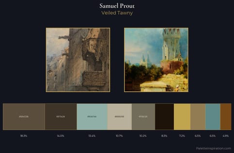
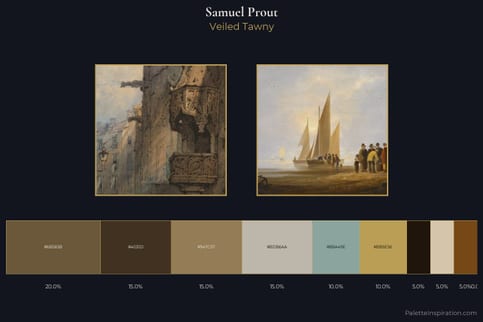
Samuel Prout Palette 1
Soft Ecru
Soft Low-contrast, gentle chroma - mid-key values and low saturation, approachable and calm.
Ecru Unbleached linen - warm mid-neutral, slightly grayed, raw and natural.
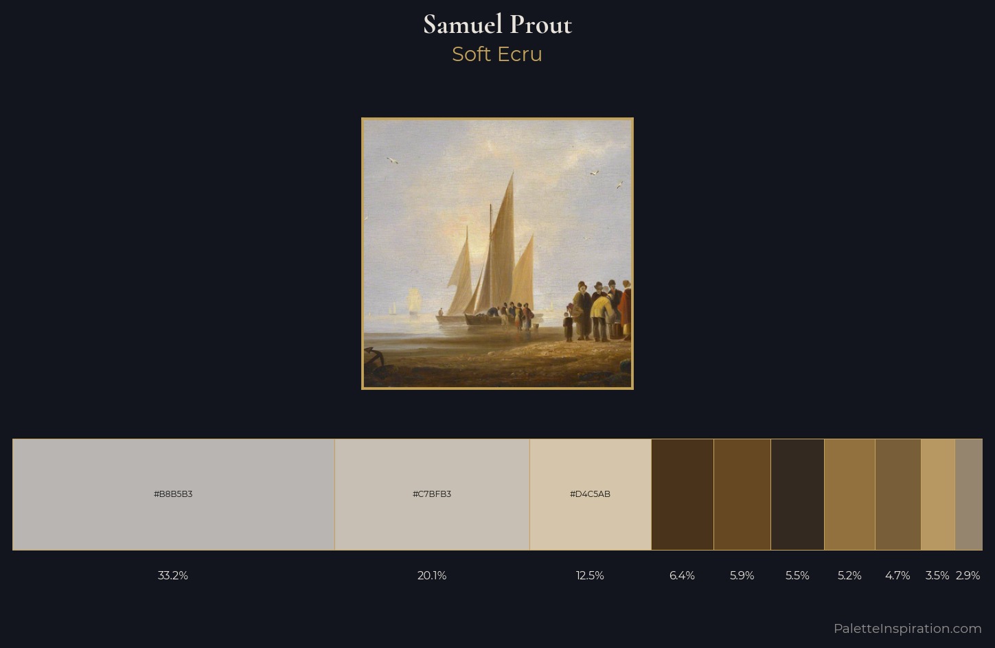
Palette Analysis
Samuel Prout is high in key: pale, luminous, and filled with optical air. Temperature is balanced: the palette pits warm earth against cool sky without declaring a winner. Every colour is desaturated; the palette proceeds through near-neutrals and gently-coloured greys. 33.2% of the palette belongs to #B8B5B3, a concentration that makes it the unmistakable visual centre. #93713F functions as the palette's exclamation mark: highest chroma, lowest percentage (5.2%). Value range is moderate at 54 units - enough contrast for legibility, not so much as to fragment the tonal unity. This is palette 1 of Samuel Prout's sequence - a single chapter in a chromatic story told across many works.
Example use cases
- exhibition design
- foundation branding
- estate management
- art education
- museums & galleries
I Love This!
Use This Palette
Copy, export, or download for your project
Copy, export, or download for your project
Copy:
Download:
Share: