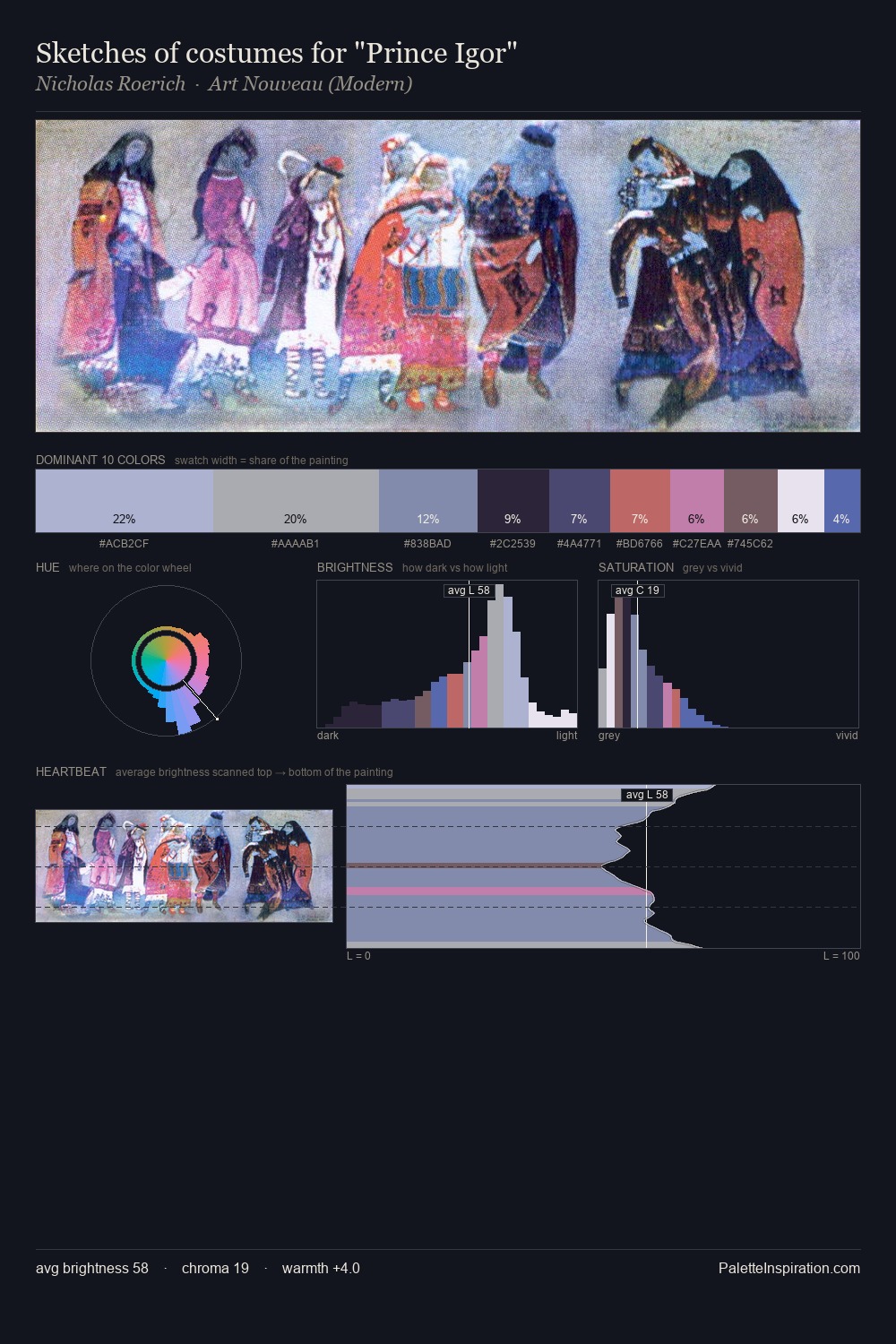
Samuel Peploe Palette 4

Palette Analysis
The high-key values of Samuel Peploe give it an effulgent, almost bleached quality. Warm and cool tones are held in careful balance - neither family dominates, creating tension and resolution simultaneously. Chroma hovers near zero; colour declares itself through subtle shifts in hue rather than outright saturation. 32.9% of the palette belongs to #EAE0E3, a concentration that makes it the unmistakable visual centre. #4E5CA2 delivers the chromatic peak at only 4.0% - a small shot of colour with outsized visual impact. From deepest dark to palest light, the palette traverses 60 units of the value scale - a span that creates natural depth. In the context of Samuel Peploe's full range of palettes, group 4 represents one movement in an ongoing chromatic dialogue.
Example use cases
- print magazines
- beauty brands
- real estate
- high-end packaging
- editorial design
I Love This!
Copy, export, or download for your project