Samuel Palmer Palette 1

Palette Analysis
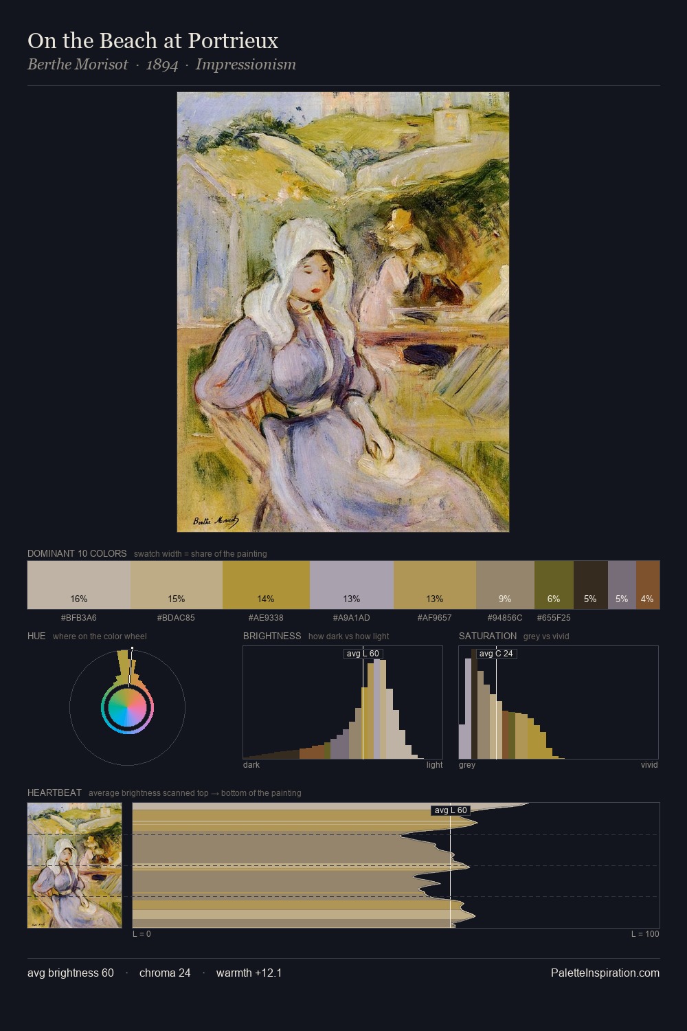
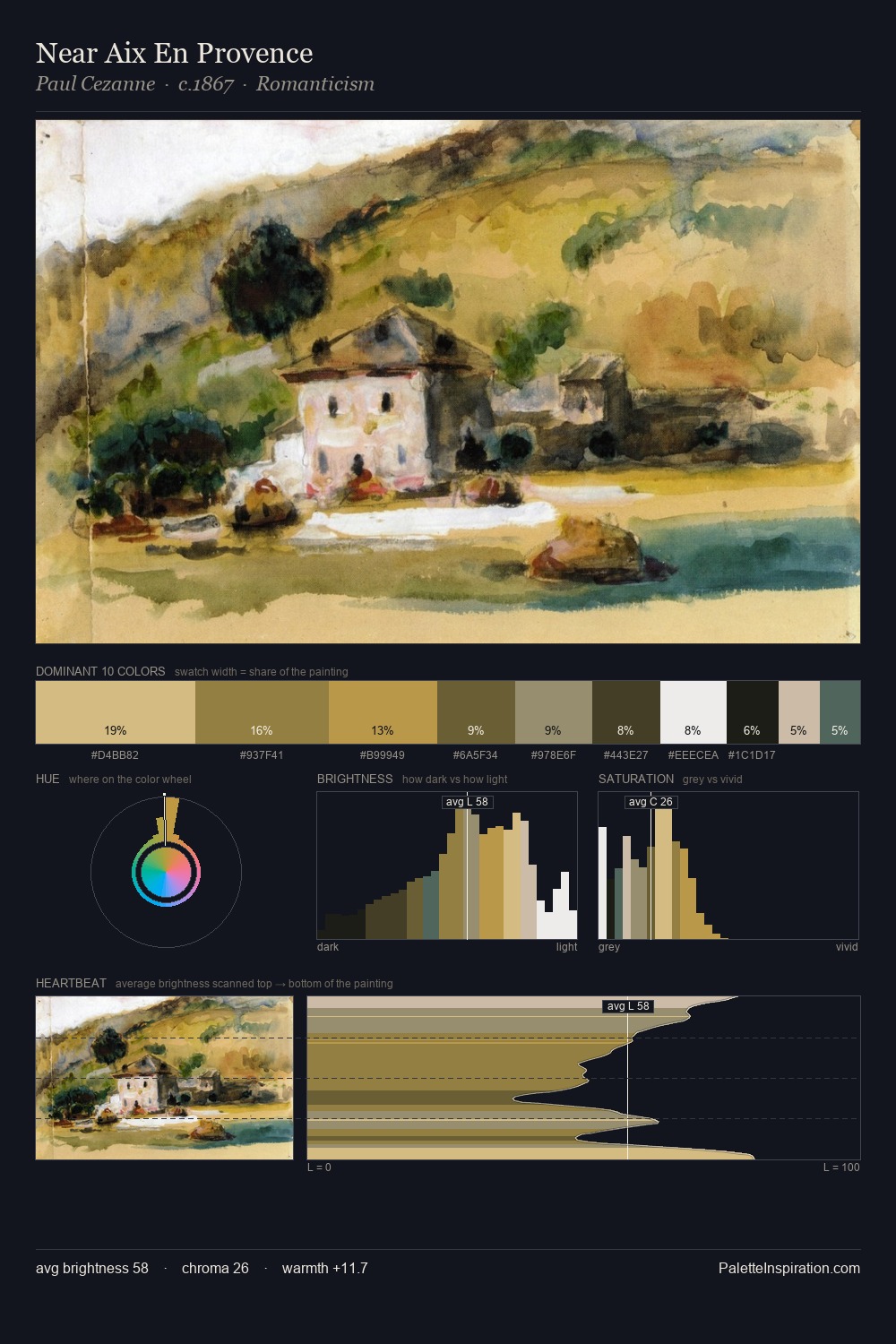
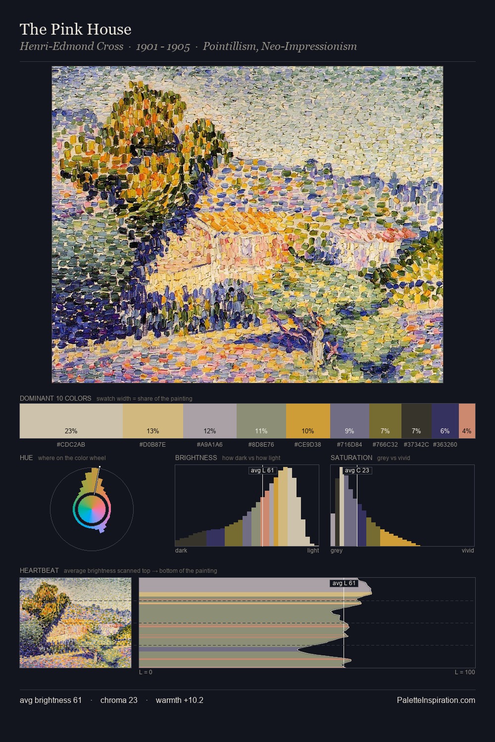
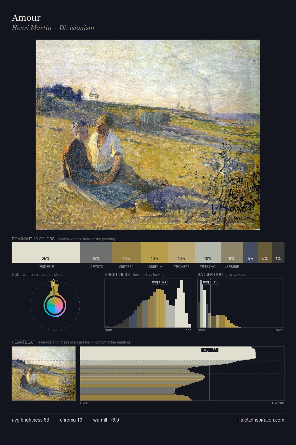
Values in Samuel Palmer tilt decisively toward white, giving the palette its luminous character. Samuel Palmer builds on cool foundations: the palette favours the blue-cyan-green arc. Saturation is deliberately withheld - the beauty here lies in the near-monochromatic gradations rather than colour difference. #D4BE9E at 37.0% of the palette: an overwhelming presence that pulls all other colours into its gravitational field. #60602C functions as the palette's exclamation mark: highest chroma, lowest percentage (5.8%). 59 units of value range underpin the palette's structural clarity: the eye always knows where light falls. High luminosity and cool temperature suggest the plein-air condition: unfiltered daylight and open sky. Samuel Palmer's palette 1 carries its own internal logic while remaining in conversation with the artist's broader colour intelligence.
Example use cases
- ceramics & pottery
- boutique hospitality
- menswear
- heritage food brands
- craft & artisan brands
I Love This!
Copy, export, or download for your project