Sam Bough Master Palette

Palette Analysis
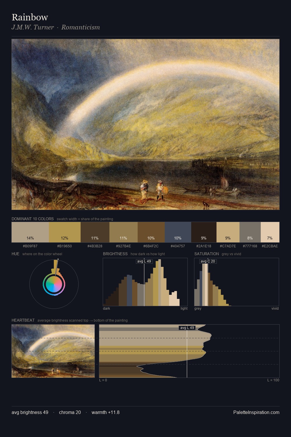
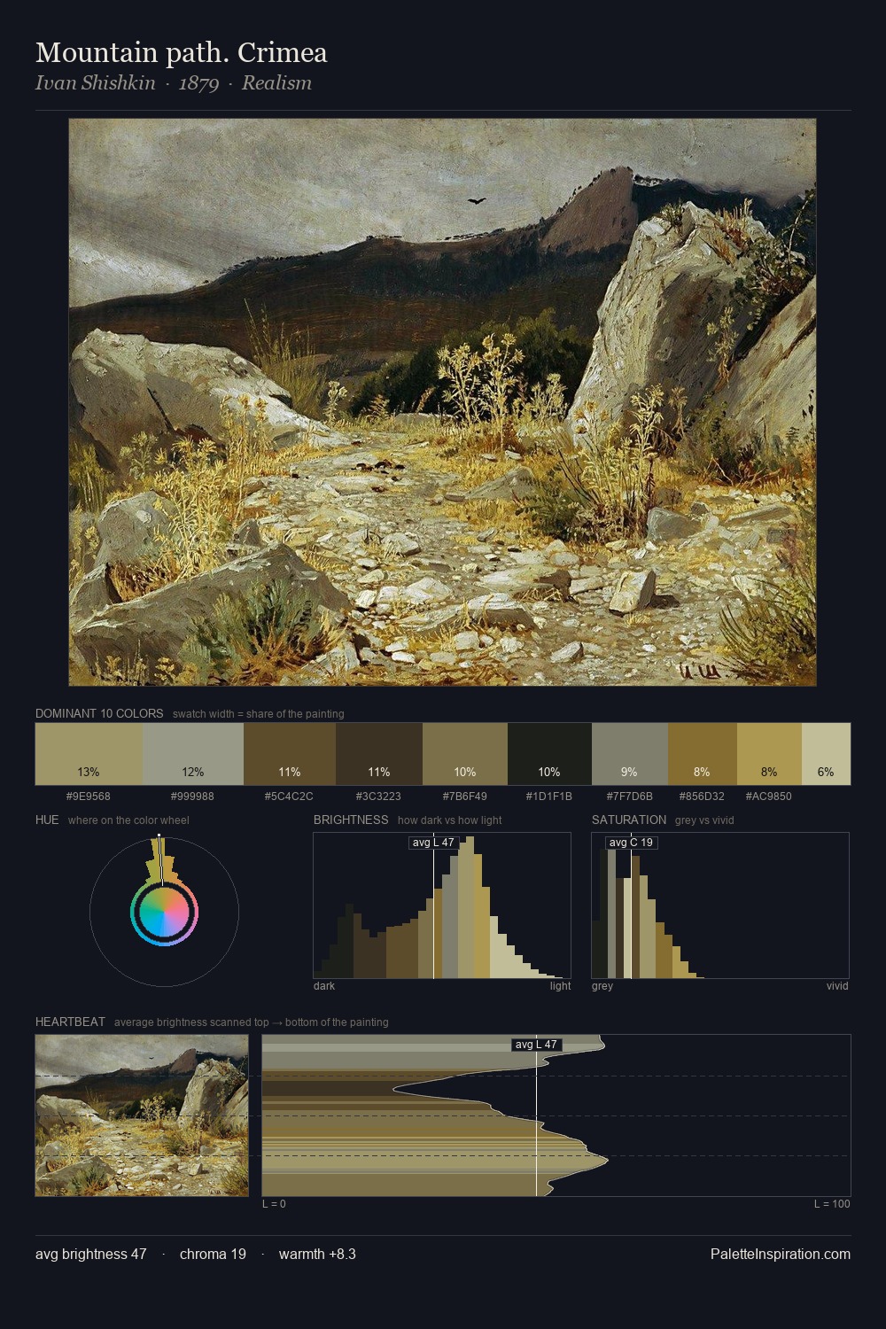
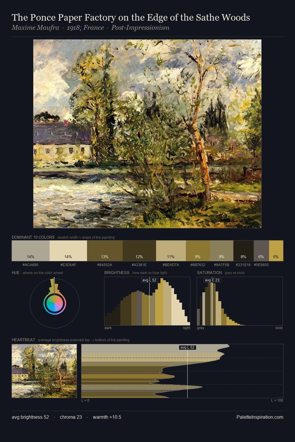
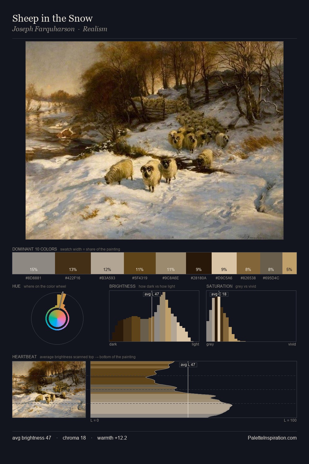
Sam Bough occupies the comfortable middle of the value scale, avoiding both extremes to hold the eye in a sustained middle grey. Cool hues prevail: blues, greens, and greys anchor the palette's emotional temperature. The absence of saturated colour is itself an expressive choice: this is a palette of restraint and atmosphere. #D6CCAA is not a small accent - at 10.0% it qualifies as a major presence and gives the palette its chromatic identity. At 60 units of value range, the palette has the tonal breadth to sustain complex spatial readings. The palette has the character of outdoor light: cool, mid-bright, with colour rendered faithfully rather than expressively. The palette is recognisably Sam Bough's own: particular in its temperature, chroma, and the economy of its brightest note.
Example use cases
- ceramics & pottery
- boutique hospitality
- menswear
- heritage food brands
- craft & artisan brands
I Love This!
Copy, export, or download for your project