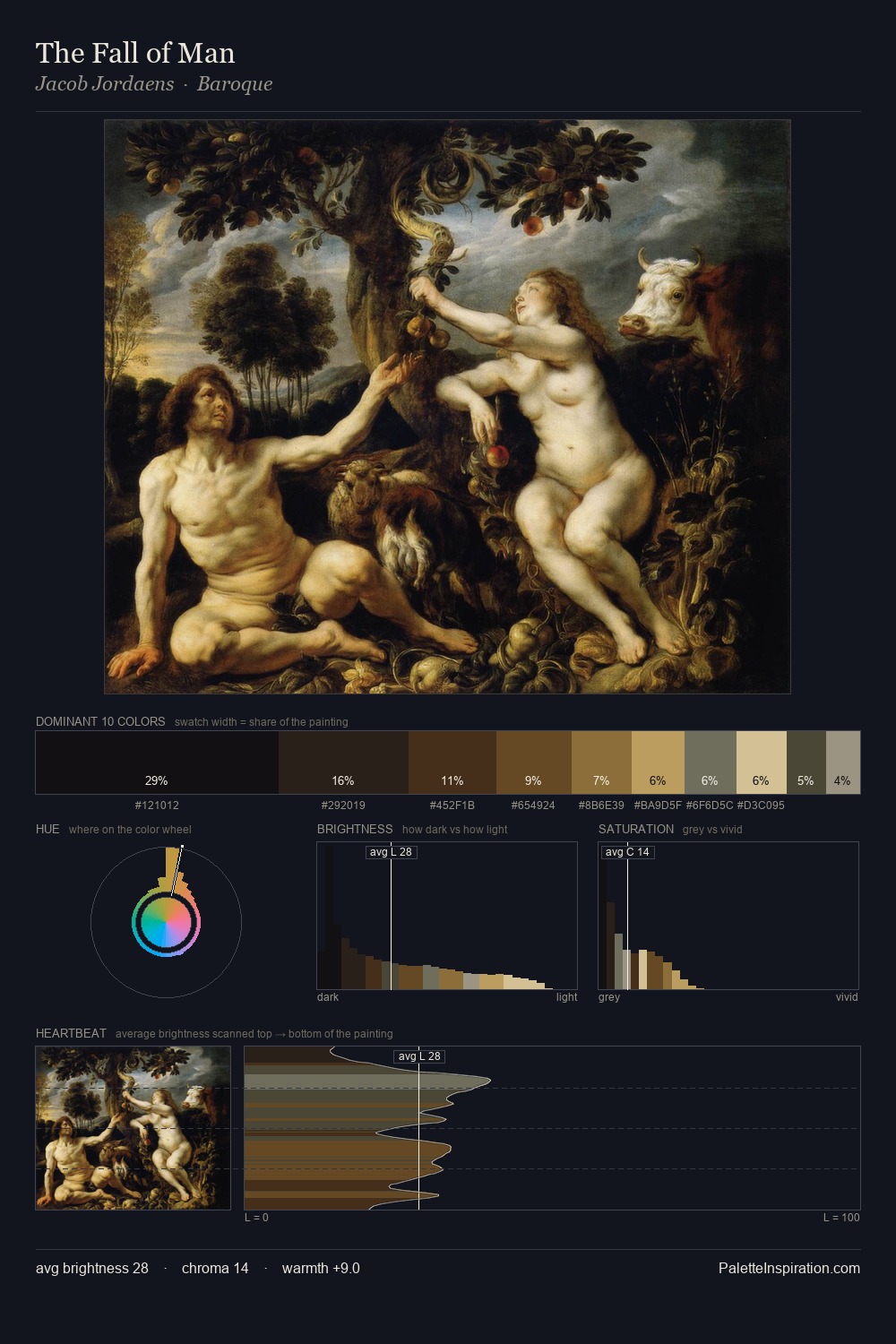
Salomon van Ruysdael Palette 8

Palette Analysis
Salomon van Ruysdael occupies the comfortable middle of the value scale, avoiding both extremes to hold the eye in a sustained middle grey. Salomon van Ruysdael tilts toward cool - blues and silver-greys carry the structural weight. All colours lean toward grey, building depth through value rather than colour punch. #E1D3A9 delivers the chromatic peak at only 6.7% - a small shot of colour with outsized visual impact. A value spread of 60 units gives the palette both depth and air - shadows are genuinely dark, lights genuinely light. The palette has the character of outdoor light: cool, mid-bright, with colour rendered faithfully rather than expressively. Palette 8 sits within the larger chromatic argument that Salomon van Ruysdael's complete body of work advances.
Example use cases
- food packaging
- leather accessories
- travel & outdoor
- natural cosmetics
- interior design
I Love This!
Copy, export, or download for your project