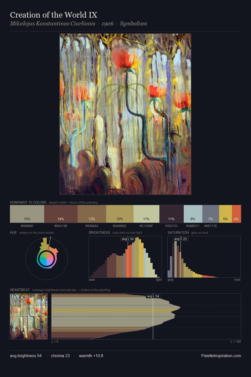
Rudolf Bauer Palette 3

Palette Analysis
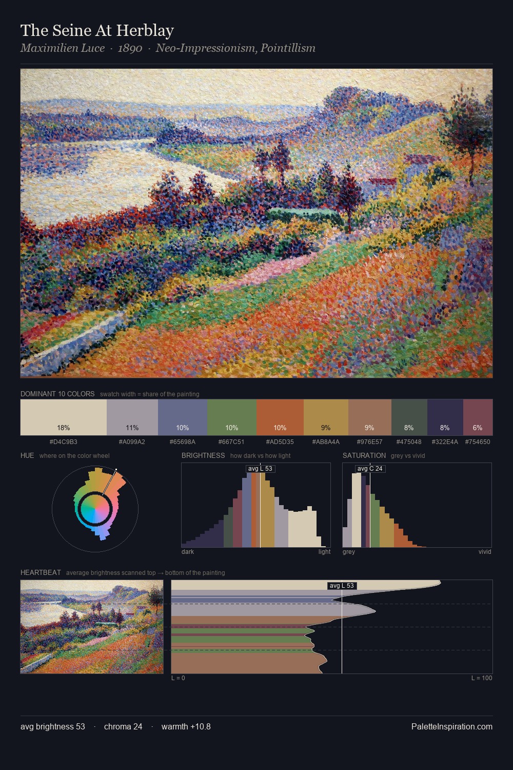
Rudolf Bauer occupies the comfortable middle of the value scale, avoiding both extremes to hold the eye in a sustained middle grey. Cool tones set the register here - the blues and greens easily outweigh any warm accents. Saturation is deliberately withheld - the beauty here lies in the near-monochromatic gradations rather than colour difference. #918F84 at 25.0% of the palette: an overwhelming presence that pulls all other colours into its gravitational field. The most saturated colour, #723246, is reserved to 2.4% of the surface, where it acts as a focal punctuation. The value range of 45 units sits in the comfortable middle: enough depth, enough light, neither extreme. The mid-to-high key, cool bias, and moderate chroma point to outdoor observation - sky and diffused daylight as the dominant light source. Rudolf Bauer's palette 3 carries its own internal logic while remaining in conversation with the artist's broader colour intelligence.
Example use cases
- exhibition design
- foundation branding
- estate management
- art education
- museums & galleries
I Love This!
Copy, export, or download for your project