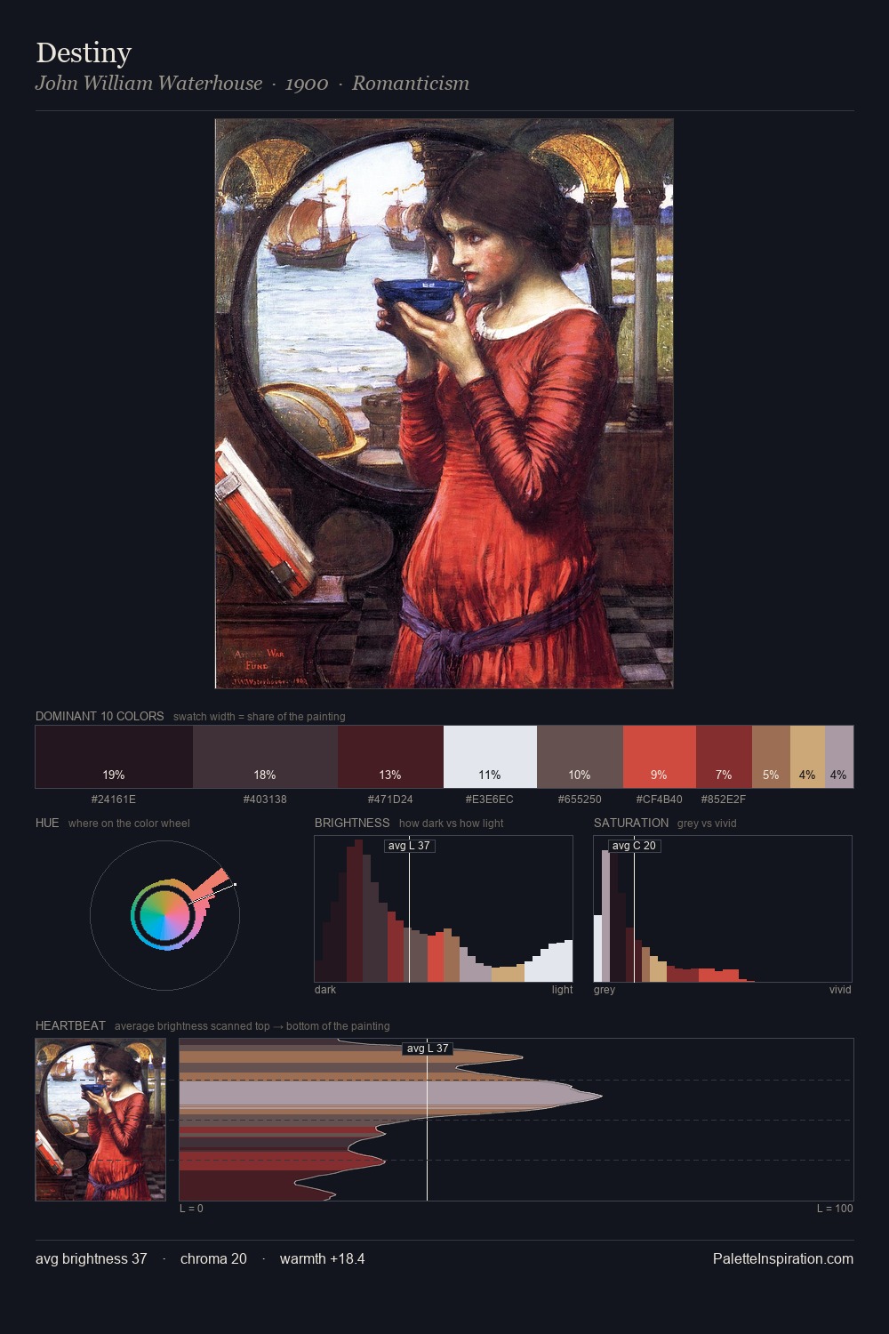
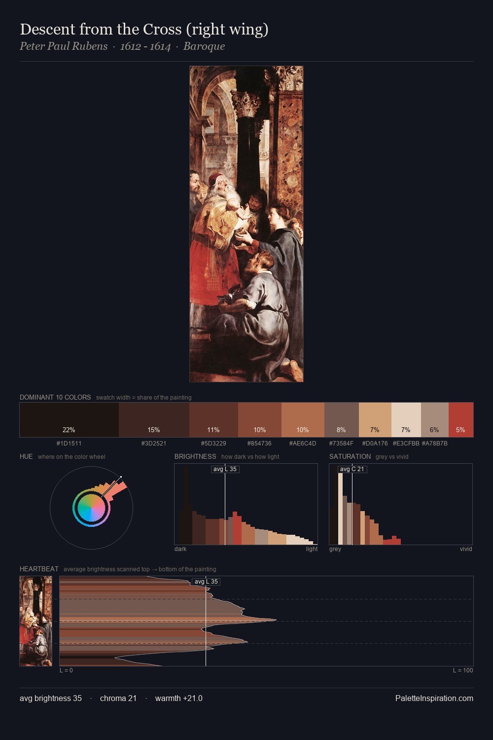
Romanesque Palette 7
Shadowed Caramel
Shadowed Low-key - values weighted toward shadow, the palette of dim interiors and overcast skies.
Caramel Warm mid-brown - the color of cooked sugar, smooth and amber-toned.

Palette Analysis
Romanesque distributes its values across the middle register, creating harmony without high contrast. Warmth dominates - the palette leans heavily on the yellow-orange-red arc of the colour wheel. Colours are neither washed out nor blazing; they occupy the productive middle ground of the chroma scale. #C4412E functions as the palette's exclamation mark: highest chroma, lowest percentage (4.6%). Value range is moderate at 49 units - enough contrast for legibility, not so much as to fragment the tonal unity.
Example use cases
- film & entertainment
- fine dining
- spirits branding
- menswear
- theater design
I Love This!
Use This Palette
Copy, export, or download for your project
Copy, export, or download for your project
Copy:
Download:
Share: