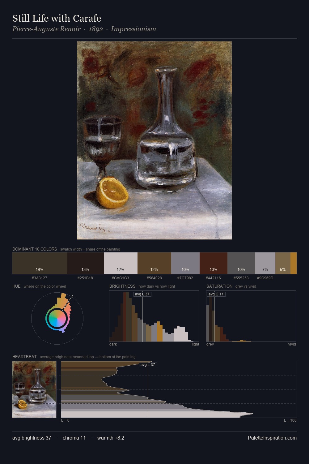
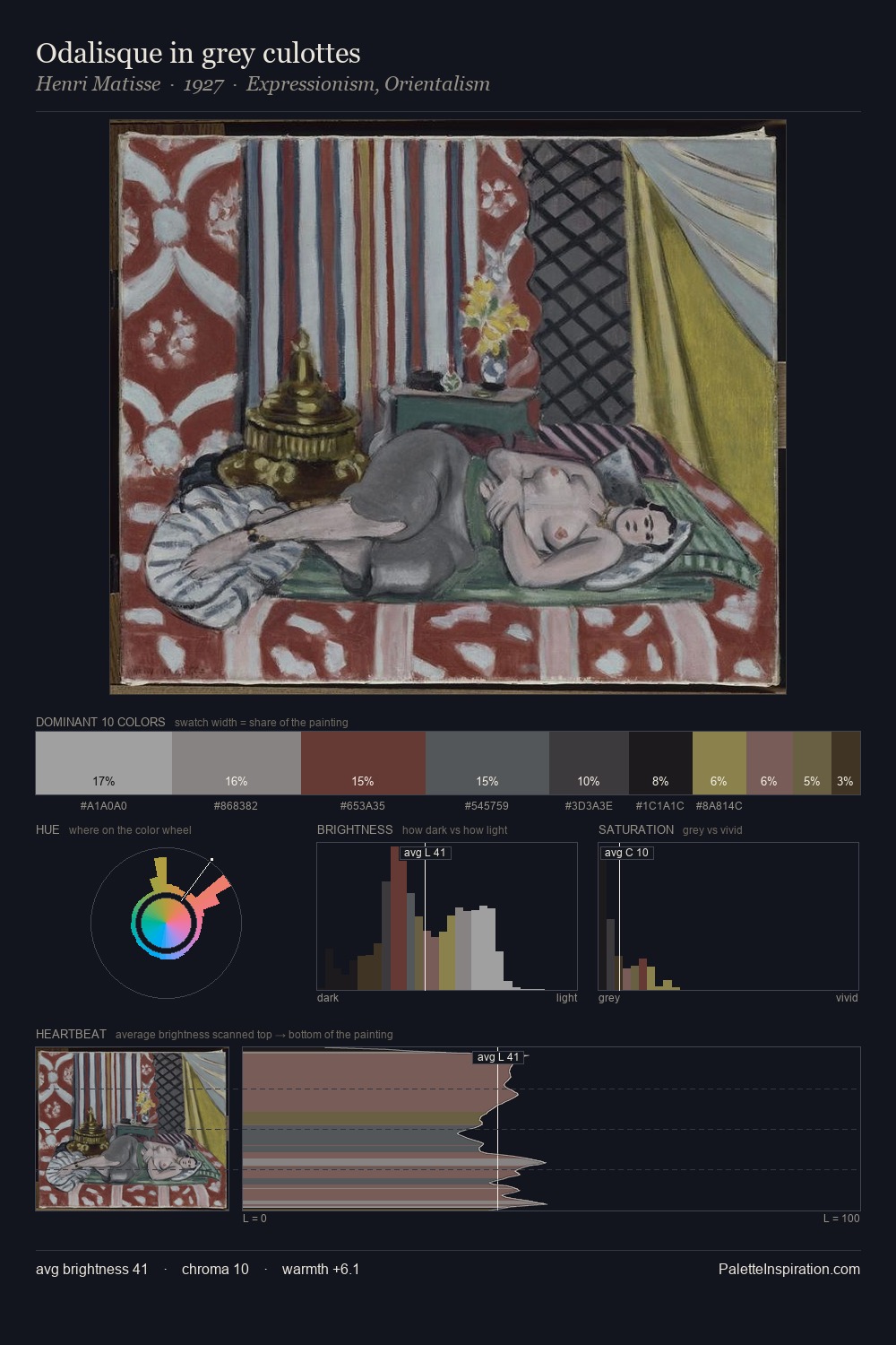
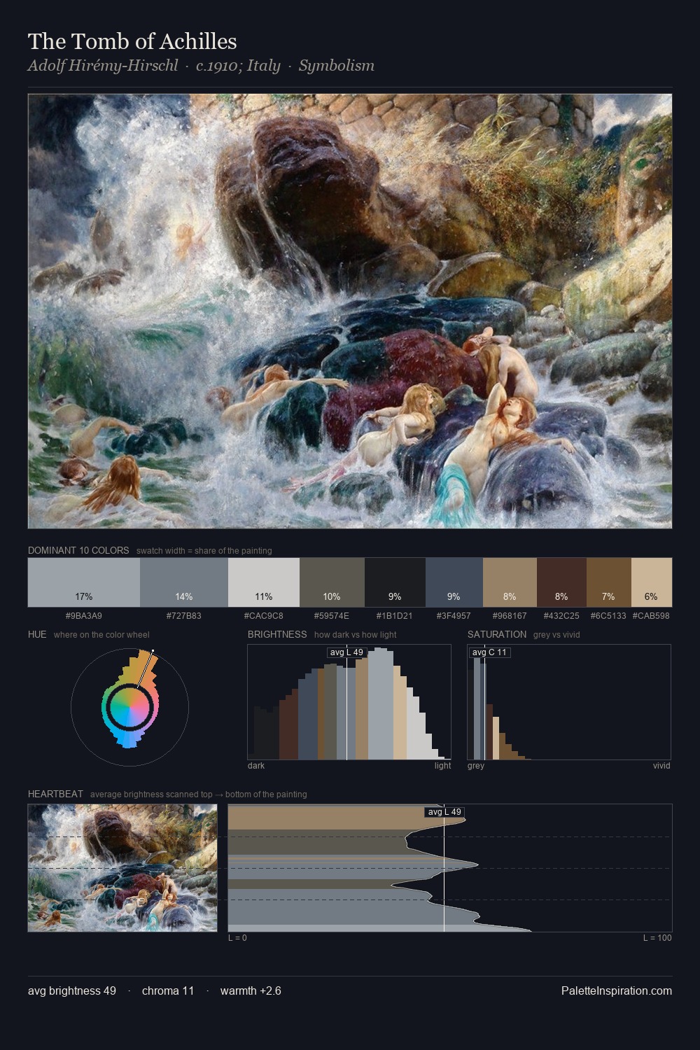
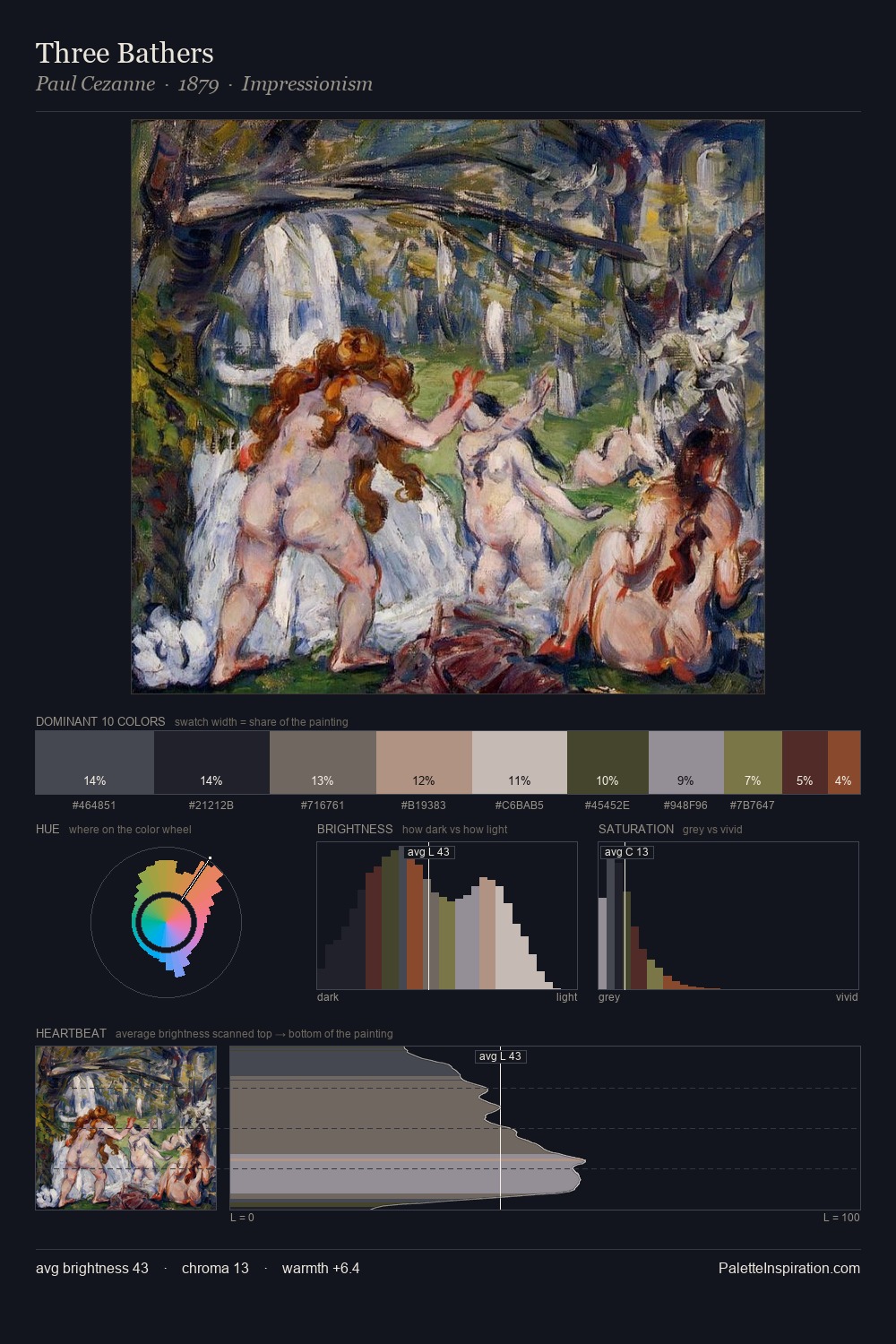
Romaine Brooks Master Palette

Palette Analysis
Romaine Brooks occupies the comfortable middle of the value scale, avoiding both extremes to hold the eye in a sustained middle grey. Blues and teal-greys govern the palette, lending it an aquatic or atmospheric quality. Chroma is kept low across all colours, producing the soft, enveloping quality that characterises tonal painting. At 6.6%, #544126 carries the palette's sharpest chromatic charge: an accent that earns its place precisely because it is withheld. A value spread of 63 units gives the palette both depth and air - shadows are genuinely dark, lights genuinely light. High luminosity and cool temperature suggest the plein-air condition: unfiltered daylight and open sky. The palette is a signature: Romaine Brooks's particular sense of value, warmth, and colour weight made legible.
Example use cases
- publishing
- corporate identity
- consumer apps
- hospitality
- design agencies
I Love This!
Copy, export, or download for your project