Rogier van der Weyden Palette 3
Shadowed Umber
Shadowed Low-key - values weighted toward shadow, the palette of dim interiors and overcast skies.
Umber Dark earthy brown - raw or burnt umber, a foundational old-master earth pigment.

Palette Analysis
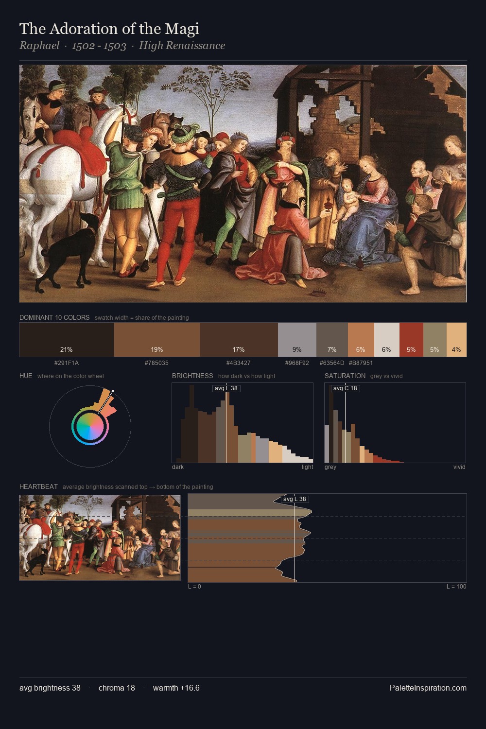
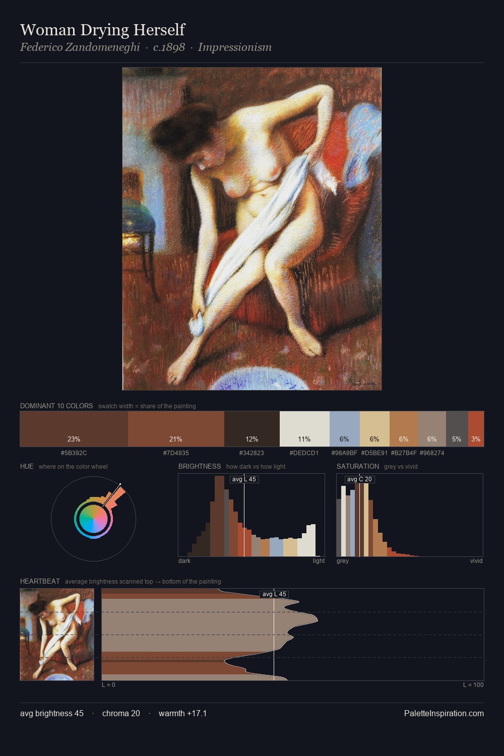
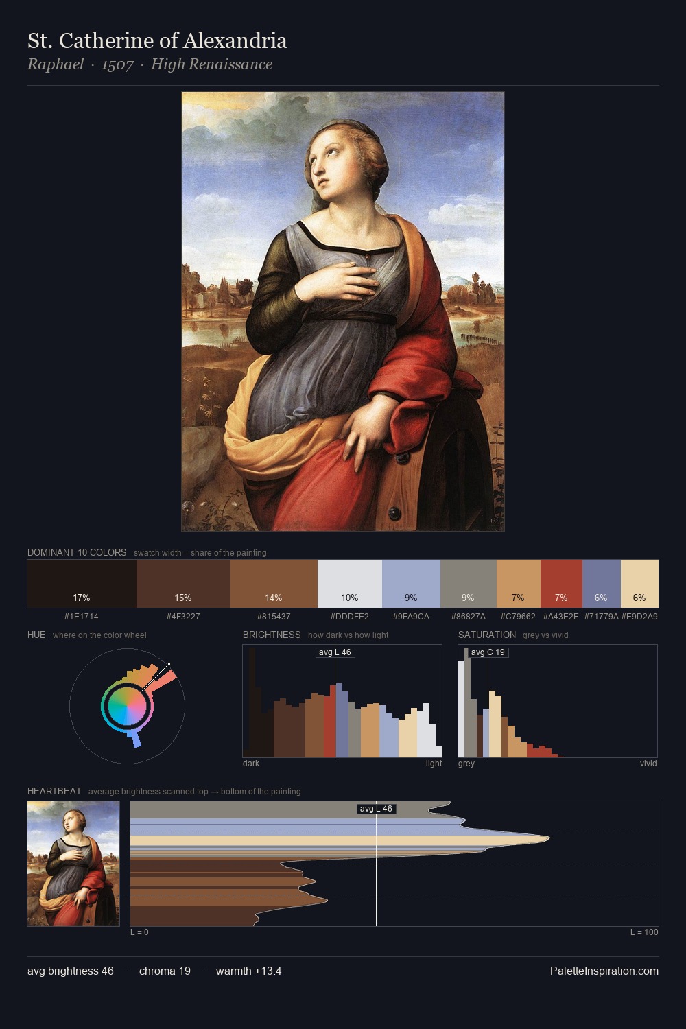
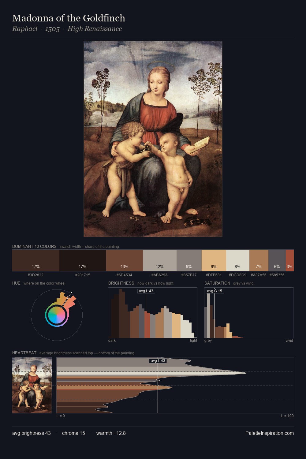
Values in Rogier van der Weyden rest in the mid-range - neither dramatically lit nor steeped in shadow. Heat pervades this palette; warm chromatic identities outweigh cool ones at almost every weight. All colours lean toward grey, building depth through value rather than colour punch. The highest-chroma note - #9B3F27 - appears at just 5.0%, deployed as a precision accent against the quieter ground. From deepest dark to palest light, the palette traverses 70 units of the value scale - a span that creates natural depth. Palette 3 sits within the larger chromatic argument that Rogier van der Weyden's complete body of work advances.
Example use cases
- theater design
- jewelry brands
- tobacco-adjacent retail
- event branding
- film & entertainment
I Love This!
Use This Palette
Copy, export, or download for your project
Copy, export, or download for your project
Copy:
Download:
Share: