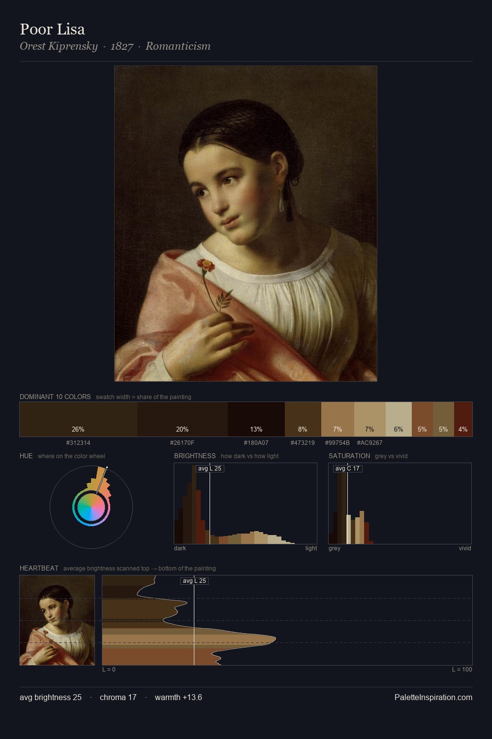
Robert Home Palette 5

Palette Analysis
Robert Home works almost entirely in the lower half of the value scale, privileging depth over brilliance. Warm hues command this palette; Robert Home favours the reds, oranges, and yellows of firelight and earth. Chroma is kept low across all colours, producing the soft, enveloping quality that characterises tonal painting. Robert Home gives 26.9% of the composition to a single #110803 - a decisive chromatic anchor. Only 5.4% is devoted to #40290E, yet that small allocation delivers the palette's entire chromatic tension. A value spread of 60 units gives the palette both depth and air - shadows are genuinely dark, lights genuinely light. Together these qualities place Robert Home firmly in the tonal tradition - concerned with mood and atmosphere rather than chromatic display. Palette 5 sits within the larger chromatic argument that Robert Home's complete body of work advances.
Example use cases
- theater design
- jewelry brands
- tobacco-adjacent retail
- event branding
- film & entertainment
I Love This!
Copy, export, or download for your project