Robert Falk Palette 1
Soft Ivory
Soft Low-contrast, gentle chroma - mid-key values and low saturation, approachable and calm.
Ivory Warm creamy white - the color of natural ivory, warmer than pure white.

Palette Analysis
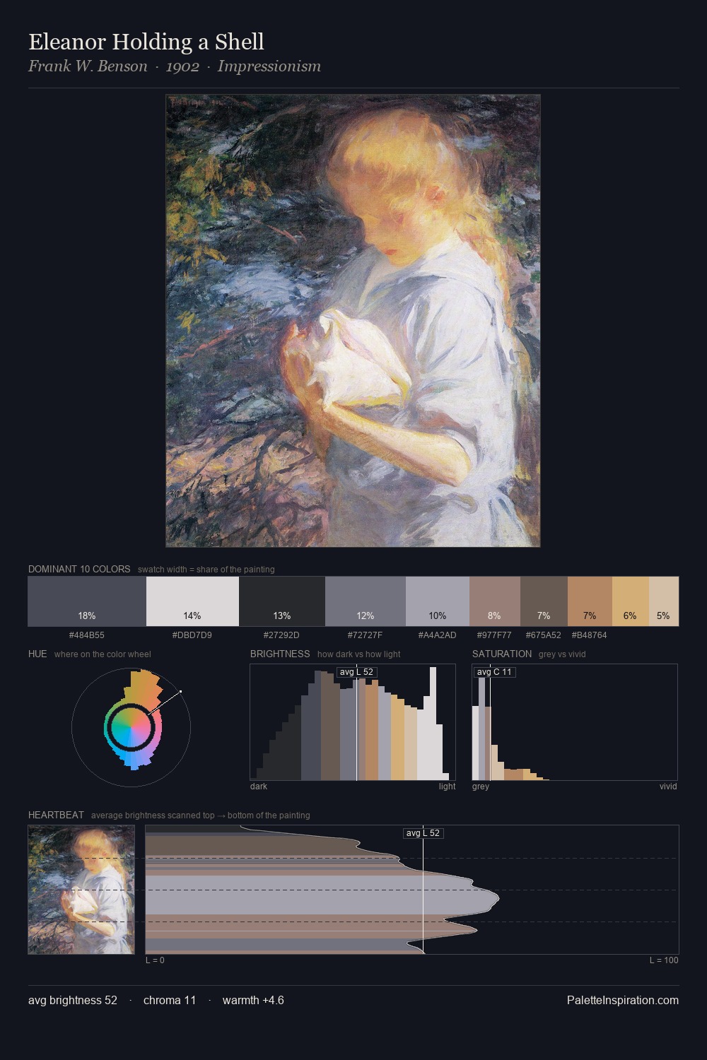
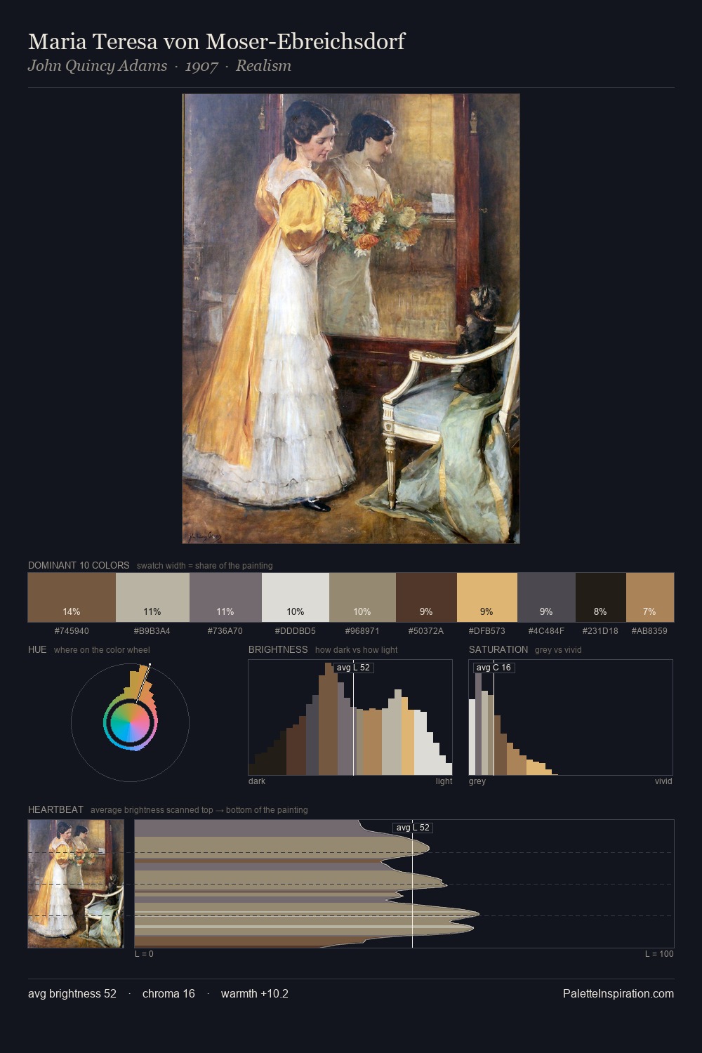
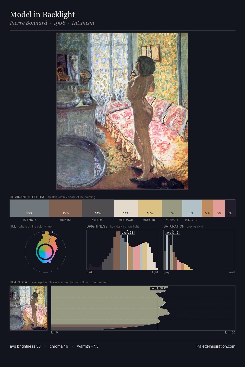
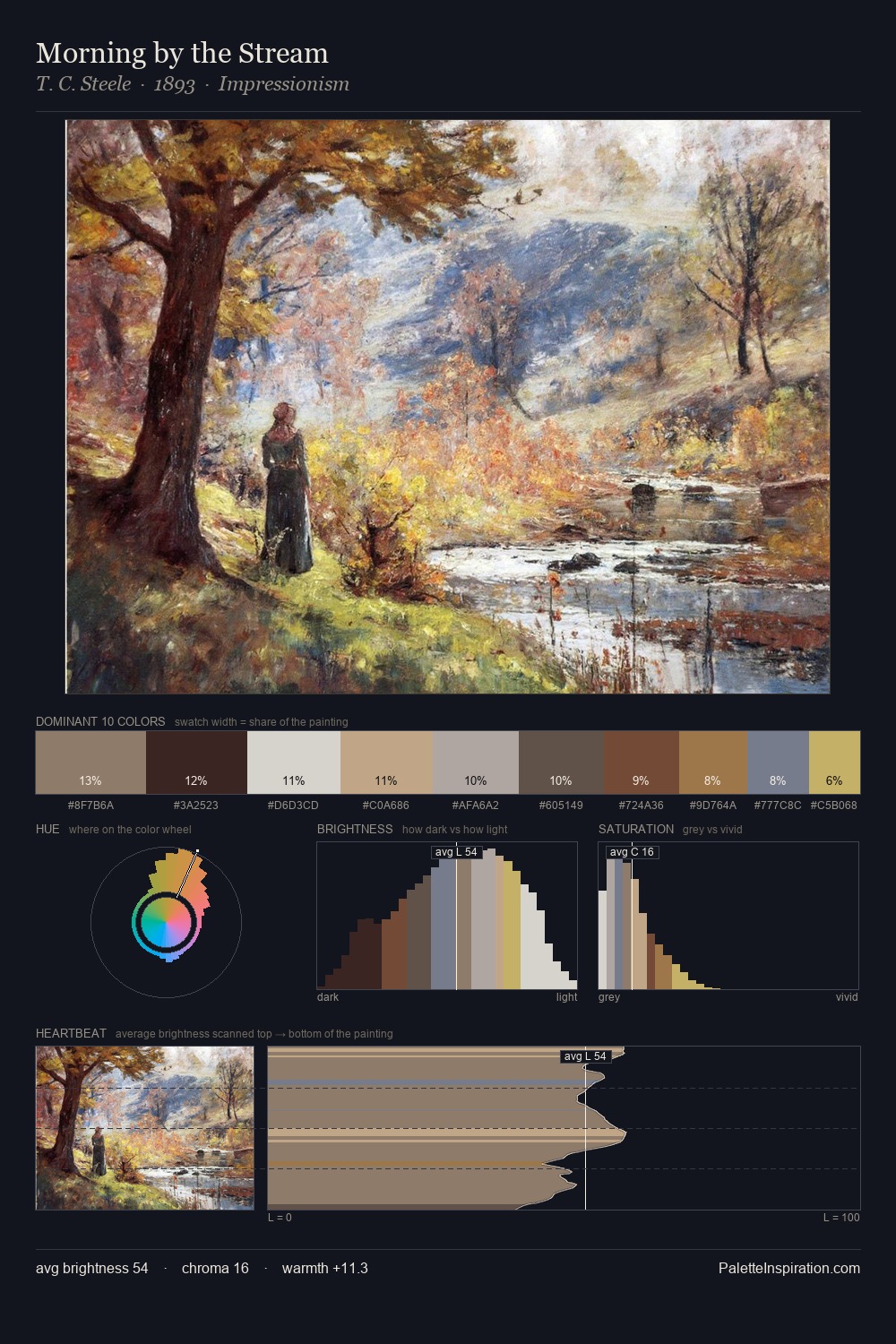
Robert Falk is strongly light-biased - shadow is suggested rather than declared. Robert Falk builds on cool foundations: the palette favours the blue-cyan-green arc. Chroma hovers near zero; colour declares itself through subtle shifts in hue rather than outright saturation. Only 8.1% is devoted to #C7B59A, yet that small allocation delivers the palette's entire chromatic tension. A value spread of 66 units gives the palette both depth and air - shadows are genuinely dark, lights genuinely light. The palette has the character of outdoor light: cool, mid-bright, with colour rendered faithfully rather than expressively. This is palette 1 of Robert Falk's sequence - a single chapter in a chromatic story told across many works.
Example use cases
- exhibition design
- foundation branding
- estate management
- art education
- museums & galleries
I Love This!
Use This Palette
Copy, export, or download for your project
Copy, export, or download for your project
Copy:
Download:
Share: