Robert Campin Palette 2

Palette Analysis
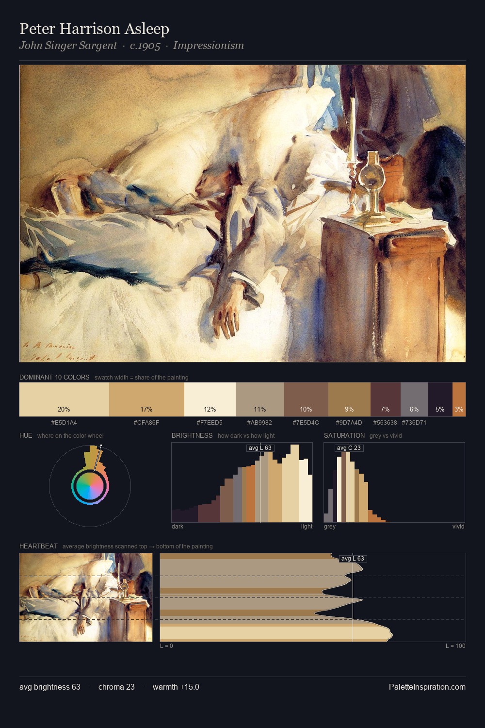
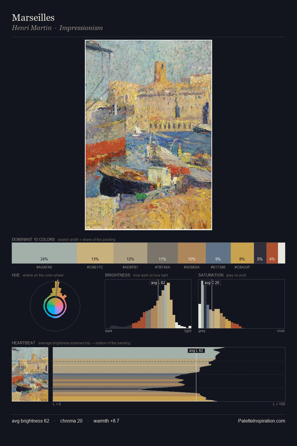
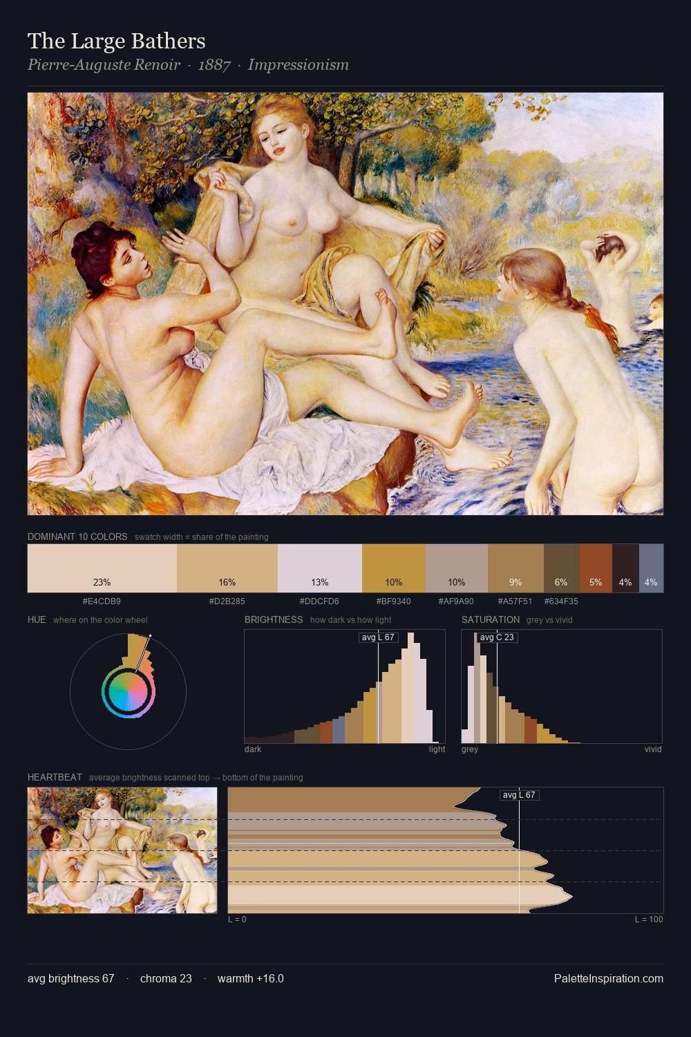
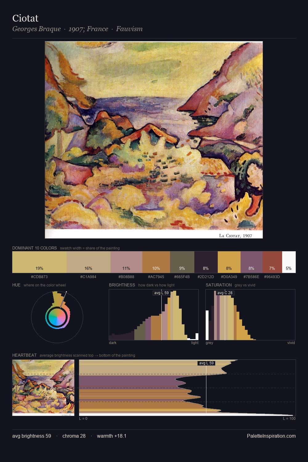
The high-key values of Robert Campin give it an effulgent, almost bleached quality. Robert Campin keeps warm and cool in parity, a balance that lends the work a perceptual shimmer. Chroma is held at a comfortable level - distinct colours, but no single hue is allowed to overwhelm. The most saturated colour, #D4B47D, is reserved to 9.6% of the surface, where it acts as a focal punctuation. 70 units of value range underpin the palette's structural clarity: the eye always knows where light falls. The palette reads as an Impressionist one - light-biased, chromatically direct, and built on temperature contrast rather than value opposition. Robert Campin's palette 2 carries its own internal logic while remaining in conversation with the artist's broader colour intelligence.
Example use cases
- ceramics & pottery
- boutique hospitality
- menswear
- heritage food brands
- craft & artisan brands
I Love This!
Copy, export, or download for your project