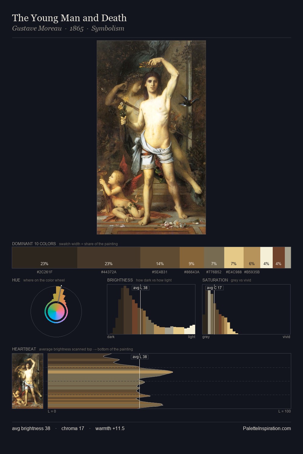
Robert Campin Palette 1

Palette Analysis
Robert Campin is strongly light-biased - shadow is suggested rather than declared. Temperature is cool-dominant, with blue and green families claiming the largest areas. Chroma is held at a comfortable level - distinct colours, but no single hue is allowed to overwhelm. The most saturated colour, #E1B262, covers 30.1% of the surface: too much to call an accent, too strong to ignore. From deepest dark to palest light, the palette traverses 64 units of the value scale - a span that creates natural depth. The mid-to-high key, cool bias, and moderate chroma point to outdoor observation - sky and diffused daylight as the dominant light source. In the context of Robert Campin's full range of palettes, group 1 represents one movement in an ongoing chromatic dialogue.
Example use cases
- publishing
- corporate identity
- consumer apps
- hospitality
- design agencies
I Love This!
Copy, export, or download for your project