Renaissance Palette 8
Tenebrous Bister
Tenebrous Dark and murky - low-key values with obscured form, Baroque in temperament.
Bister Dark warm brown - a traditional ink and wash pigment made from wood soot.

Palette Analysis
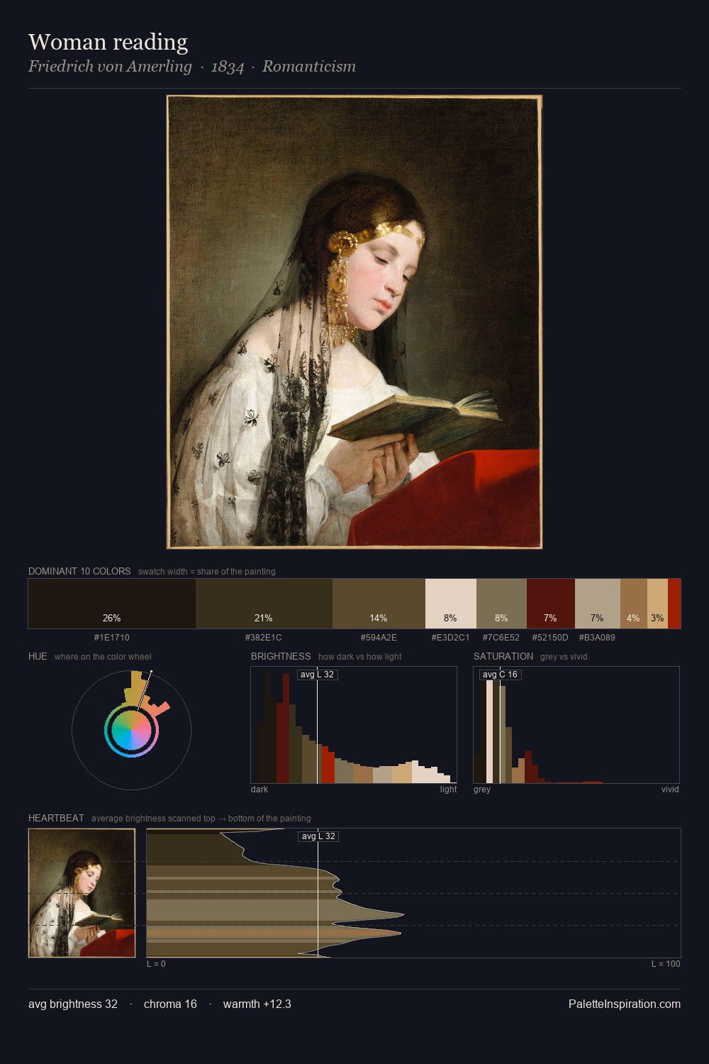
The value structure of Renaissance is mid-key: quiet, controlled, and cohesive. Cool tones set the register here - the blues and greens easily outweigh any warm accents. Saturation is deliberately withheld - the beauty here lies in the near-monochromatic gradations rather than colour difference. 25.8% of the palette belongs to #191915, a concentration that makes it the unmistakable visual centre. The saturated accent, #65492F, registers at 6.6% - sparse enough to feel like a deliberate surprise. 62 units of value range underpin the palette's structural clarity: the eye always knows where light falls. The palette has the character of outdoor light: cool, mid-bright, with colour rendered faithfully rather than expressively.
Example use cases
- theater design
- jewelry brands
- tobacco-adjacent retail
- event branding
- film & entertainment
I Love This!
Use This Palette
Copy, export, or download for your project
Copy, export, or download for your project
Copy:
Download:
Share: