Renaissance Palette 6
Brooding Mist
Brooding Low-key and emotionally weighted - dark values with a sense of psychological depth.
Mist Pale cool gray - the atmospheric color of morning mist over water.

Palette Analysis
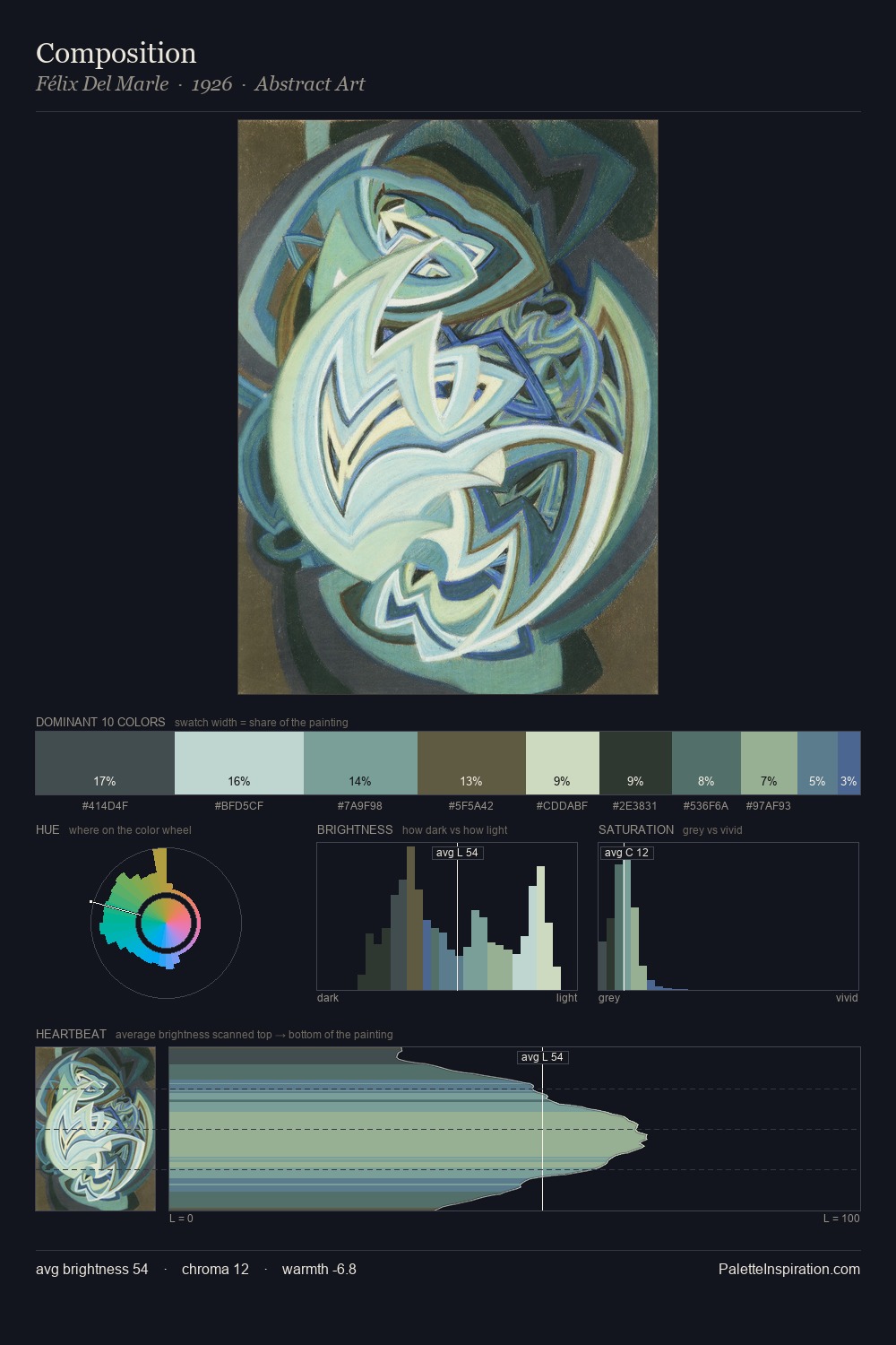
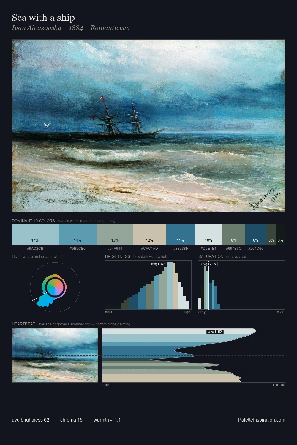
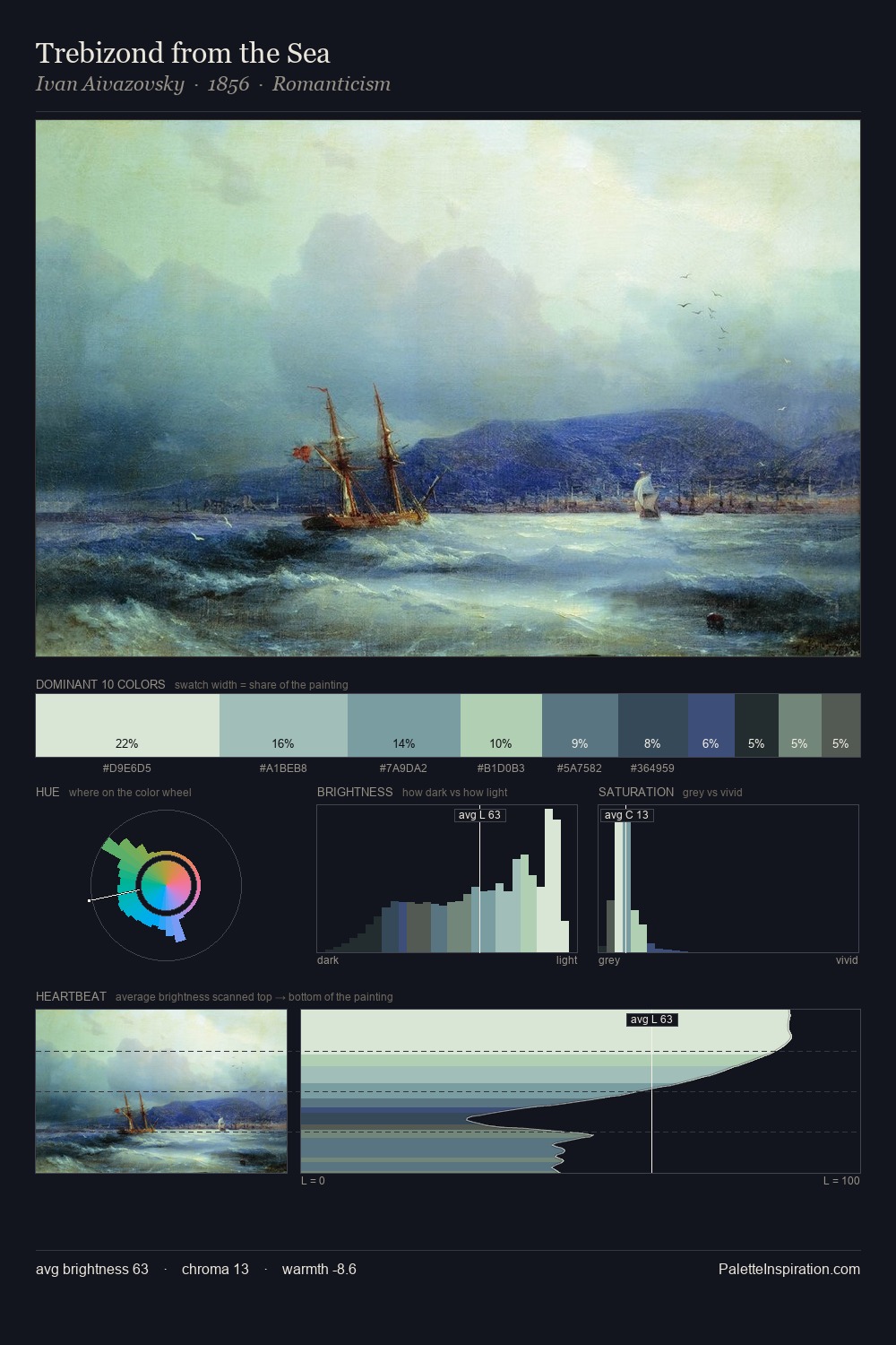
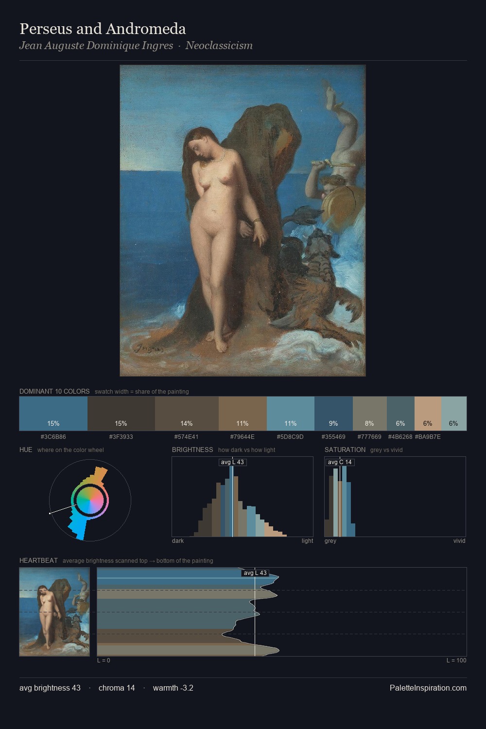
Renaissance keeps values measured and balanced, a hallmark of tonal restraint. Cool hues prevail: blues, greens, and greys anchor the palette's emotional temperature. Chroma hovers near zero; colour declares itself through subtle shifts in hue rather than outright saturation. Only 6.8% is devoted to #73ACAA, yet that small allocation delivers the palette's entire chromatic tension. The value range of 37 units sits in the comfortable middle: enough depth, enough light, neither extreme. The mid-to-high key, cool bias, and moderate chroma point to outdoor observation - sky and diffused daylight as the dominant light source.
Example use cases
- legal services
- corporate identity
- industrial design
- professional services
- fintech
I Love This!
Use This Palette
Copy, export, or download for your project
Copy, export, or download for your project
Copy:
Download:
Share: