Renaissance Palette 5
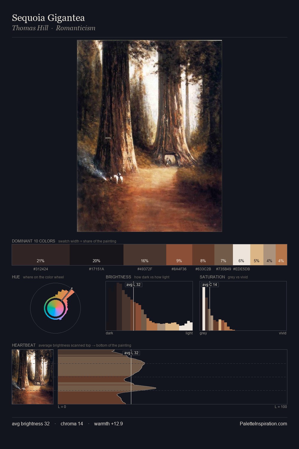
Shadowed Caramel
Shadowed Low-key - values weighted toward shadow, the palette of dim interiors and overcast skies.
Caramel Warm mid-brown - the color of cooked sugar, smooth and amber-toned.

Palette Analysis
The value structure of Renaissance is mid-key: quiet, controlled, and cohesive. Warmth dominates - the palette leans heavily on the yellow-orange-red arc of the colour wheel. Chroma is held at a comfortable level - distinct colours, but no single hue is allowed to overwhelm. The most saturated colour, #96452C, covers 18.4% of the surface: too much to call an accent, too strong to ignore. The full value range is 68 units: broad enough to build convincing three-dimensional form.
Example use cases
- theater design
- jewelry brands
- tobacco-adjacent retail
- event branding
- film & entertainment
I Love This!
Use This Palette
Copy, export, or download for your project
Copy, export, or download for your project
Copy:
Download:
Share: