Renaissance Palette 1
Shadowed Parchment
Shadowed Low-key - values weighted toward shadow, the palette of dim interiors and overcast skies.
Parchment Aged warm neutral - the color of old manuscript parchment, tan and slightly yellowed.

Palette Analysis
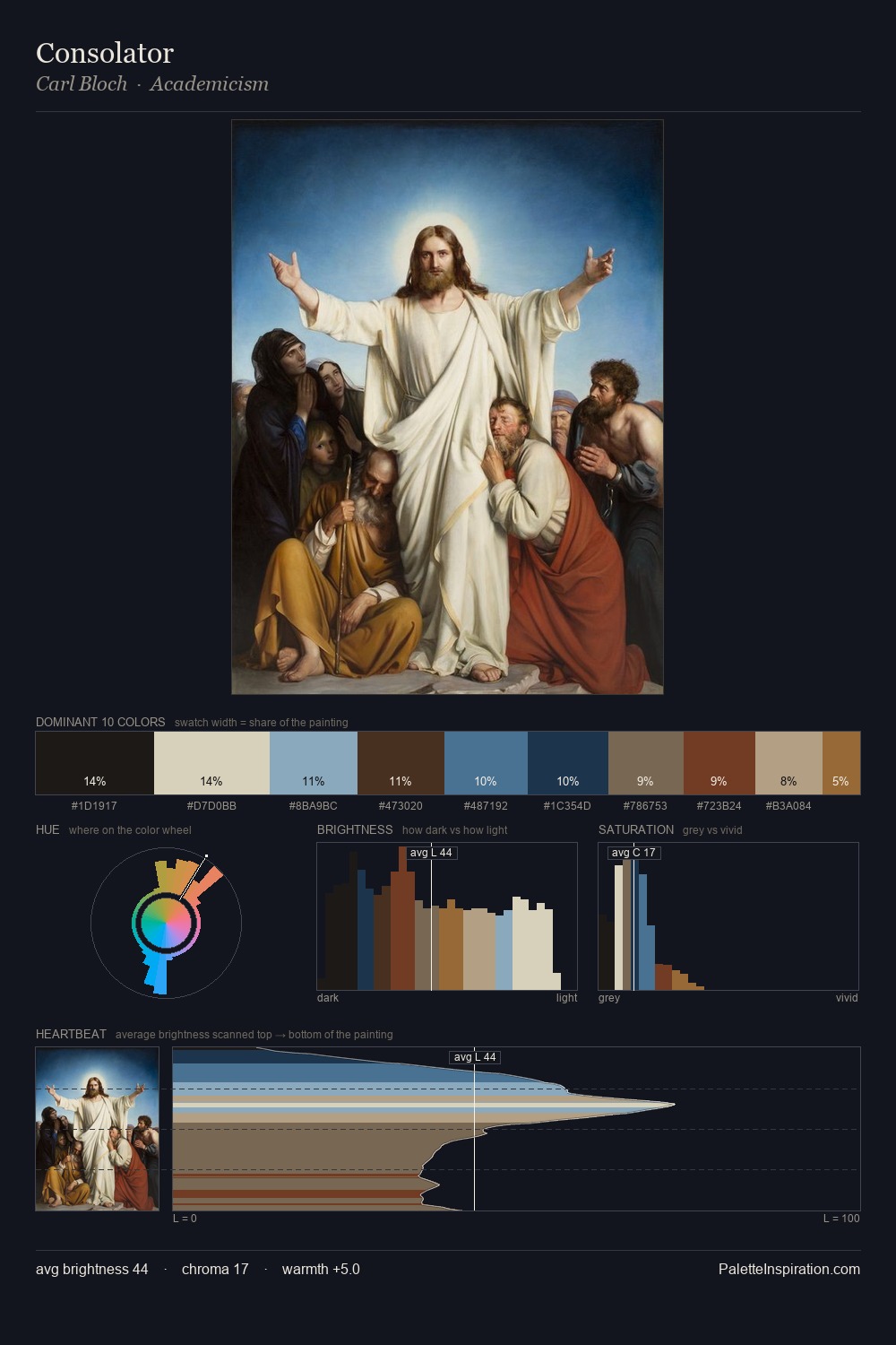
Renaissance distributes its values across the middle register, creating harmony without high contrast. Neither warm nor cool has the upper hand here; the equilibrium between the two generates the palette's visual energy. Chroma is kept low across all colours, producing the soft, enveloping quality that characterises tonal painting. #9E7443 delivers the chromatic peak at only 6.9% - a small shot of colour with outsized visual impact. The full value range is 67 units: broad enough to build convincing three-dimensional form.
Example use cases
- theater design
- jewelry brands
- tobacco-adjacent retail
- event branding
- film & entertainment
I Love This!
Use This Palette
Copy, export, or download for your project
Copy, export, or download for your project
Copy:
Download:
Share: