Rembrandt Peale Palette 9

Palette Analysis
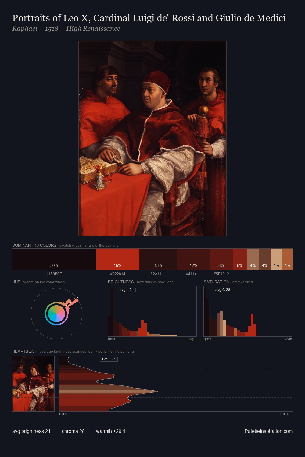
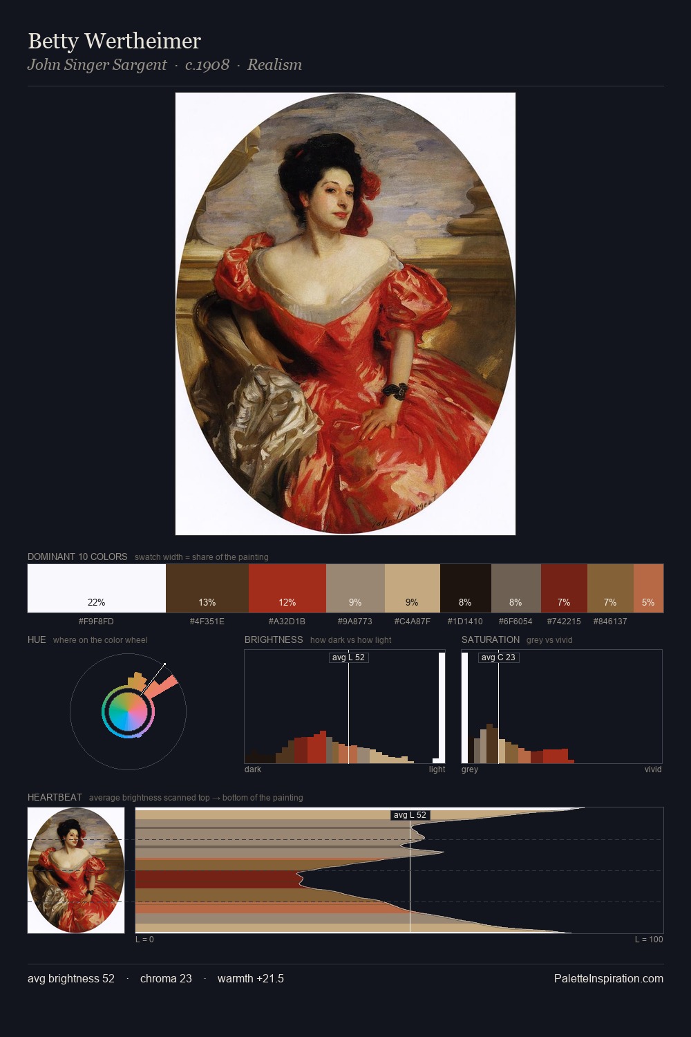
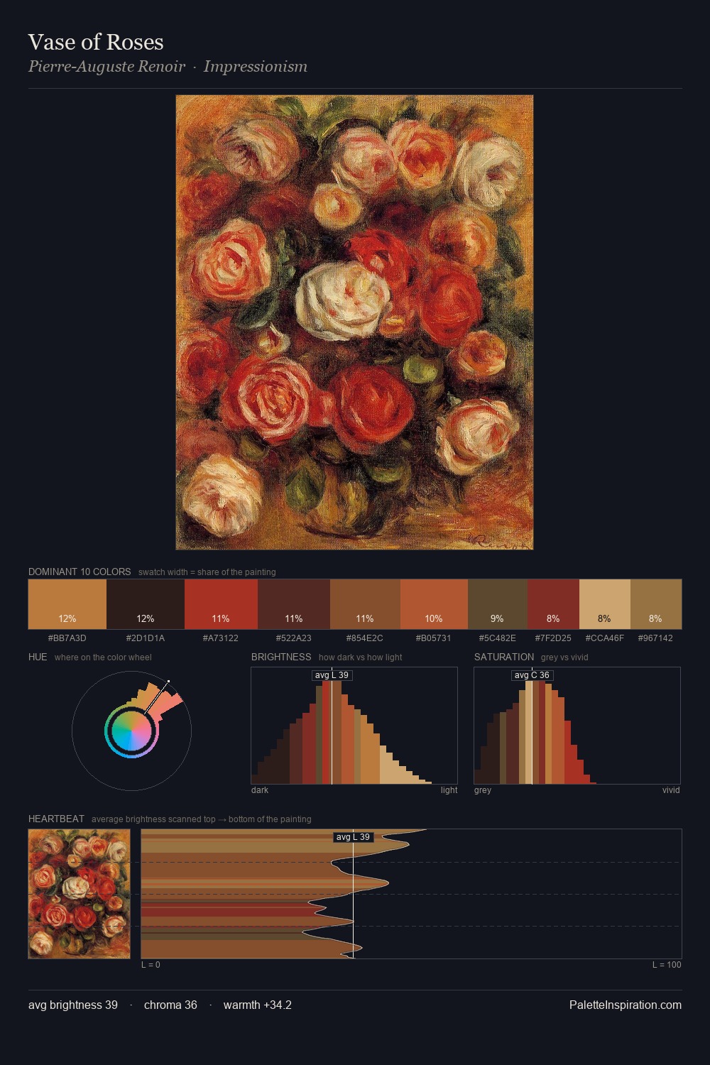
Rembrandt Peale occupies the comfortable middle of the value scale, avoiding both extremes to hold the eye in a sustained middle grey. Heat pervades this palette; warm chromatic identities outweigh cool ones at almost every weight. Chroma hovers near zero; colour declares itself through subtle shifts in hue rather than outright saturation. The dominant colour, #16120E, takes 33.5% of the total area, establishing the overall mood before any other hue is introduced. #6D1212 functions as the palette's exclamation mark: highest chroma, lowest percentage (7.3%). At 66 units of value range, the palette has the tonal breadth to sustain complex spatial readings. This is palette 9 of Rembrandt Peale's sequence - a single chapter in a chromatic story told across many works.
Example use cases
- music labels
- luxury hospitality
- editorial photography
- leather goods
- premium streaming
I Love This!
Copy, export, or download for your project