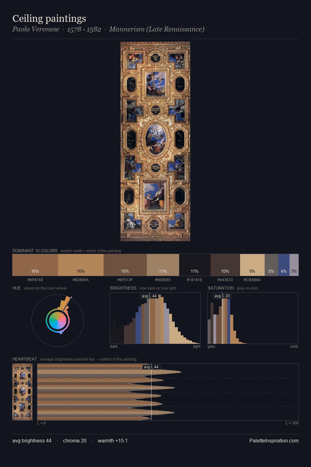
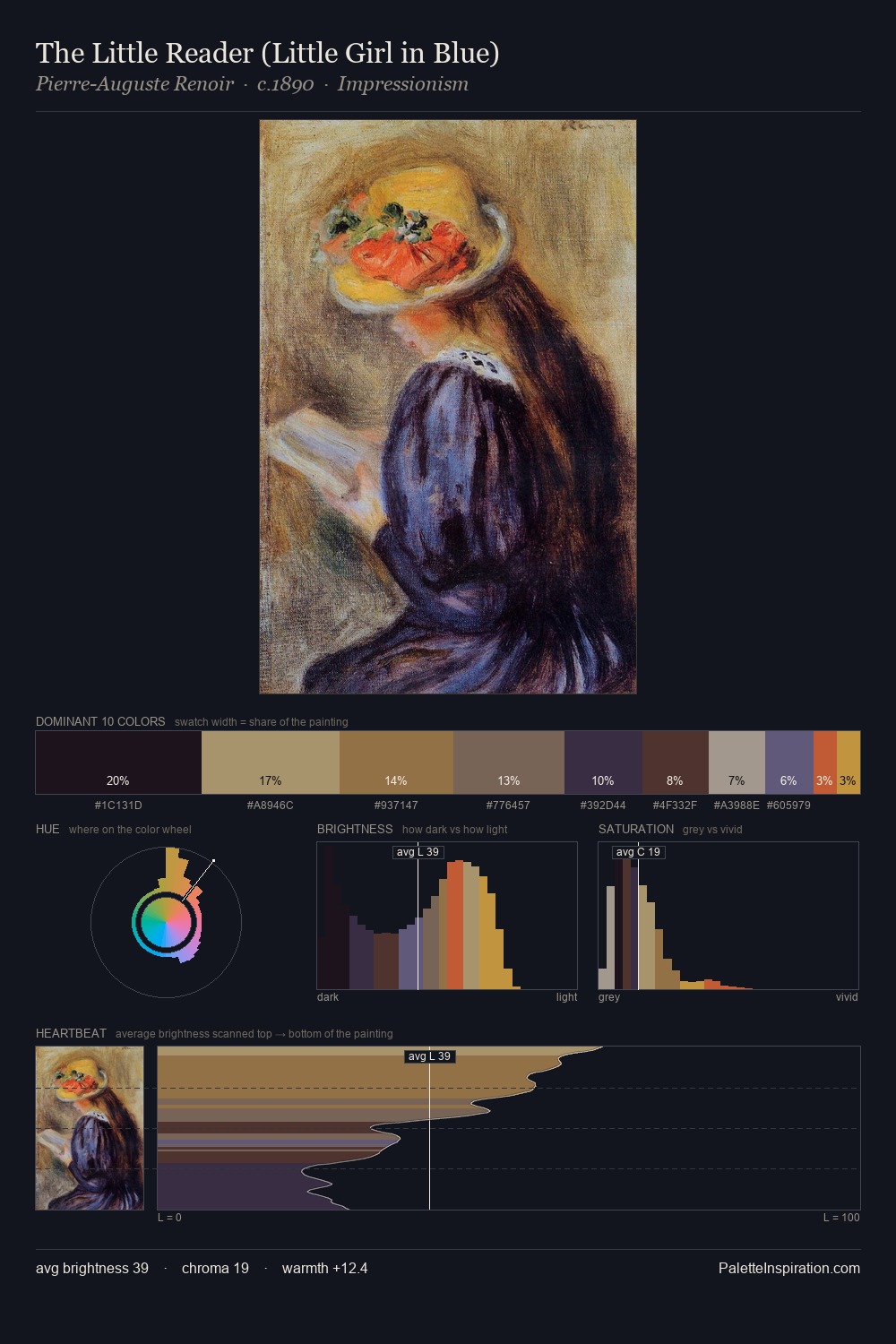
Quadratura Palette 7
Shadowed Tawny
Shadowed Low-key - values weighted toward shadow, the palette of dim interiors and overcast skies.
Tawny Warm orange-brown - a traditional term for the color of tanned leather or lion fur.

Palette Analysis
quadratura occupies the comfortable middle of the value scale, avoiding both extremes to hold the eye in a sustained middle grey. The dominant temperature is warm, with earth tones and fire-hues setting the emotional key. Chroma hovers near zero; colour declares itself through subtle shifts in hue rather than outright saturation. Only 2.1% is devoted to #414E7E, yet that small allocation delivers the palette's entire chromatic tension. The palette spans 51 value units: a measured range that delivers coherence over drama.
Example use cases
- theater design
- jewelry brands
- tobacco-adjacent retail
- event branding
- film & entertainment
I Love This!
Use This Palette
Copy, export, or download for your project
Copy, export, or download for your project
Copy:
Download:
Share: