Pyotr Konchalovsky Palette 4

Palette Analysis
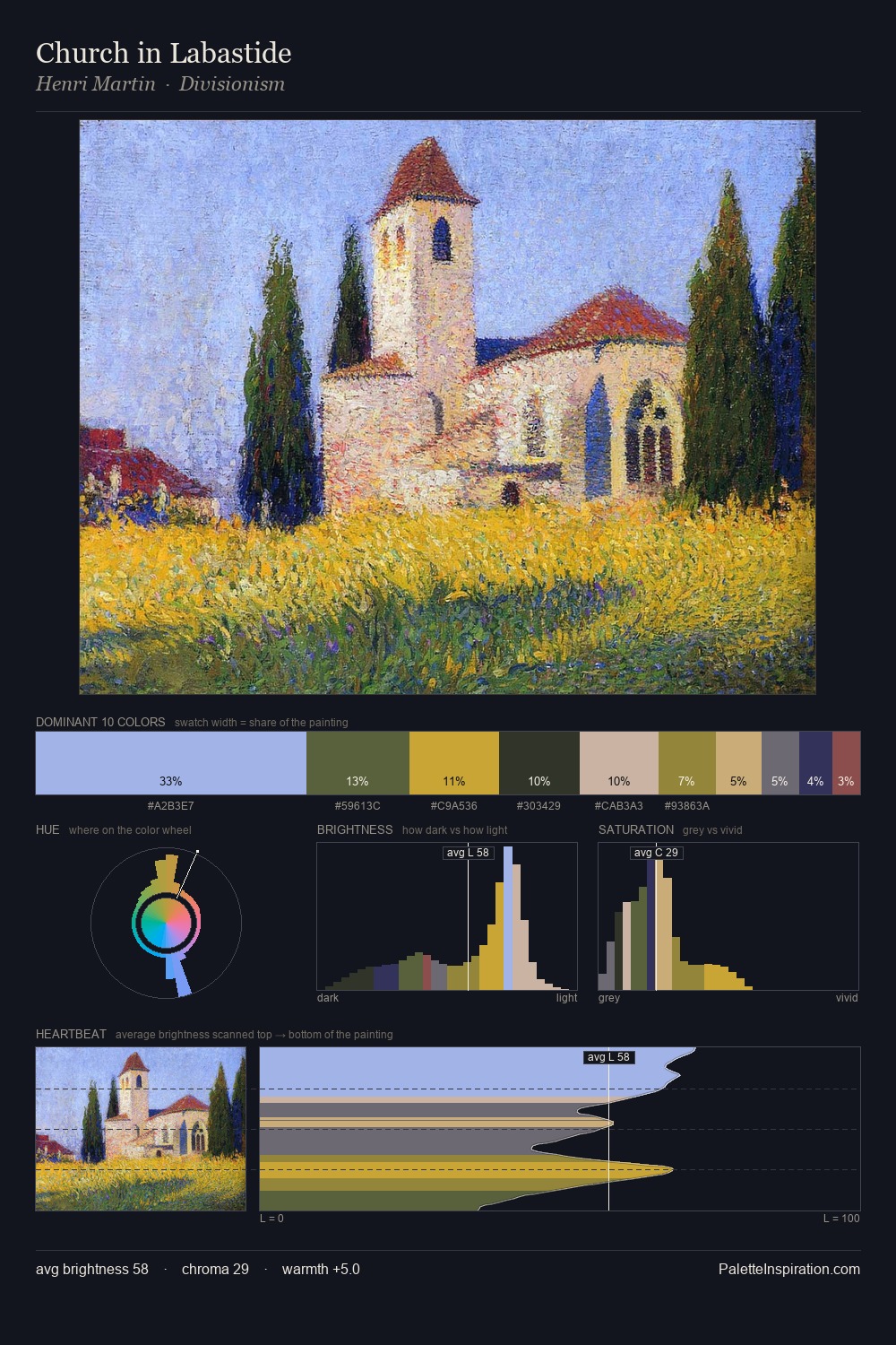
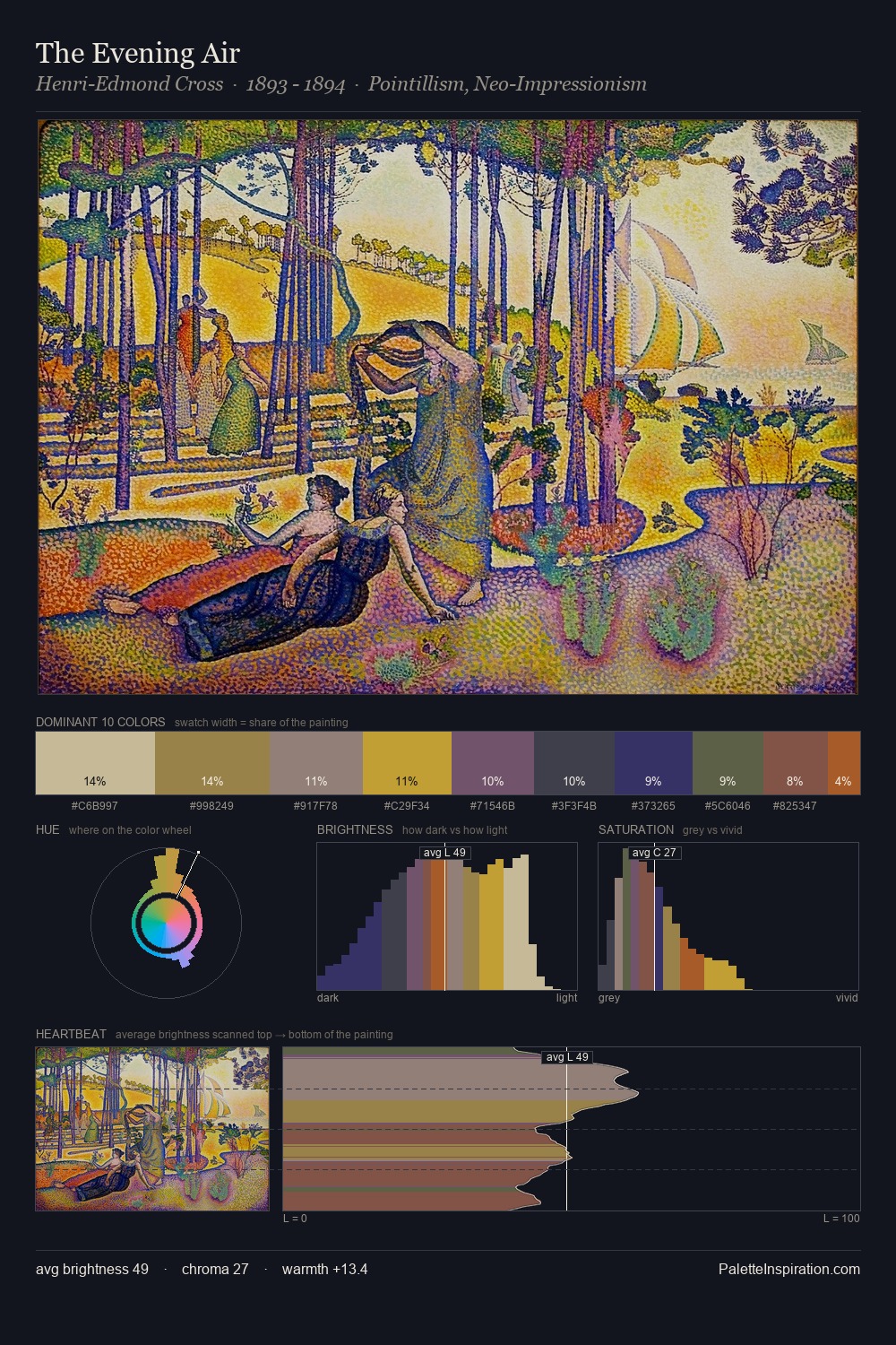
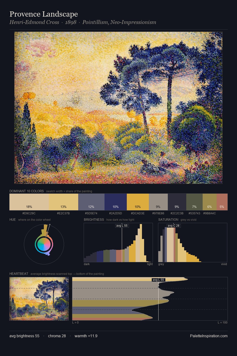
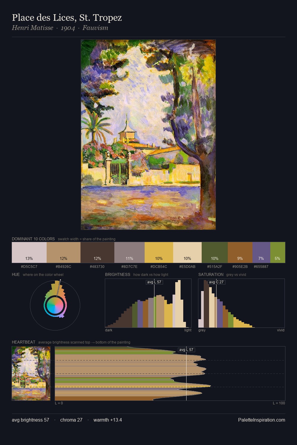
Pyotr Konchalovsky distributes its values across the middle register, creating harmony without high contrast. Warm and cool tones are held in careful balance - neither family dominates, creating tension and resolution simultaneously. Saturation is measured and controlled, giving the palette presence without visual aggression. The most saturated colour, #DBAC26, covers 20.2% of the surface: too much to call an accent, too strong to ignore. Spanning 47 units on the value axis, the palette achieves the balance between tonal flatness and fragmentation. The combination of mid-to-high key, balanced temperature, and elevated chroma is characteristic of Impressionist observation: light broken into its component hues. In the context of Pyotr Konchalovsky's full range of palettes, group 4 represents one movement in an ongoing chromatic dialogue.
Example use cases
- food packaging
- leather accessories
- travel & outdoor
- natural cosmetics
- interior design
I Love This!
Copy, export, or download for your project