Pyotr Konchalovsky Palette 1
Soft Ecru
Soft Low-contrast, gentle chroma - mid-key values and low saturation, approachable and calm.
Ecru Unbleached linen - warm mid-neutral, slightly grayed, raw and natural.

Palette Analysis
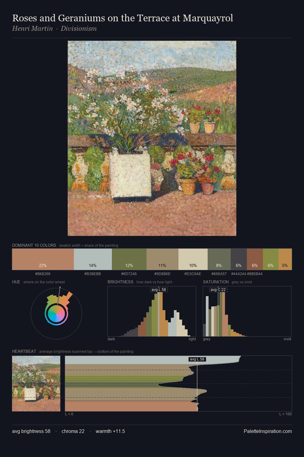
Light floods Pyotr Konchalovsky; the palette keeps values pale and airy across its range. Pyotr Konchalovsky tilts toward cool - blues and silver-greys carry the structural weight. Chroma hovers near zero; colour declares itself through subtle shifts in hue rather than outright saturation. #CAB892 functions as the palette's exclamation mark: highest chroma, lowest percentage (6.1%). The palette spans 51 value units: a measured range that delivers coherence over drama. The mid-to-high key, cool bias, and moderate chroma point to outdoor observation - sky and diffused daylight as the dominant light source. In the context of Pyotr Konchalovsky's full range of palettes, group 1 represents one movement in an ongoing chromatic dialogue.
Example use cases
- exhibition design
- foundation branding
- estate management
- art education
- museums & galleries
I Love This!
Use This Palette
Copy, export, or download for your project
Copy, export, or download for your project
Copy:
Download:
Share: