Purism Palette 1
Gleaming Aureolin
Gleaming Bright and polished - high-key, often warm, suggesting reflective or luminous surfaces.
Aureolin Bright transparent yellow - a clear, luminous lemon-gold pigment hue.

Palette Analysis
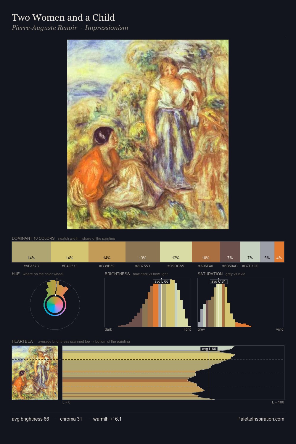
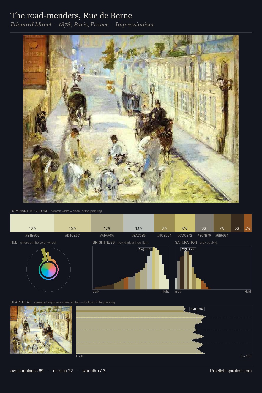
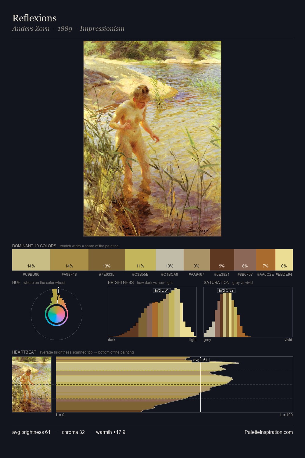
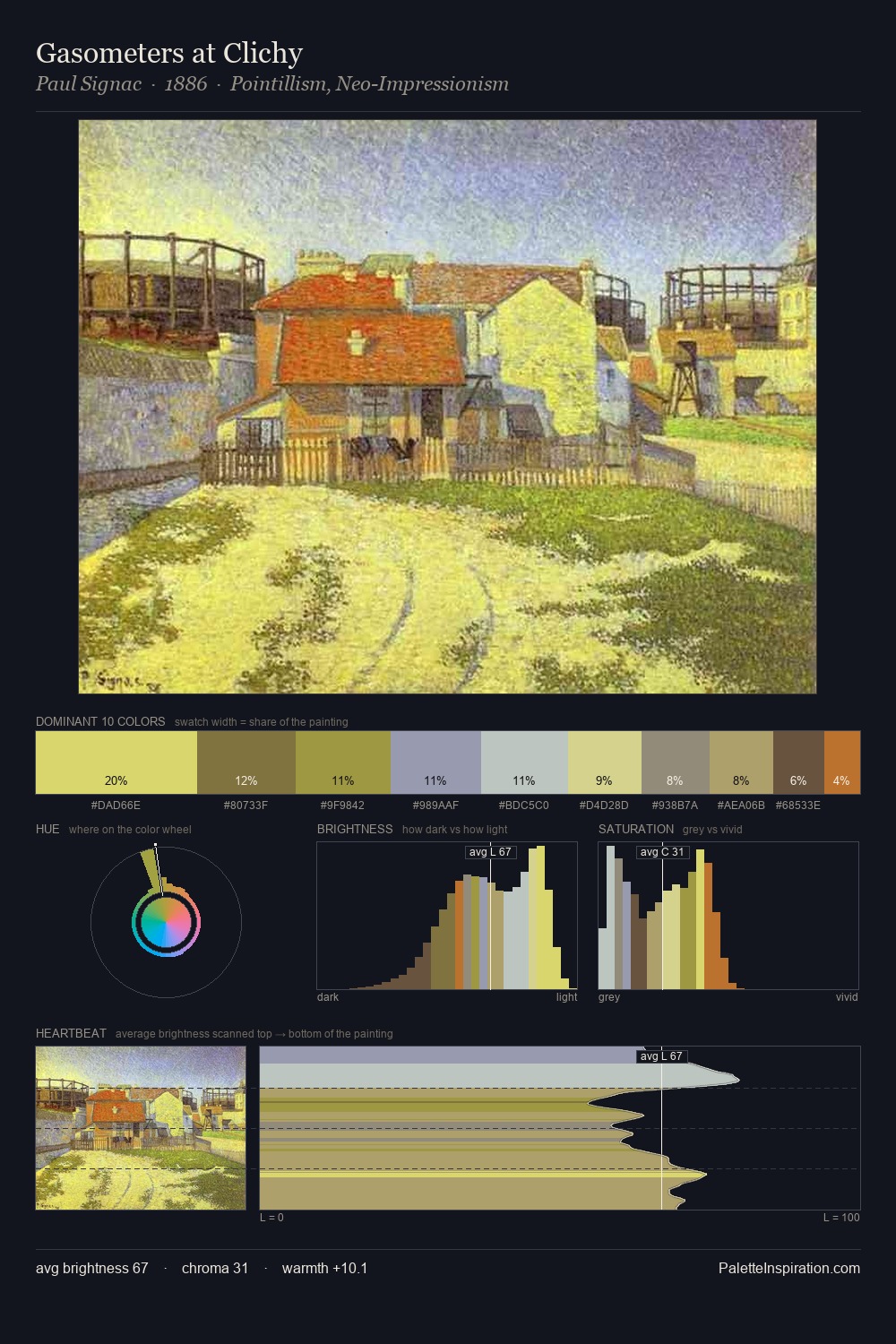
Light floods Purism; the palette keeps values pale and airy across its range. The palette tilts toward cool - blues and silver-greys carry the structural weight. Saturation is measured and controlled, giving the palette presence without visual aggression. The most saturated colour, #D4D06D, covers 47.1% of the surface: too much to call an accent, too strong to ignore. 40 units of value spread create a palette that is varied but unified - contrast in the service of harmony. High luminosity and cool temperature suggest the plein-air condition: unfiltered daylight and open sky.
Example use cases
- publishing
- corporate identity
- consumer apps
- hospitality
- design agencies
I Love This!
Use This Palette
Copy, export, or download for your project
Copy, export, or download for your project
Copy:
Download:
Share: