Prudence Heward Master Palette
Palette Analysis
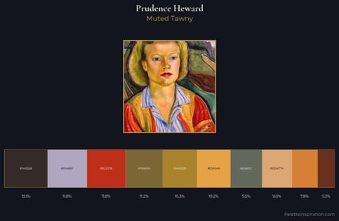
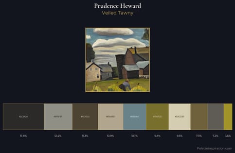
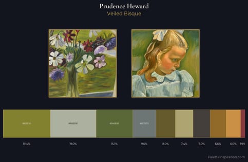
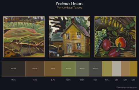
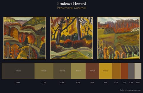
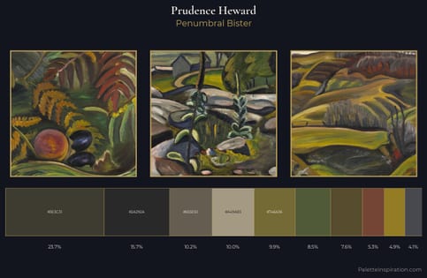
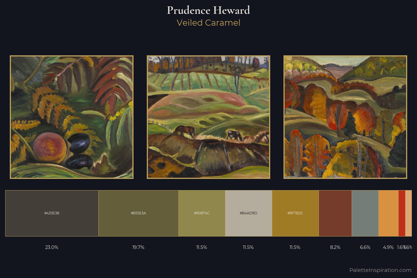
Prudence Heward keeps values measured and balanced, a hallmark of tonal restraint. Cool hues prevail: blues, greens, and greys anchor the palette's emotional temperature. The absence of saturated colour is itself an expressive choice: this is a palette of restraint and atmosphere. At 1.6%, #BD2F18 carries the palette's sharpest chromatic charge: an accent that earns its place precisely because it is withheld. The value range of 40 units sits in the comfortable middle: enough depth, enough light, neither extreme. The mid-to-high key, cool bias, and moderate chroma point to outdoor observation - sky and diffused daylight as the dominant light source. These proportions encode Prudence Heward's instinctive sense of how much of each quality the eye can hold.
Example use cases
- theater design
- jewelry brands
- tobacco-adjacent retail
- event branding
- film & entertainment
I Love This!
Copy, export, or download for your project