Prudence Heward Palette 2

Palette Analysis
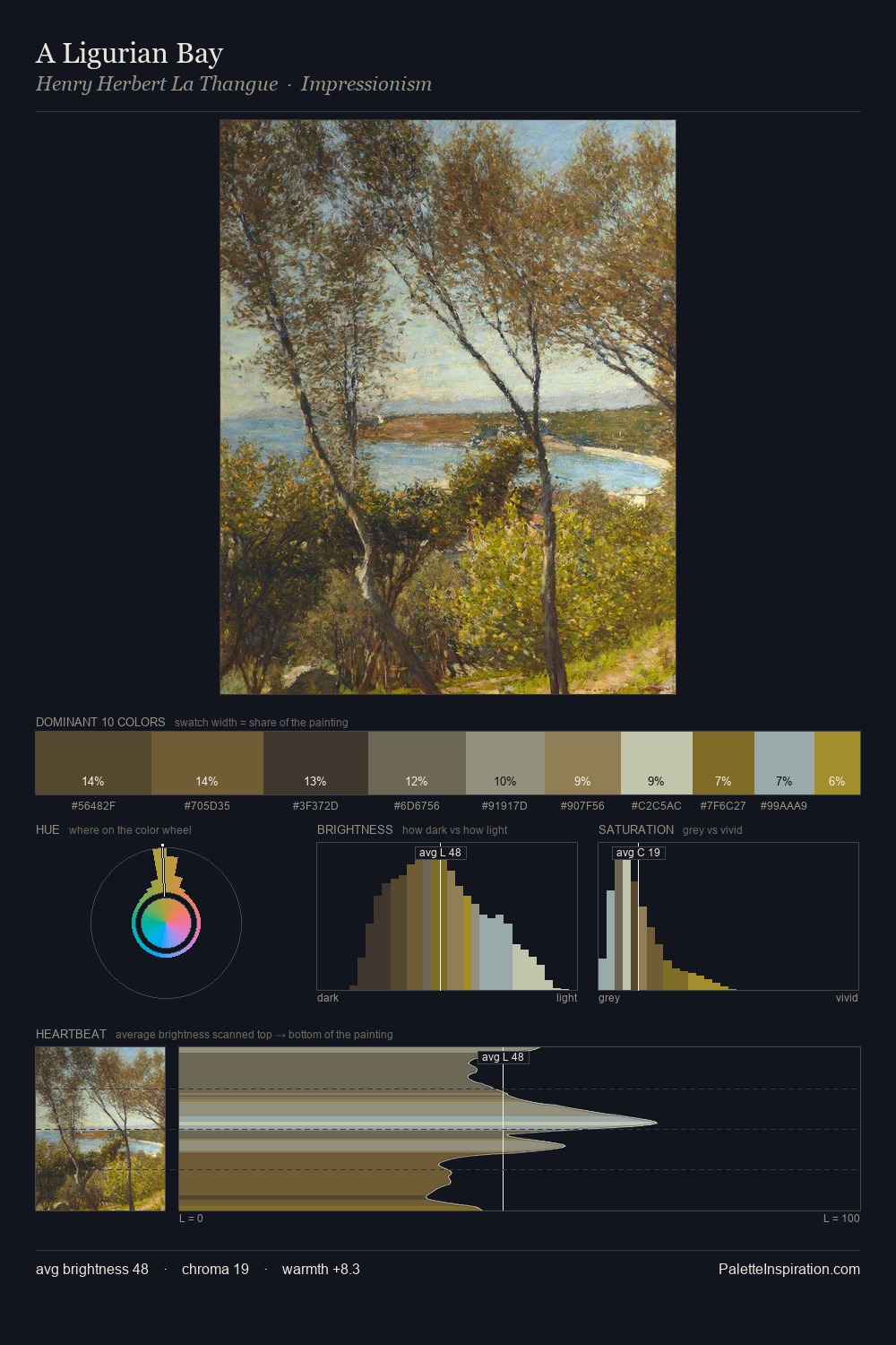
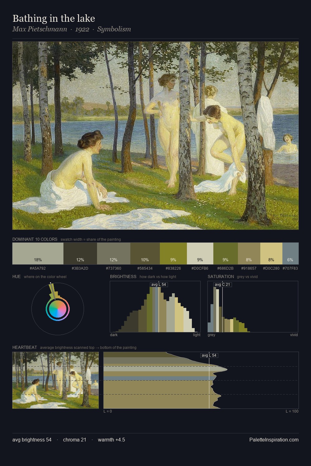
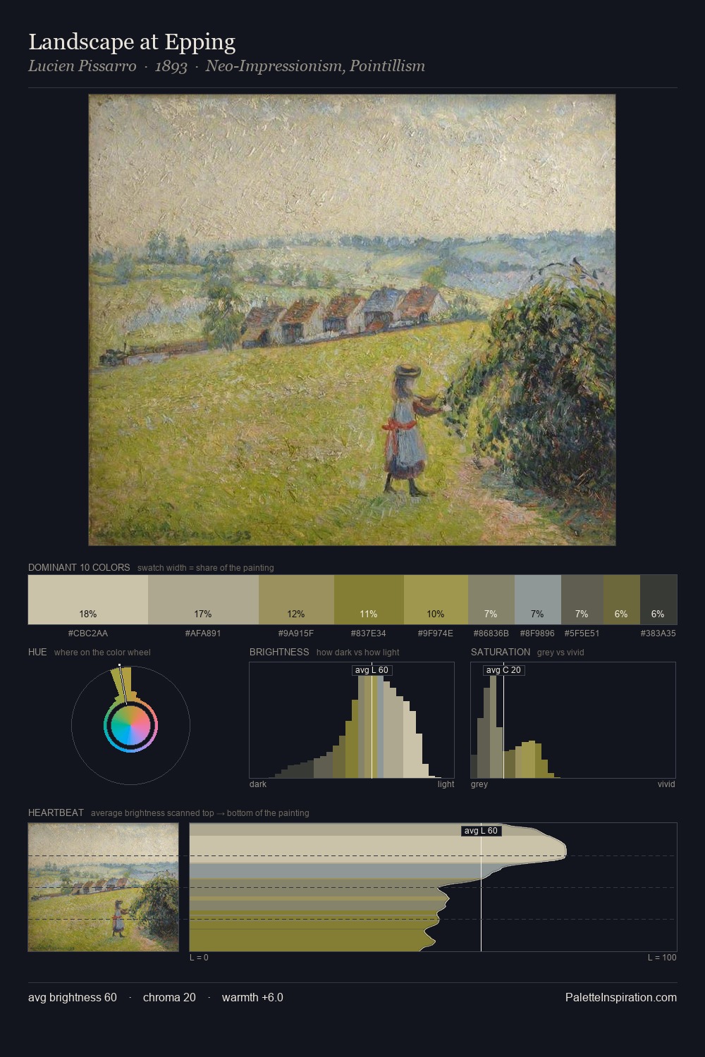
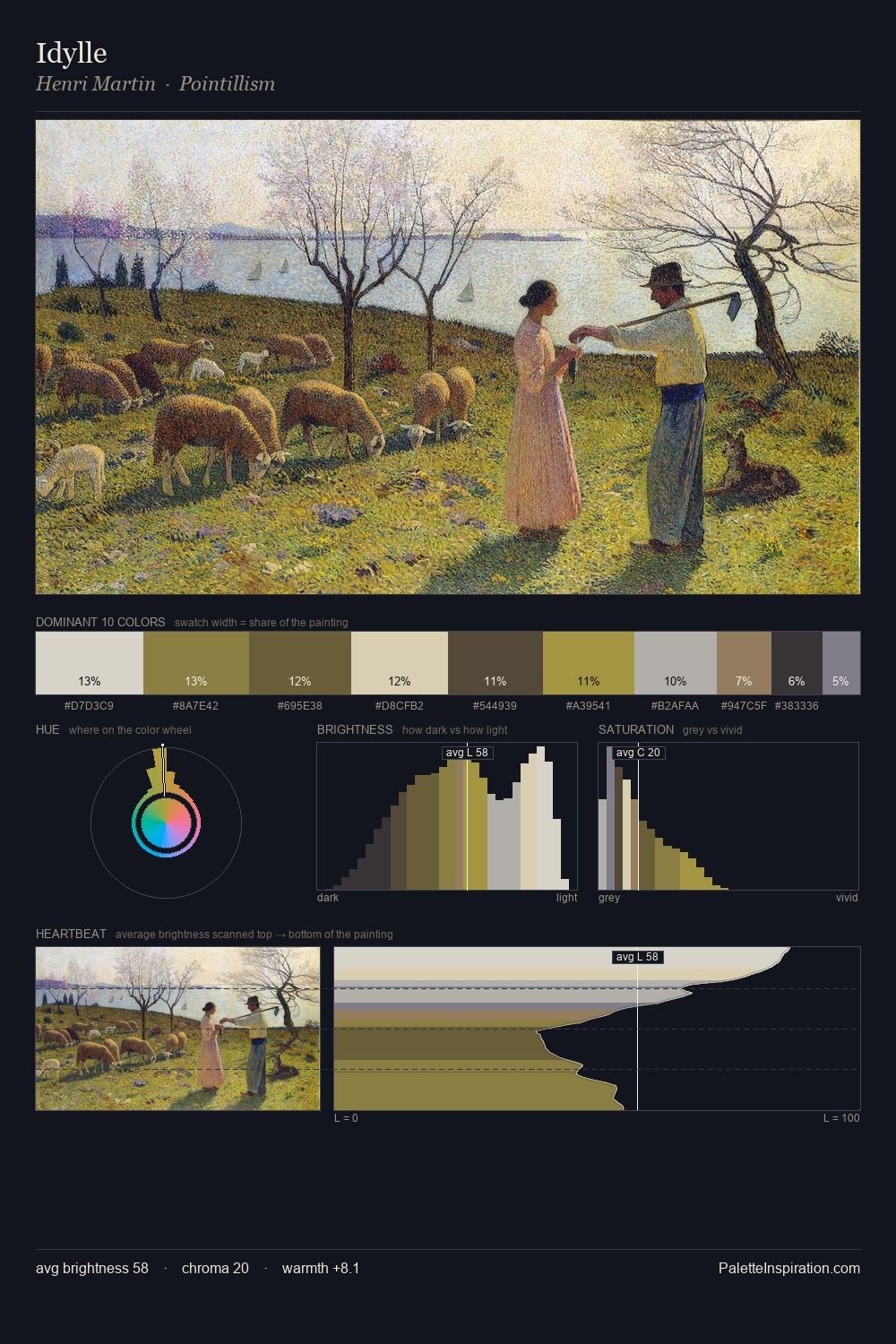
Values in Prudence Heward rest in the mid-range - neither dramatically lit nor steeped in shadow. Cool hues prevail: blues, greens, and greys anchor the palette's emotional temperature. Muted throughout, the palette achieves its effects through value and temperature rather than chromatic force. #A29329 delivers the chromatic peak at only 3.6% - a small shot of colour with outsized visual impact. A value spread of 56 units gives the palette both depth and air - shadows are genuinely dark, lights genuinely light. The mid-to-high key, cool bias, and moderate chroma point to outdoor observation - sky and diffused daylight as the dominant light source. This is palette 2 of Prudence Heward's sequence - a single chapter in a chromatic story told across many works.
Example use cases
- museums & galleries
- academic publishing
- heritage brands
- auction houses
- exhibition design
I Love This!
Copy, export, or download for your project