Precisionism Palette 11

Palette Analysis
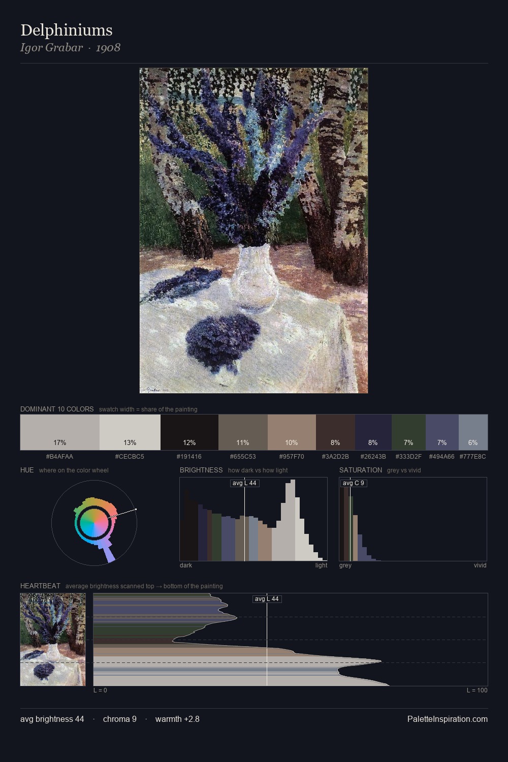
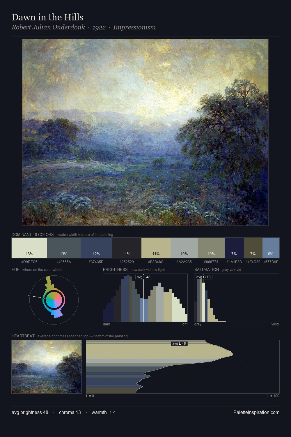
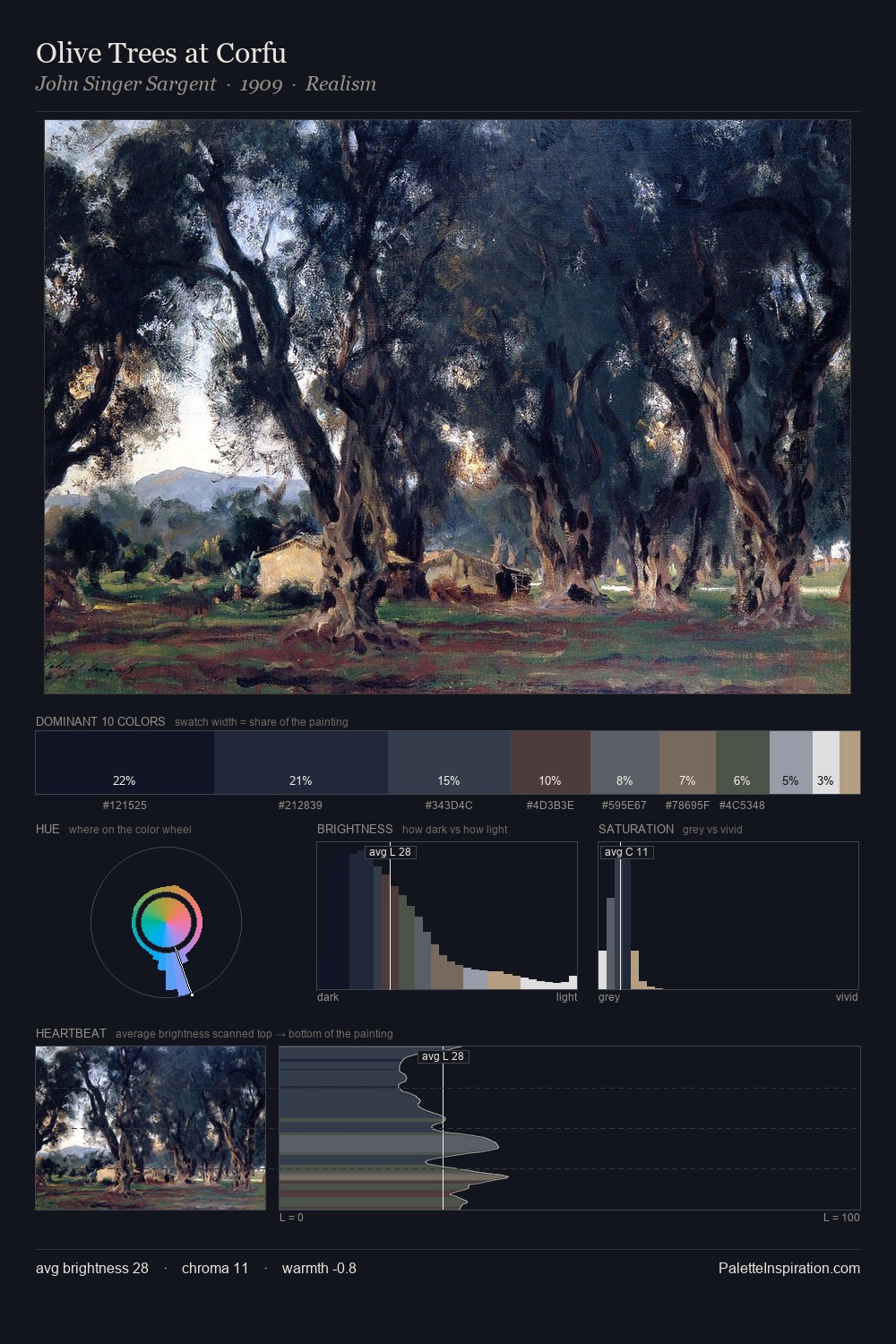
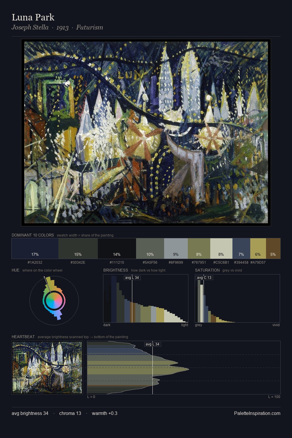
Precisionism distributes its values across the middle register, creating harmony without high contrast. The palette tilts toward cool - blues and silver-greys carry the structural weight. Chroma is kept low across all colours, producing the soft, enveloping quality that characterises tonal painting. At 25.7%, #181011 functions less as a colour accent and more as a complete atmospheric environment. The most saturated colour, #0F1529, is reserved to 10.1% of the surface, where it acts as a focal punctuation. The value range spans 75 units across the palette, providing the full gamut from deep shadow to near-white and ensuring clear tonal hierarchy. High luminosity and cool temperature suggest the plein-air condition: unfiltered daylight and open sky.
Example use cases
- publishing
- corporate identity
- consumer apps
- hospitality
- design agencies
I Love This!
Copy, export, or download for your project