Poster Palette 2
Gleaming Blaze
Gleaming Bright and polished - high-key, often warm, suggesting reflective or luminous surfaces.
Blaze Intense red-orange - the color of active flame at its hottest visible point.

Palette Analysis
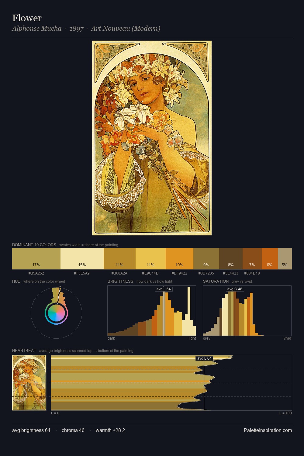
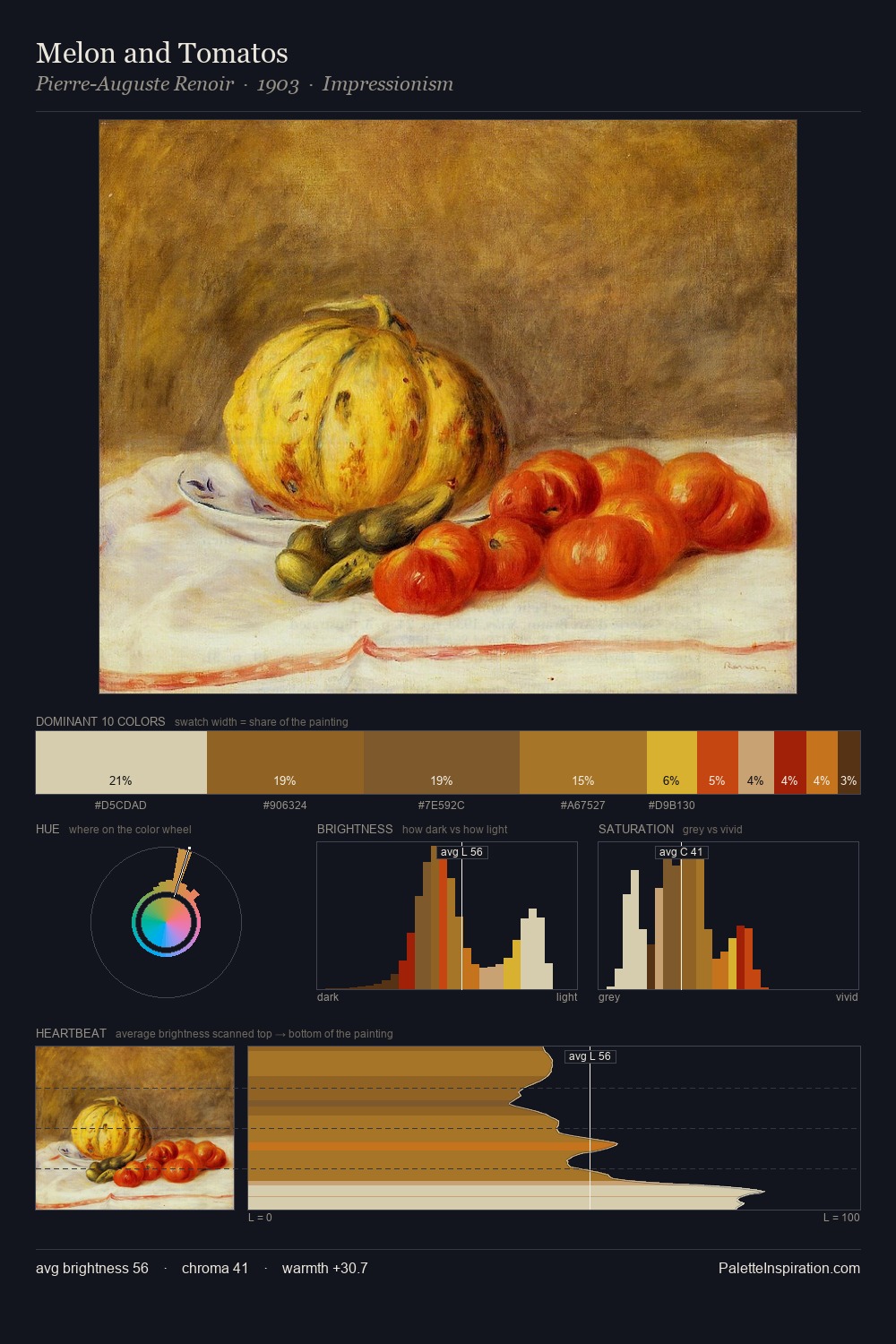
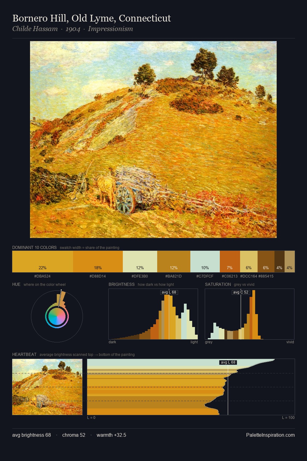
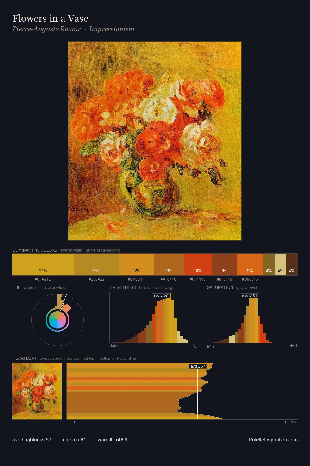
poster is strongly light-biased - shadow is suggested rather than declared. A distinctly cool atmosphere runs through this palette: sky, water, and mist given colour form. A restrained, mid-chroma palette: every hue is present and legible, but nothing shouts. #F5D152 at 40.2% of the palette: an overwhelming presence that pulls all other colours into its gravitational field. Only 2.1% is devoted to #8A4C14, yet that small allocation delivers the palette's entire chromatic tension. 56 units of value range underpin the palette's structural clarity: the eye always knows where light falls. The palette has the character of outdoor light: cool, mid-bright, with colour rendered faithfully rather than expressively.
Example use cases
- publishing
- corporate identity
- consumer apps
- hospitality
- design agencies
I Love This!
Use This Palette
Copy, export, or download for your project
Copy, export, or download for your project
Copy:
Download:
Share: