Poster Palette 1
Pale Apricot
Pale High-key and low-chroma - delicate, bleached, washed with light.
Apricot Soft warm orange - peach-adjacent, the color of ripe stone fruit.

Palette Analysis
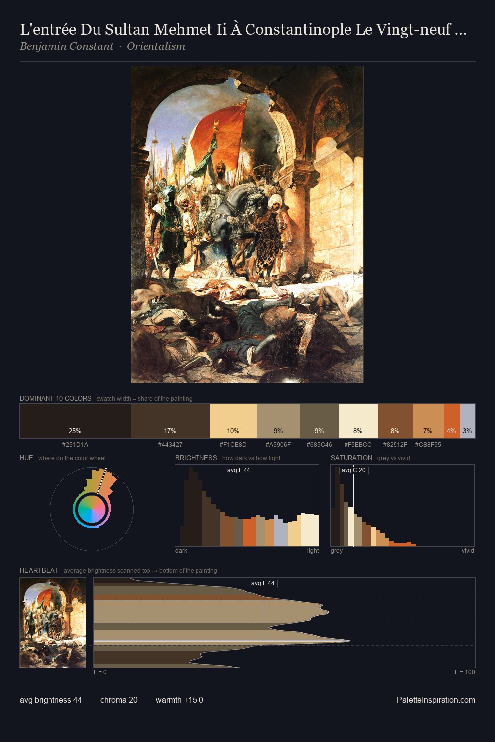
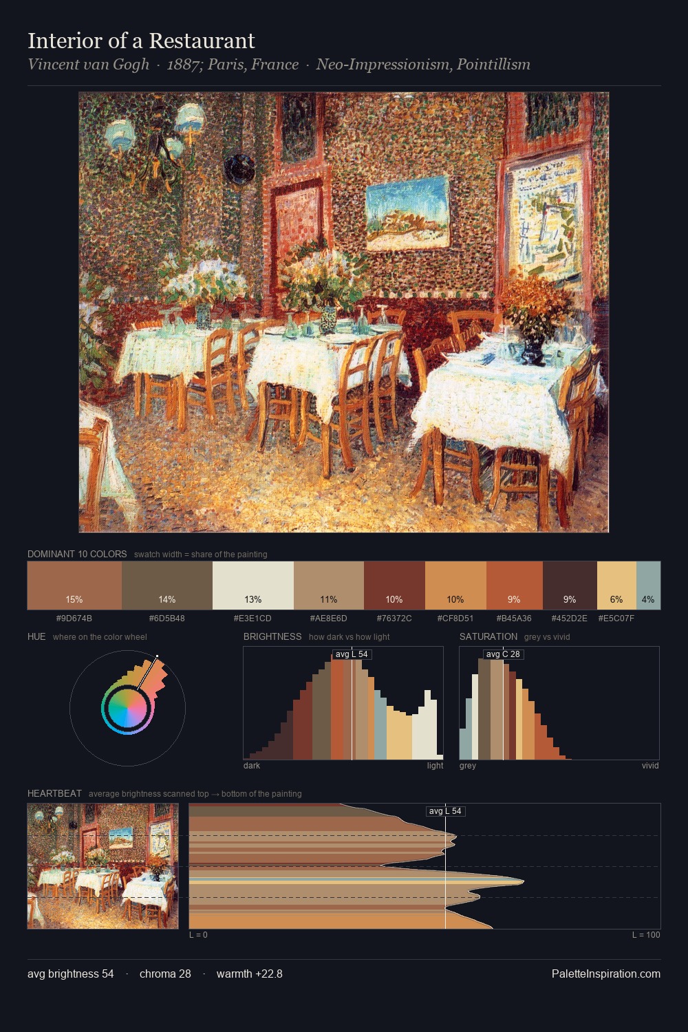
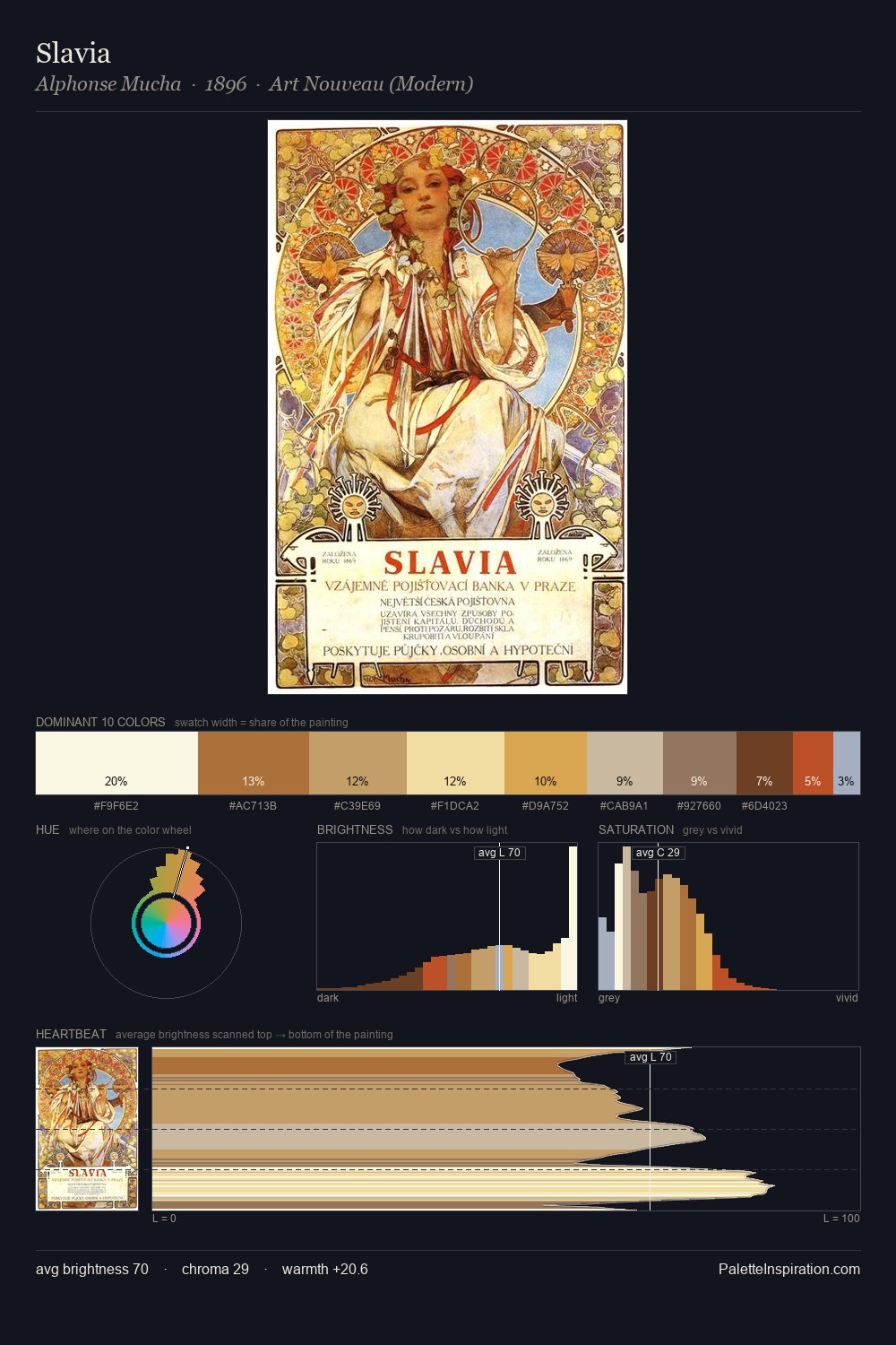
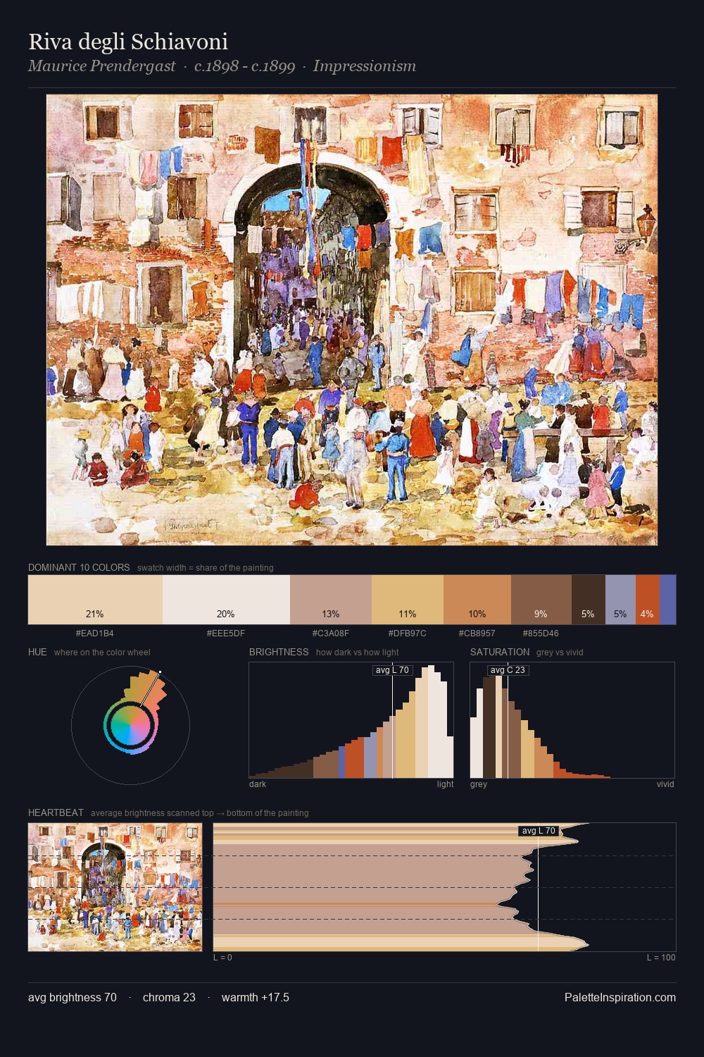
poster is high-key - luminous, open, and weighted toward light. Warmth dominates - the palette leans heavily on the yellow-orange-red arc of the colour wheel. Chroma is moderate: colours carry enough saturation to be read as colour, but the palette stops well short of garish intensity. At 3.9%, #AF4928 carries the palette's sharpest chromatic charge: an accent that earns its place precisely because it is withheld. The full value range is 59 units: broad enough to build convincing three-dimensional form.
Example use cases
- publishing
- corporate identity
- consumer apps
- hospitality
- design agencies
I Love This!
Use This Palette
Copy, export, or download for your project
Copy, export, or download for your project
Copy:
Download:
Share: