Pompeo Batoni Palette 11
Nocturnal Umber
Nocturnal Night-register palette - very low values, the world after dark.
Umber Dark earthy brown - raw or burnt umber, a foundational old-master earth pigment.

Palette Analysis
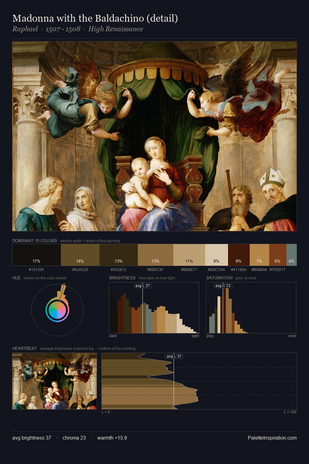
Pompeo Batoni occupies the comfortable middle of the value scale, avoiding both extremes to hold the eye in a sustained middle grey. Pompeo Batoni orchestrates warmth above all else - reds, ambers, and siennas take the lead. Saturation is deliberately withheld - the beauty here lies in the near-monochromatic gradations rather than colour difference. Only 10.1% is devoted to #5A3E1D, yet that small allocation delivers the palette's entire chromatic tension. A value spread of 61 units gives the palette both depth and air - shadows are genuinely dark, lights genuinely light. This is palette 11 of Pompeo Batoni's sequence - a single chapter in a chromatic story told across many works.
Example use cases
- theater design
- jewelry brands
- tobacco-adjacent retail
- event branding
- film & entertainment
I Love This!
Use This Palette
Copy, export, or download for your project
Copy, export, or download for your project
Copy:
Download:
Share: