Placido Costanzi Palette 2

Palette Analysis
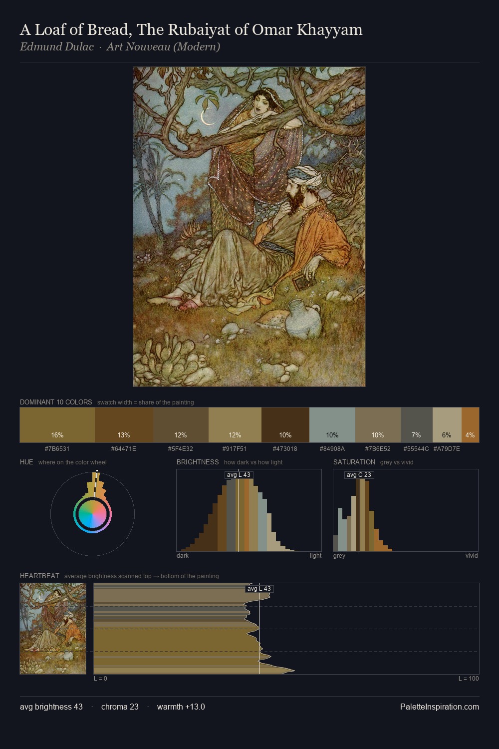
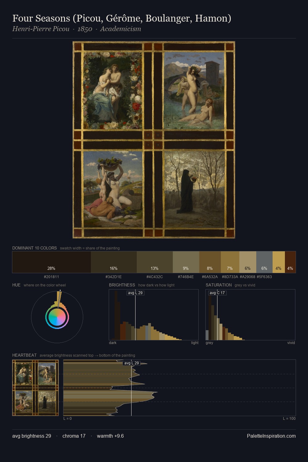
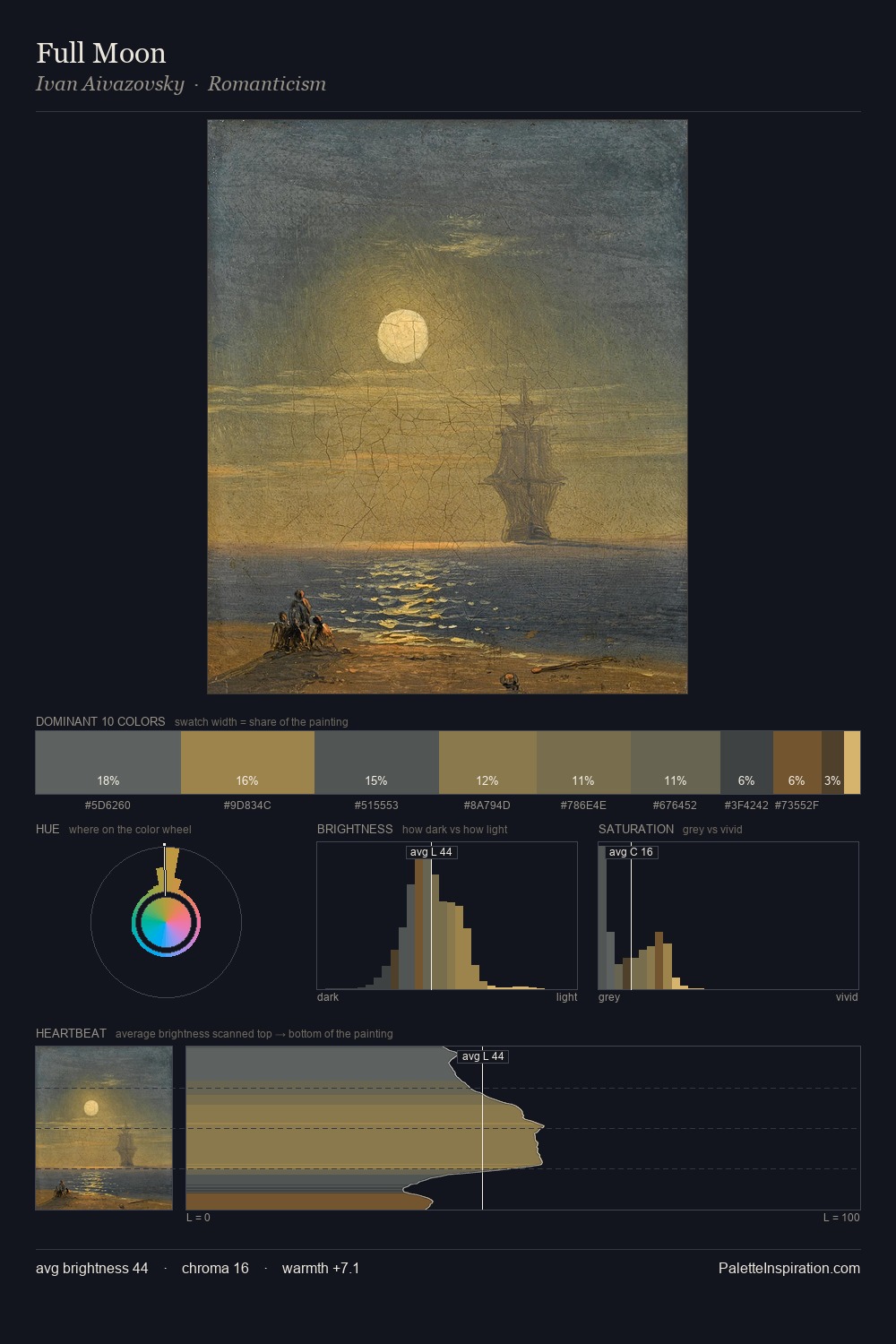
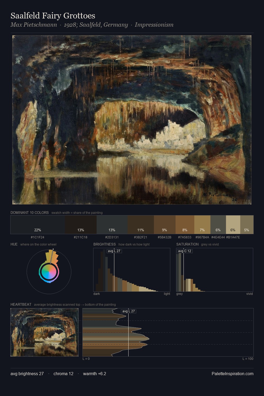
Mid-key values give Placido Costanzi its characteristic quietness - nothing blazes, nothing disappears. Temperature is cool-dominant, with blue and green families claiming the largest areas. A restrained, mid-chroma palette: every hue is present and legible, but nothing shouts. The most saturated colour, #775D37, is reserved to 7.4% of the surface, where it acts as a focal punctuation. The value range of 26 units sits in the comfortable middle: enough depth, enough light, neither extreme. The mid-to-high key, cool bias, and moderate chroma point to outdoor observation - sky and diffused daylight as the dominant light source. Placido Costanzi's palette 2 carries its own internal logic while remaining in conversation with the artist's broader colour intelligence.
Example use cases
- theater design
- jewelry brands
- tobacco-adjacent retail
- event branding
- film & entertainment
I Love This!
Copy, export, or download for your project