Pinturicchio Palette 5
Shadowed Tawny
Shadowed Low-key - values weighted toward shadow, the palette of dim interiors and overcast skies.
Tawny Warm orange-brown - a traditional term for the color of tanned leather or lion fur.

Palette Analysis
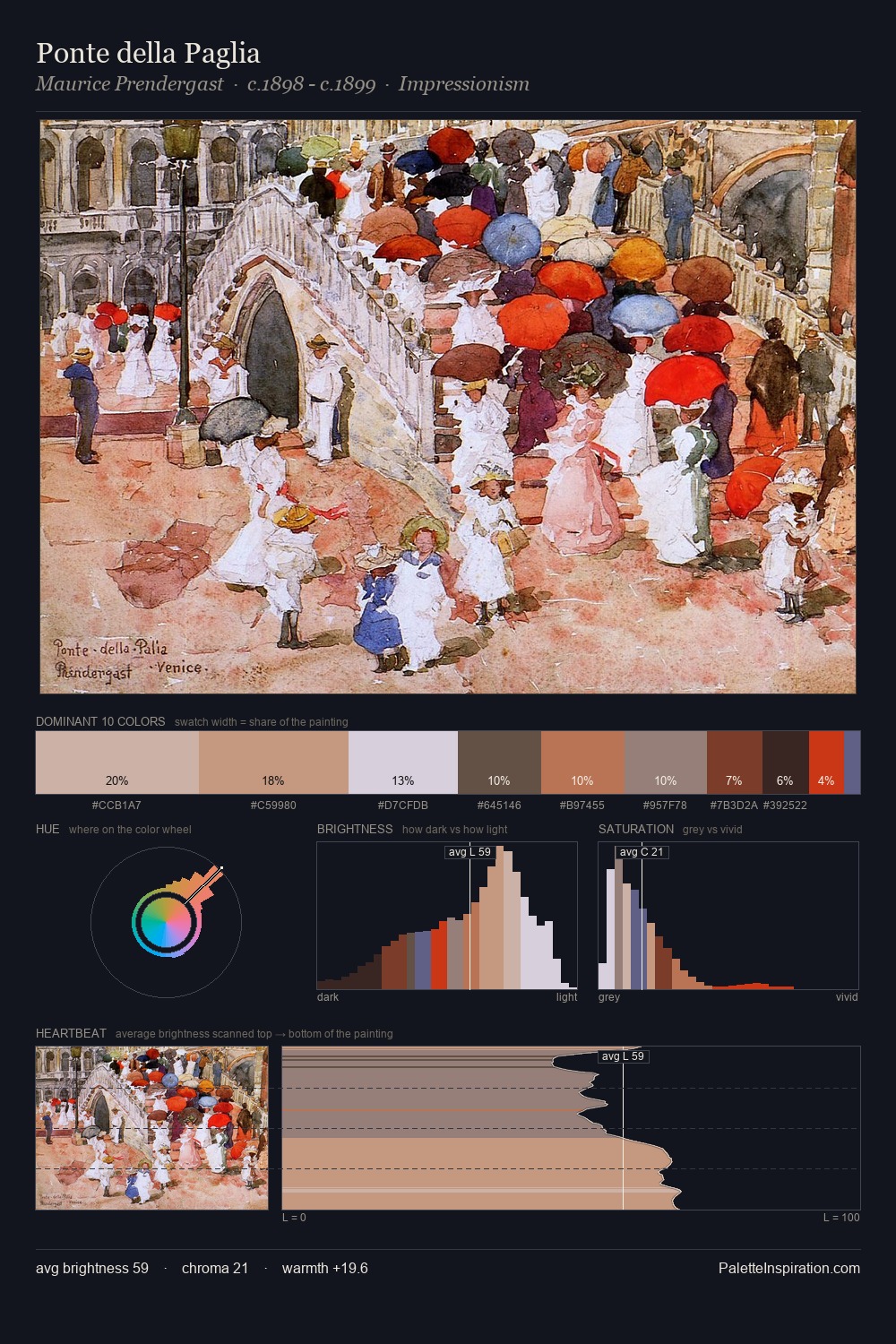
Mid-key values give Pinturicchio its characteristic quietness - nothing blazes, nothing disappears. Warm hues command this palette; Pinturicchio favours the reds, oranges, and yellows of firelight and earth. Saturation is deliberately withheld - the beauty here lies in the near-monochromatic gradations rather than colour difference. The saturated accent, #B59379, registers at 7.7% - sparse enough to feel like a deliberate surprise. 60 units of value range underpin the palette's structural clarity: the eye always knows where light falls. In the context of Pinturicchio's full range of palettes, group 5 represents one movement in an ongoing chromatic dialogue.
Example use cases
- theater design
- jewelry brands
- tobacco-adjacent retail
- event branding
- film & entertainment
I Love This!
Use This Palette
Copy, export, or download for your project
Copy, export, or download for your project
Copy:
Download:
Share: