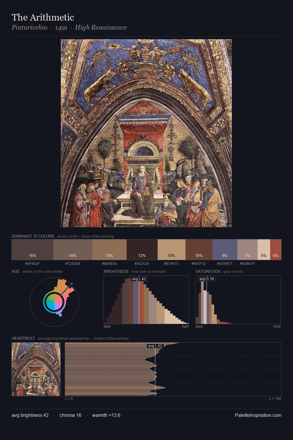
Pinturicchio Palette 4
Muted Tawny
Muted Deliberately desaturated - chroma pulled toward gray, the restraint of tonal painting.
Tawny Warm orange-brown - a traditional term for the color of tanned leather or lion fur.

Palette Analysis
Mid-key values give Pinturicchio its characteristic quietness - nothing blazes, nothing disappears. Warmth dominates - the palette of Pinturicchio leans heavily on the yellow-orange-red arc of the colour wheel. Saturation is deliberately withheld - the beauty here lies in the near-monochromatic gradations rather than colour difference. At 2.6%, #994D3C carries the palette's sharpest chromatic charge: an accent that earns its place precisely because it is withheld. At 42 units across the value scale, the palette keeps contrast readable without letting it dominate. This is palette 4 of Pinturicchio's sequence - a single chapter in a chromatic story told across many works.
Example use cases
- exhibition design
- foundation branding
- estate management
- art education
- museums & galleries
I Love This!
Use This Palette
Copy, export, or download for your project
Copy, export, or download for your project
Copy:
Download:
Share: