Pietro Paolini Master Palette
Shadowed Caramel
Shadowed Low-key - values weighted toward shadow, the palette of dim interiors and overcast skies.
Caramel Warm mid-brown - the color of cooked sugar, smooth and amber-toned.

Palette Analysis
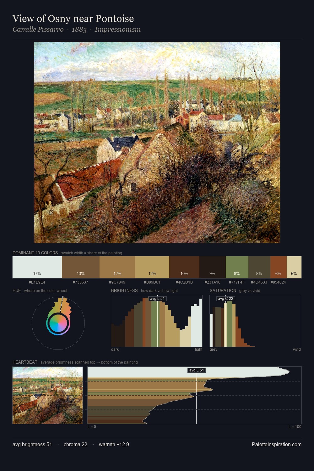
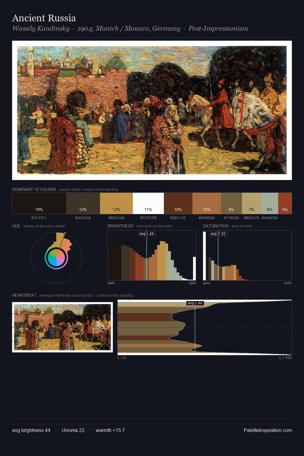
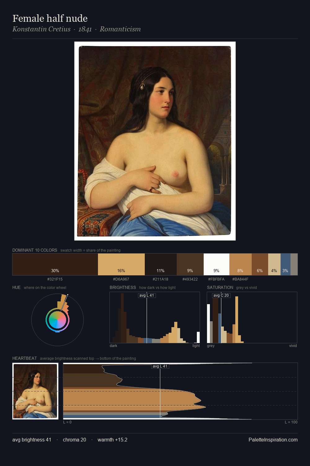
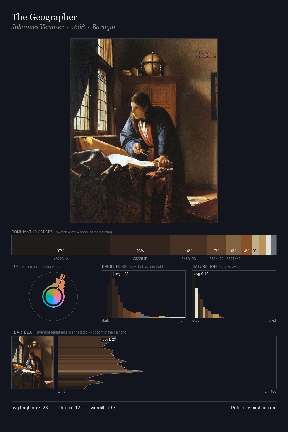
The value structure of Pietro Paolini is mid-key: quiet, controlled, and cohesive. The dominant temperature is warm, with earth tones and fire-hues setting the emotional key. Muted throughout, the palette achieves its effects through value and temperature rather than chromatic force. #221C16 at 26.1% of the palette: an overwhelming presence that pulls all other colours into its gravitational field. The saturated accent, #E2AB65, registers at 8.7% - sparse enough to feel like a deliberate surprise. The full value range is 72 units: broad enough to build convincing three-dimensional form. The palette is a signature: Pietro Paolini's particular sense of value, warmth, and colour weight made legible.
Example use cases
- theater design
- jewelry brands
- tobacco-adjacent retail
- event branding
- film & entertainment
I Love This!
Use This Palette
Copy, export, or download for your project
Copy, export, or download for your project
Copy:
Download:
Share: