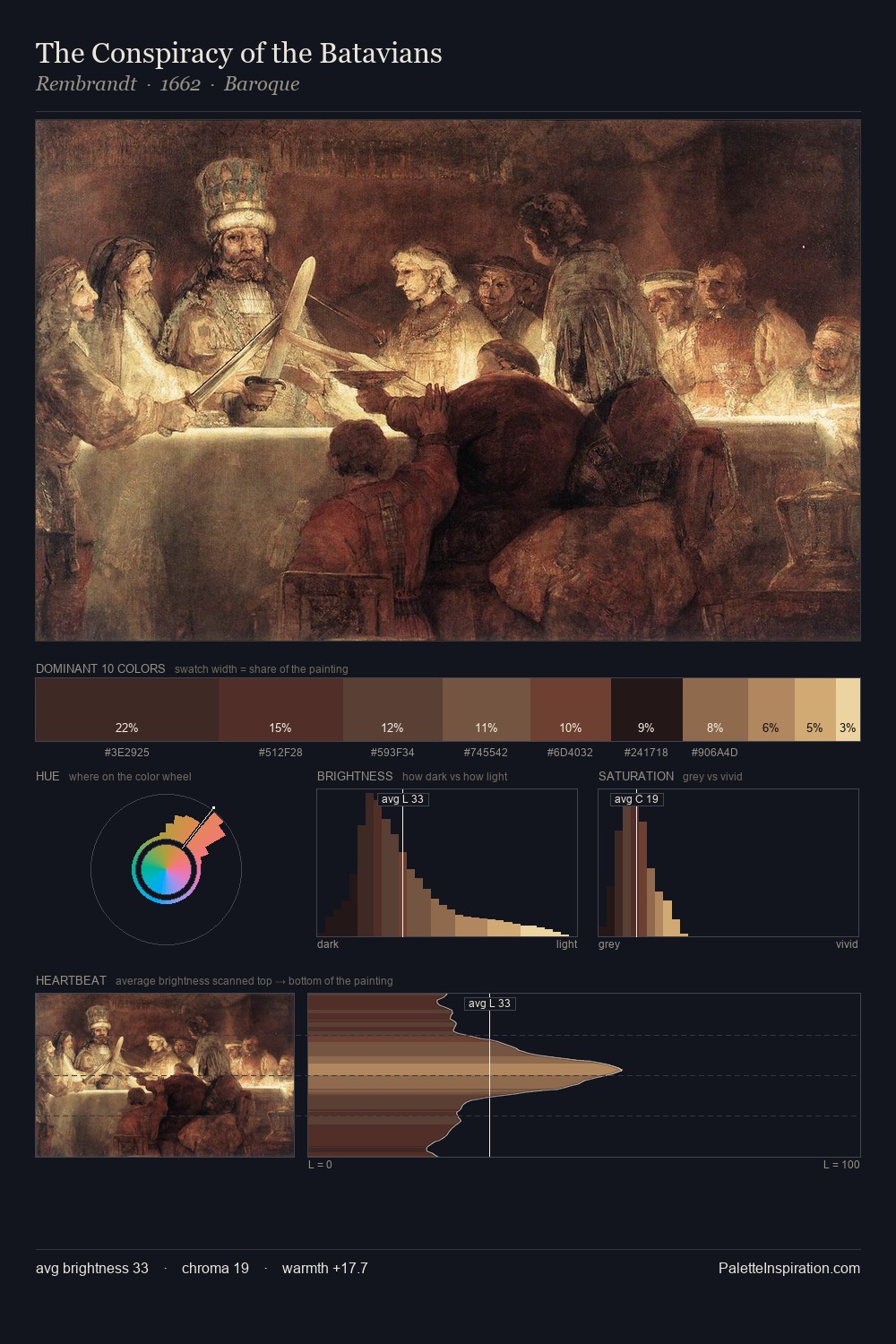
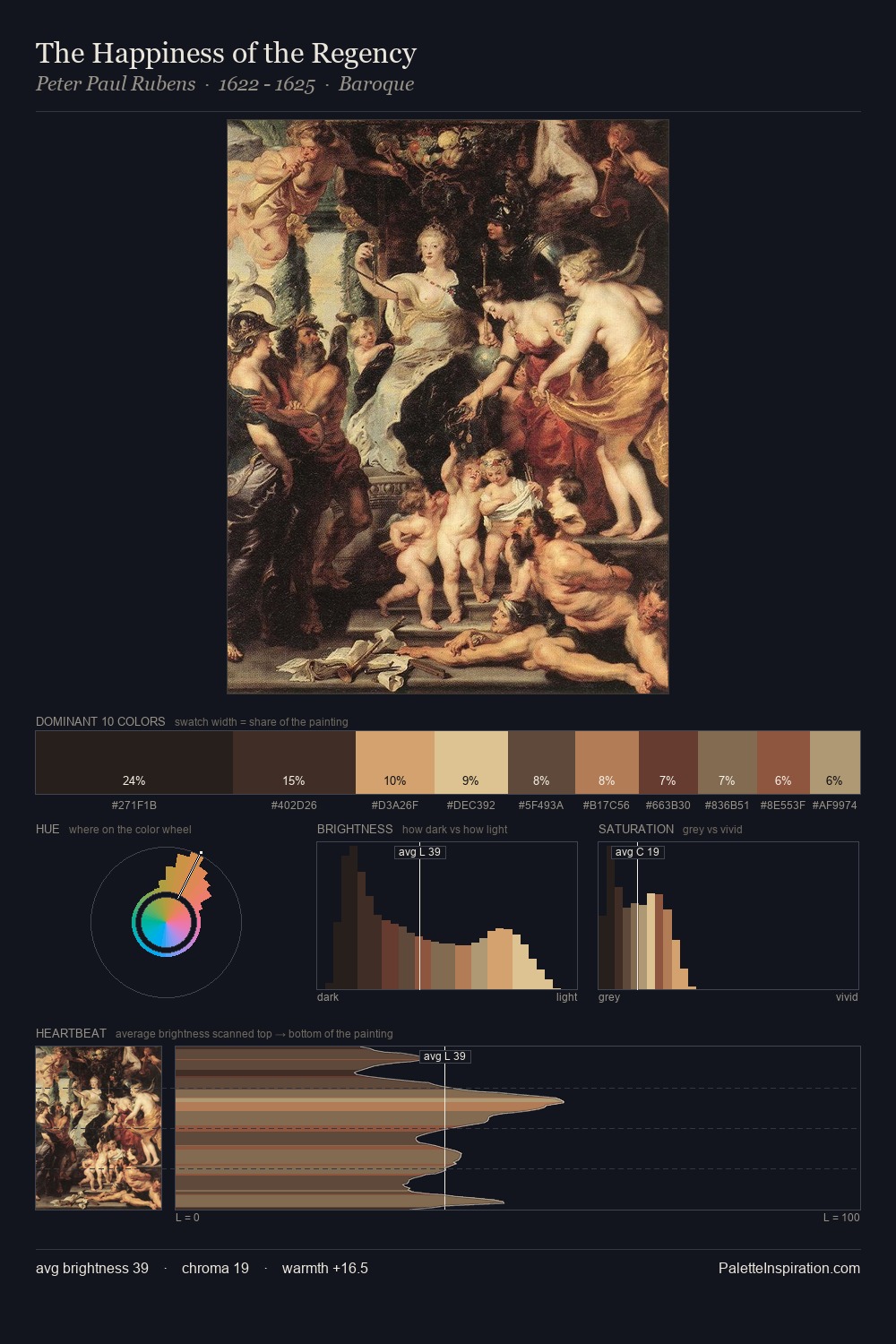
Pietro Longhi Palette 7

Palette Analysis
Pietro Longhi distributes its values across the middle register, creating harmony without high contrast. Warm hues command this palette; Pietro Longhi favours the reds, oranges, and yellows of firelight and earth. Muted throughout, the palette achieves its effects through value and temperature rather than chromatic force. The dominant colour, #512F2A, takes 27.2% of the total area, establishing the overall mood before any other hue is introduced. #8F5A3F functions as the palette's exclamation mark: highest chroma, lowest percentage (5.4%). 64 units of value range underpin the palette's structural clarity: the eye always knows where light falls. This is palette 7 of Pietro Longhi's sequence - a single chapter in a chromatic story told across many works.
Example use cases
- theater design
- jewelry brands
- tobacco-adjacent retail
- event branding
- film & entertainment
I Love This!
Copy, export, or download for your project