Pietro de' Pietri Master Palette

Palette Analysis
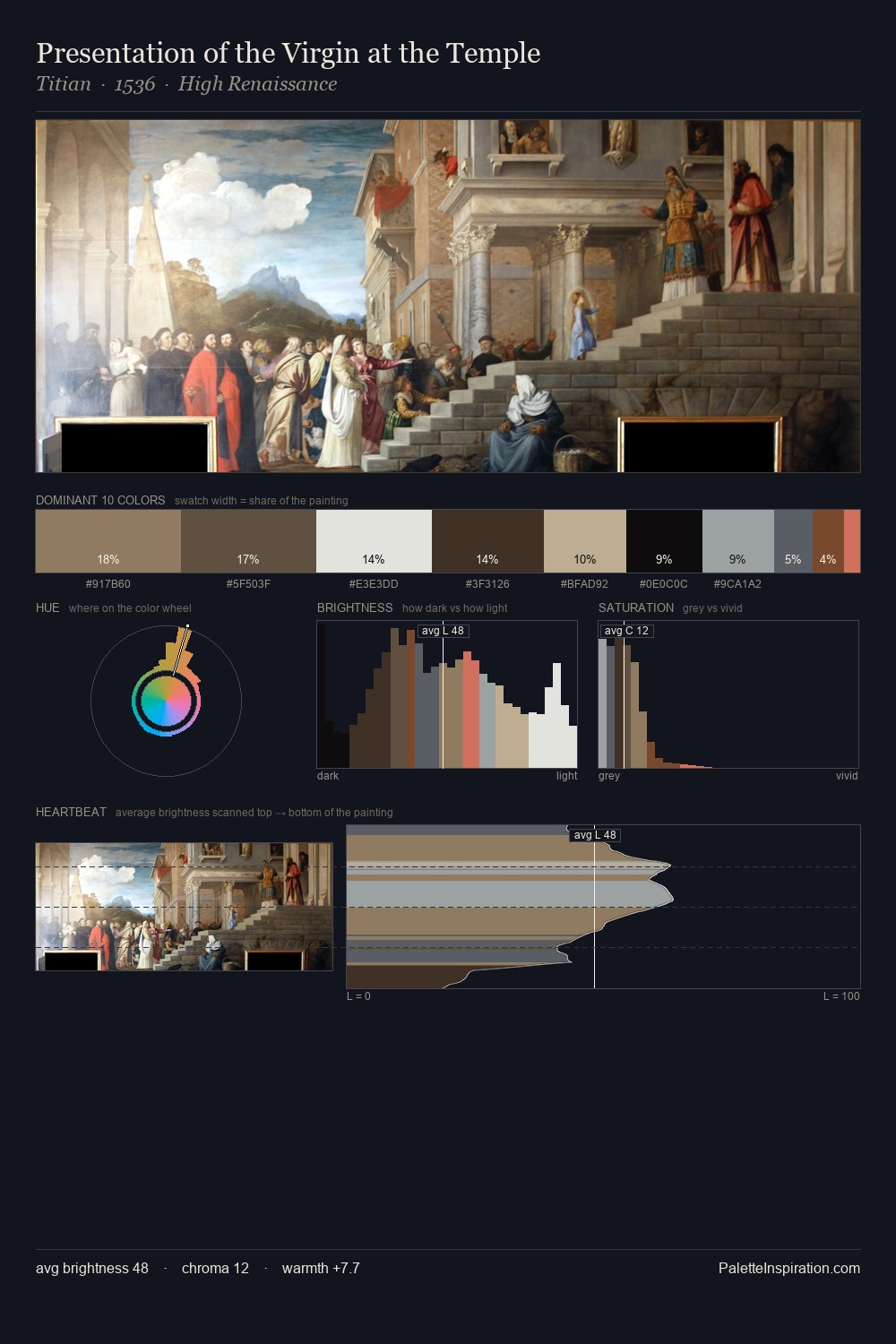
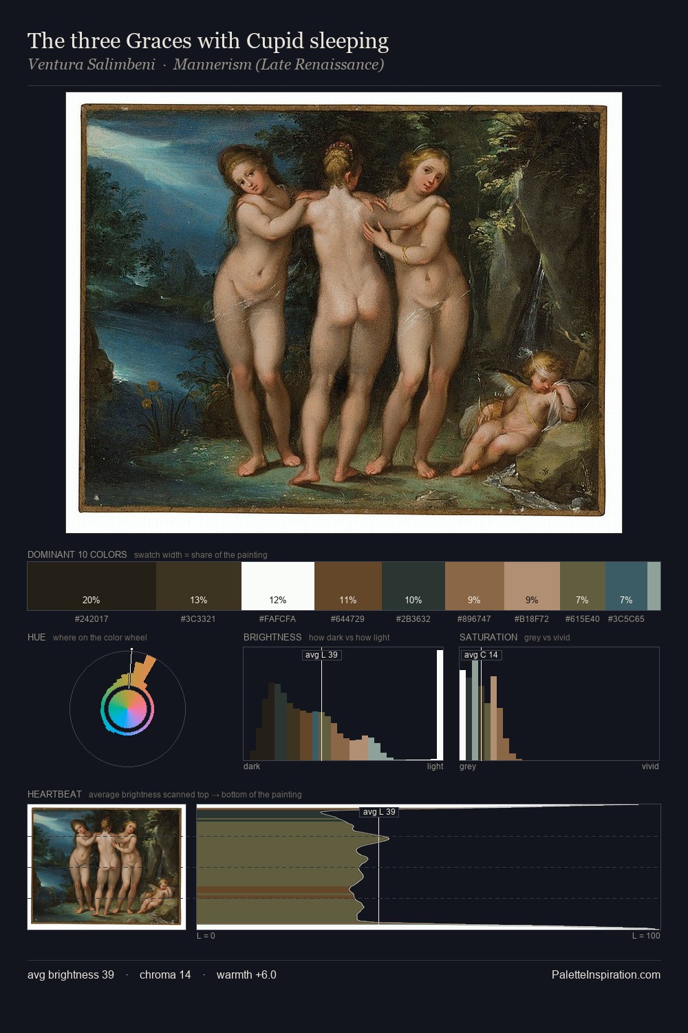
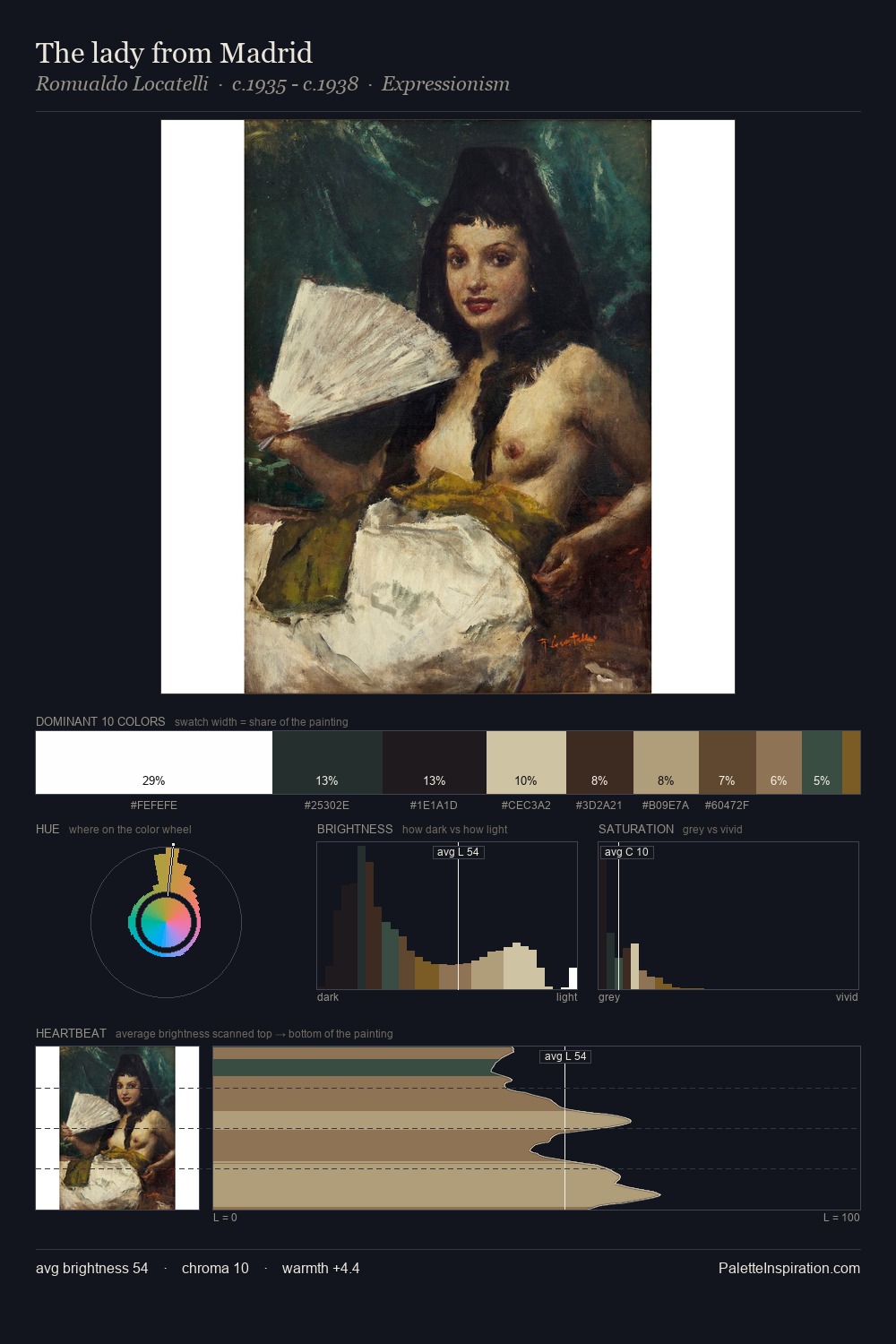
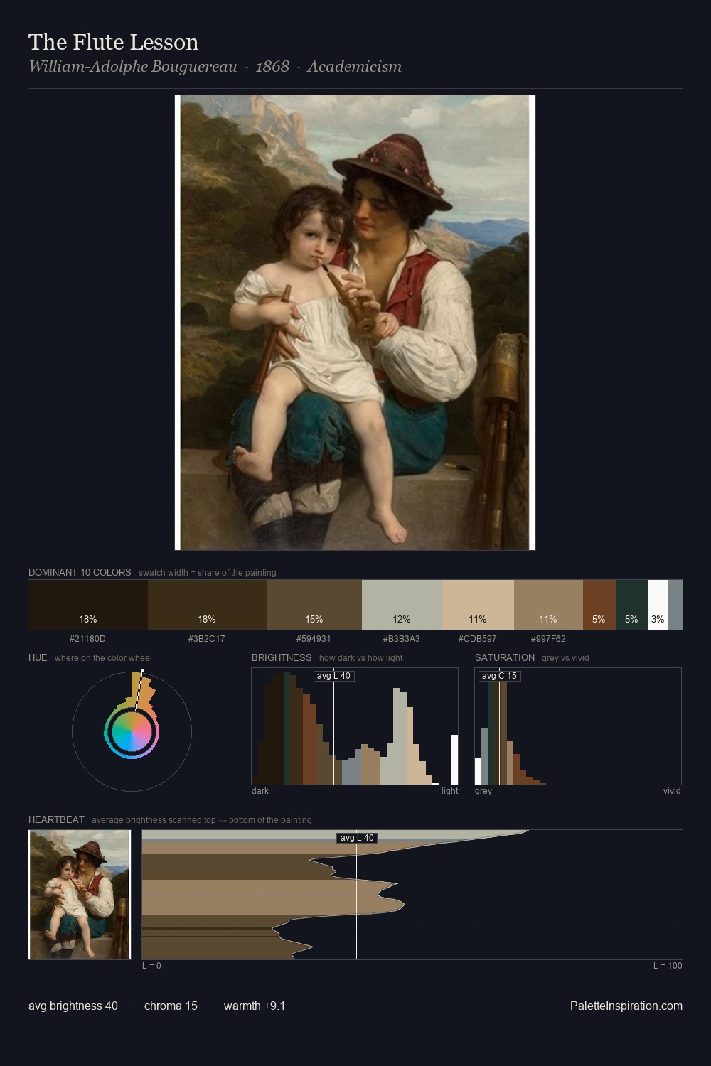
The value structure of Pietro de' Pietri is mid-key: quiet, controlled, and cohesive. The dominant temperature is warm, with earth tones and fire-hues setting the emotional key. The absence of saturated colour is itself an expressive choice: this is a palette of restraint and atmosphere. At 40.0%, #221B16 functions less as a colour accent and more as a complete atmospheric environment. The highest-chroma note - #9B7E54 - appears at just 3.0%, deployed as a precision accent against the quieter ground. A value spread of 76 units gives the palette both depth and air - shadows are genuinely dark, lights genuinely light. The palette is recognisably Pietro de' Pietri's own: particular in its temperature, chroma, and the economy of its brightest note.
Example use cases
- theater design
- jewelry brands
- tobacco-adjacent retail
- event branding
- film & entertainment
I Love This!
Copy, export, or download for your project