Pietro da Cortona Palette 5
Shadowed Umber
Shadowed Low-key - values weighted toward shadow, the palette of dim interiors and overcast skies.
Umber Dark earthy brown - raw or burnt umber, a foundational old-master earth pigment.

Palette Analysis
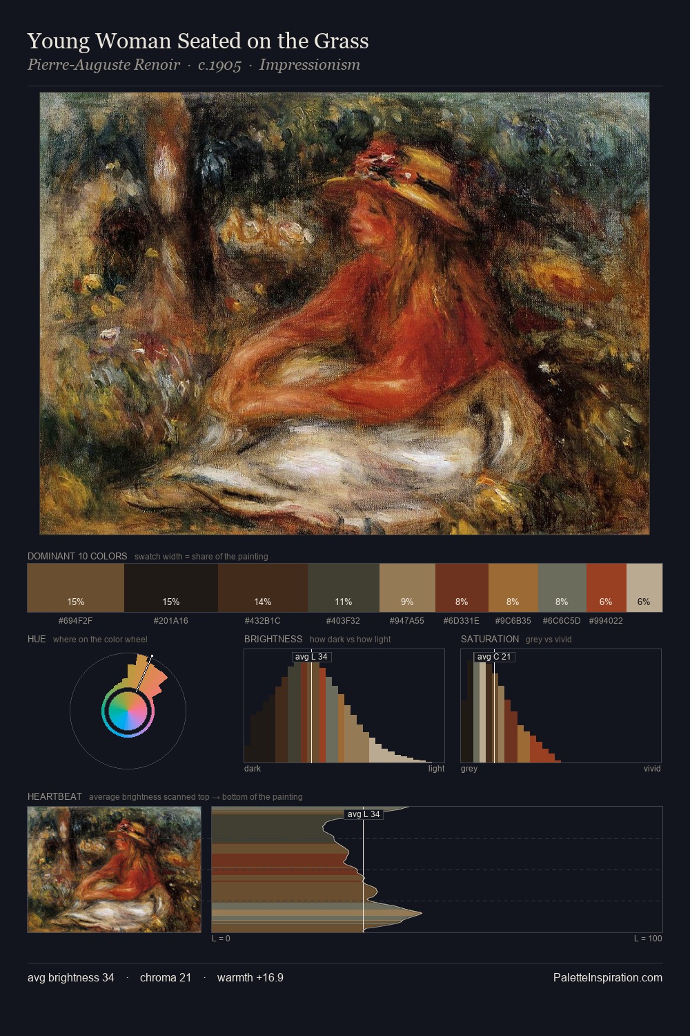
Pietro da Cortona occupies the comfortable middle of the value scale, avoiding both extremes to hold the eye in a sustained middle grey. Neither warm nor cool has the upper hand here; the equilibrium between the two generates the palette's visual energy. Chroma hovers near zero; colour declares itself through subtle shifts in hue rather than outright saturation. The highest-chroma note - #402410 - appears at just 12.8%, deployed as a precision accent against the quieter ground. The value range spans 58 units across the palette, providing the full gamut from deep shadow to near-white and ensuring clear tonal hierarchy. This is palette 5 of Pietro da Cortona's sequence - a single chapter in a chromatic story told across many works.
Example use cases
- theater design
- jewelry brands
- tobacco-adjacent retail
- event branding
- film & entertainment
I Love This!
Use This Palette
Copy, export, or download for your project
Copy, export, or download for your project
Copy:
Download:
Share: